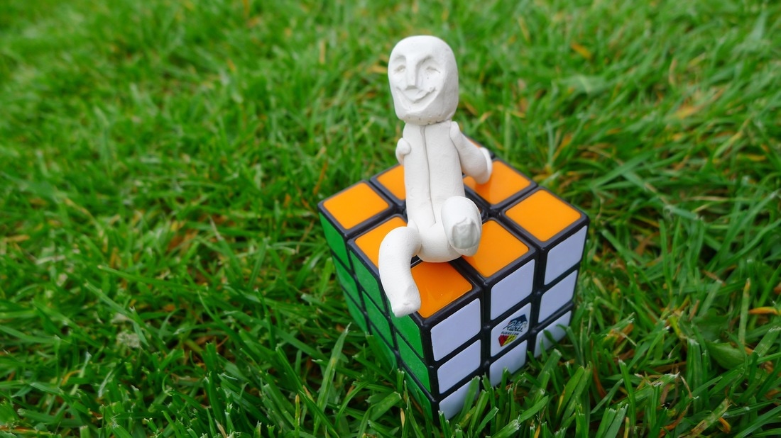
UNIT 8 ( FMP )
First of all, we start writing on a board as a whole class, familiar things and strange things that came to our mind. Then we mixed and wrote strange and familiar, which was quite an easy step.
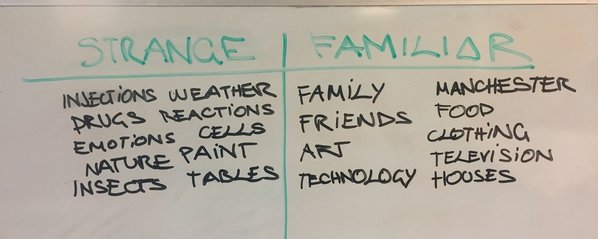
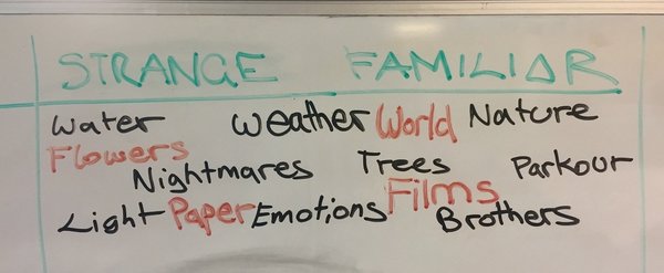
After this we start thinking about the theme we will choose for the final project. This was a very hard step as it envolved all the work. All we do and all of our art pieces will have to be related to that, or it will be focus mainly on that theme.
I´ve chosen parkour as my strange but familiar theme and write the Project Proposal.
I would like to explore and make various pieces of art, and make them in various ways and styles of art.
My strengths are fine art, photography and moving image.
It could be considered as weaknesses portraits, realistic drawings and project management.
For me, danger or adrenaline are strange and familiar because it´s difficult to achieve that state or feeling and means you´re trying something risky but in my case, as I practise everyday it´s normal so familiar.
My theme for Strange but familiar is Parkour.
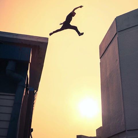
Parkour is a dangerous sport and it could be even a lifestyle. I´ve chosen this sport because it is not normal, it is really unusual (strange) due to its short elderly. It was created around 1990 but it has become very famous so fast as it is very visual, and some photos impact many people for their impossibility, but that impossibility is only achieved with constance and hard training everyday. That´s why it is familiar. I use to practise it everywhere, even in my house when it´s raining.
My strengths are fine art, photography and moving image.
It could be considered as weaknesses portraits, realistic drawings and project management.
For me, danger or adrenaline are strange and familiar because it´s difficult to achieve that state or feeling and means you´re trying something risky but in my case, as I practise everyday it´s normal so familiar.
My theme for Strange but familiar is Parkour.
Parkour is a dangerous sport and it could be even a lifestyle. I´ve chosen this sport because it is not normal, it is really unusual (strange) due to its short elderly. It was created around 1990 but it has become very famous so fast as it is very visual, and some photos impact many people for their impossibility, but that impossibility is only achieved with constance and hard training everyday. That´s why it is familiar. I use to practise it everywhere, even in my house when it´s raining.
|
|
|
PARKOUR RESEARCH
Parkour is a training discipline using movement that developed from military obstacle course training. Practitioners aim to get from one point to another in a complex environment, without assistive equipment and in the fastest and most efficient way possible. Parkour includes running, climbing, swinging, vaulting, jumping, rolling, quadrupedal movement, and other movements as deemed most suitable for the situation. Parkour's development from military training gives it some aspects of a non-combative martial art.
Parkour is an activity that can be practised alone or with others and is usually—but not exclusively—carried out in urban spaces. Parkour involves seeing one's environment in a new way, and imagining the potential for navigating it by movement around, across, through, over and under its features.
Parkour was developed in France, primarily by Raymond Belle, and further by his son David and the later's group of friends, the self-styled Yamakasi, during the late 1980s. The discipline was popularised in the late 1990s and 2000s through films, documentaries, and advertisements featuring the Yamakasi.
According to Williams Belle, the philosophies and theories behind parkour are an integral aspect of the art, one that many non-practitioners have never been exposed to. Belle says he trains people because he wants it "to be alive" and "for people to use it". Chau Belle explains it is a "type of freedom" or "kind of expression"; that parkour is "only a state of mind" rather than a set of actions, and that it is about overcoming and adapting to mental and emotional obstacles as well as physical barriers. Traceur Dylan Baker says, "Parkour also influences one's thought processes by enhancing self-confidence and critical thinking skills that allow one to overcome everyday physical and mental obstacles".
It is very common between tracers to study Photography, media, or design so many of them create their own logo, and if they are very famous they make their own brand selling t-shirts, sport trousers, shoes...
Parkour and free-running have generated a huge textile industry. Around parkour and even more around free-running, textile industry has been generated and expanded; In the previous years it hasn't stop growing and growing.
Different brands saw the potential and decided to exploit it.
In 2007, Red Bull 'Art of Motion' was created and the boom of this kind of movement expanded.
The principal brands related to this sport are:
Red Bull : the promoters of the most famous competition. They also sponsor some of the best considered athletes at the moment.
Etre Fort : founded by two swedish athletes, Roger Widmer and Felix Stockly, it is one of the brands who sponsors more athletes all over the world.
X-Dubai : founded in Dubai, its aim is to sponsor athletes of different sports which are looking forward to break records in dubai.
Apart from all this, many athletes groups have made their own brands such as :
Storror : is probably the most famous parkour group because of their huge amount of travels. They are the most traveler group. They are also vey recognised for their amazing videos. They have even made their first film called Roof culture Asia, the premiere of the film is right now, this month in the United States.
MADD : merged in Madrid from some lonely traceurs that knew each other one day while training.
They are very known because of the creativity they have doing the videos, as running at night full of leds, practising parkour as if they were drunk, many cliff-diving...
Team Farang : it has no nationality due to its name (faring means foreigner), because there are are athletes from Germany, Thailand, Latvia, Australia...
They are one of the best known groups right now and their clothing is the best rated.
Team Tempest : merged in L.A., California, and it has been the best example of how doing things correctly as they were the first group taking out and selling their own clothing brand.
GUP : merged in Spain, when a group of friends met in a park to play together. They are mainly known for their incredible videos.
This are some of their logos:
|
GALIZIAN URBAN PROJECT
STORROR
|
TEAM FARANG
TEAM TEMPEST
|
THE MOTUS PROJECTS
MADRID ART OF MOVEMENT
|
END OF PARKOUR RESEARCH
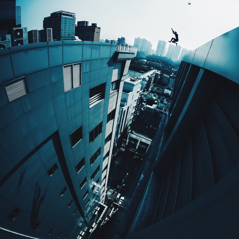
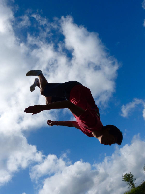
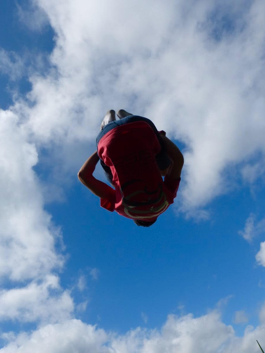
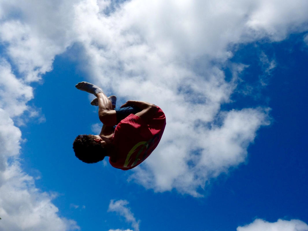
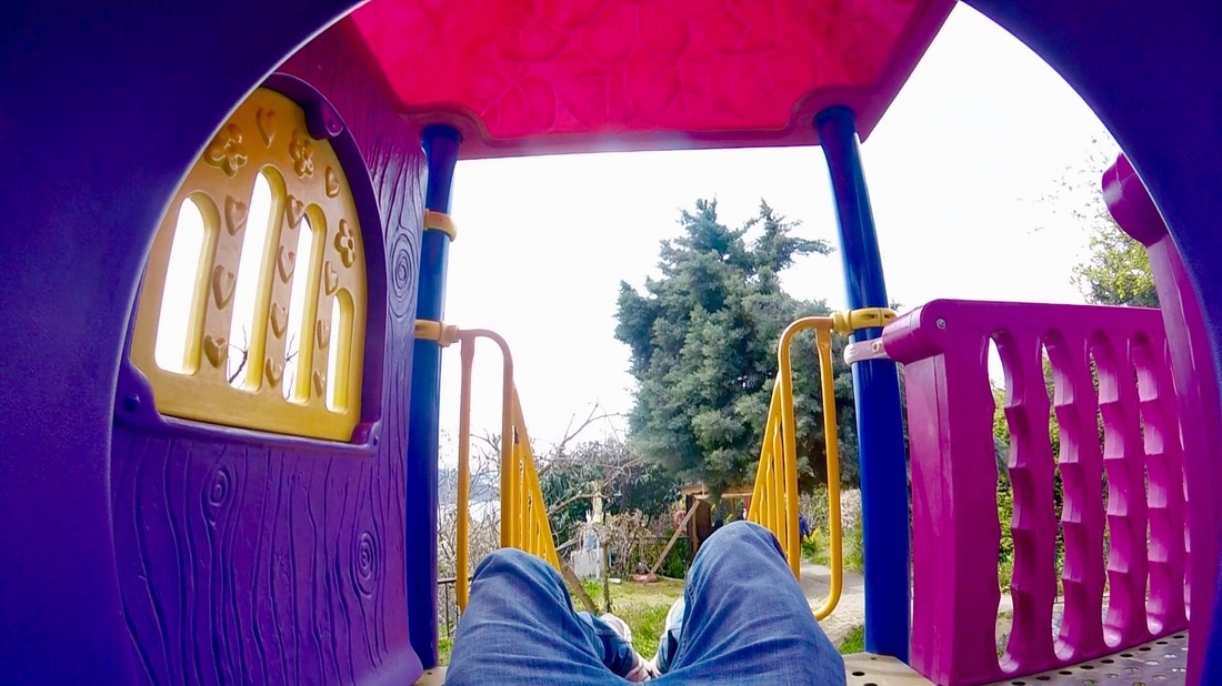
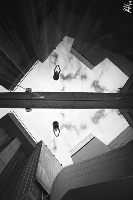
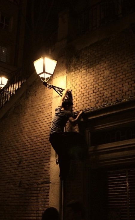
As I chose parkour I went to my cousin's house in Nottingham and took some photos flipping on a trampoline to give that huge jump impression.
I really love this session because it looks like if I am flying, and hopefully it was a sunny day.
I could draw or paint this with pencil, continuous line. I could also do other drawing using this colours, the blue from the sky and the white from the clouds.
Maybe it could have been better if I have photographed more different poses in the air, other flips, or just other movements to make funny poses.
|
|
HALF TERM
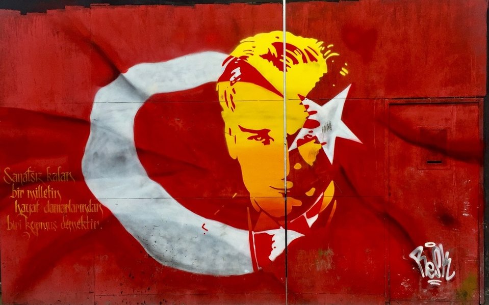
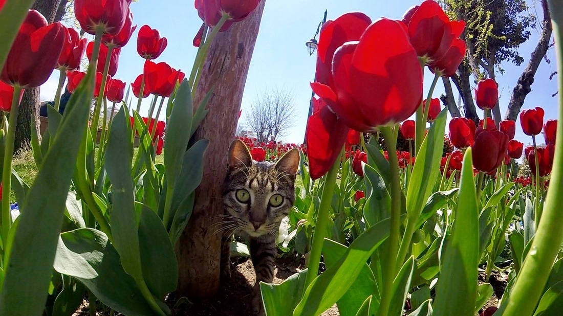
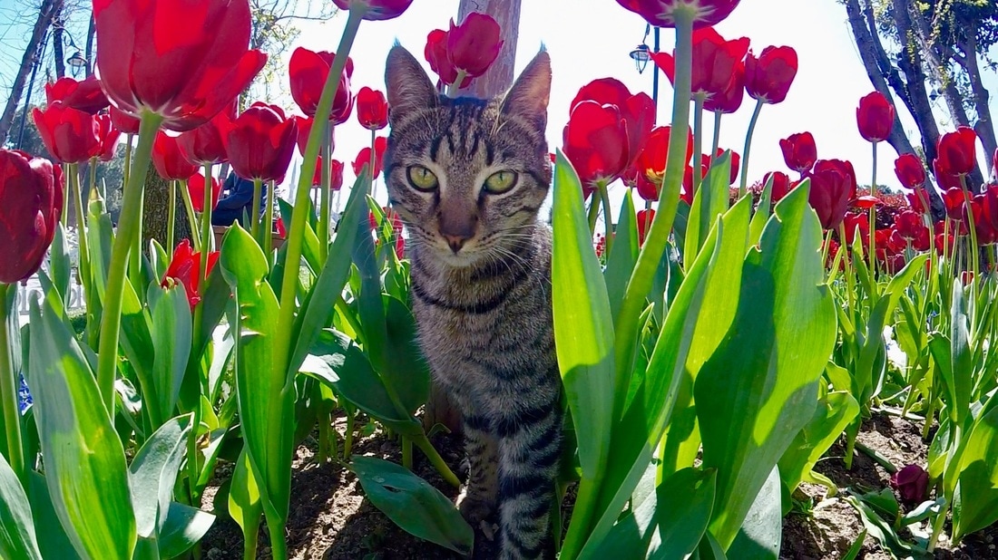
It was half term and we went to Istanbul, where I took several photos .
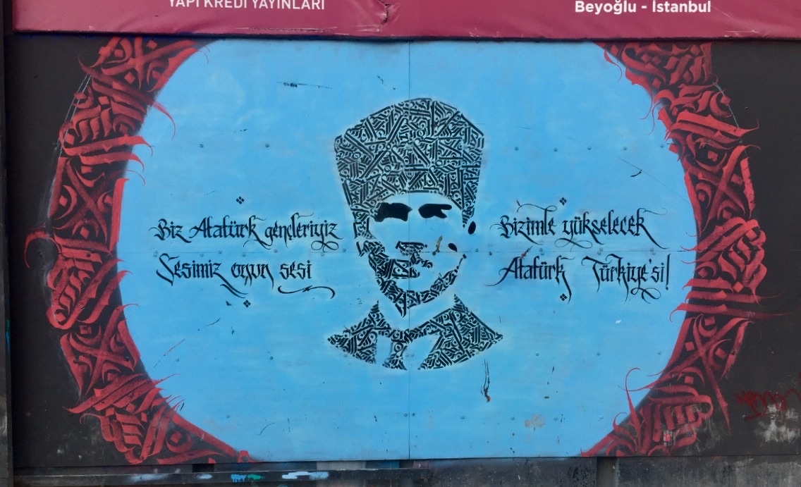
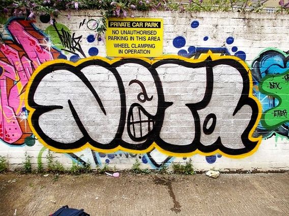
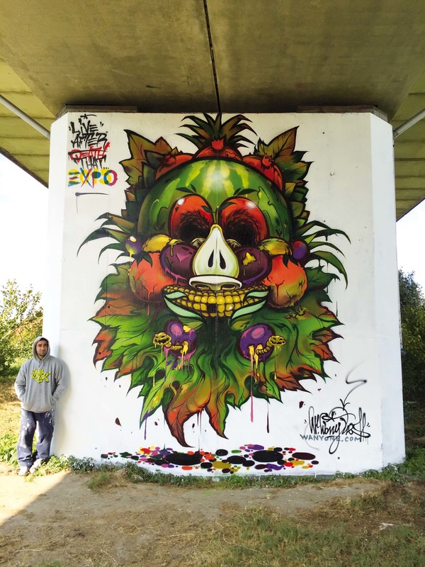
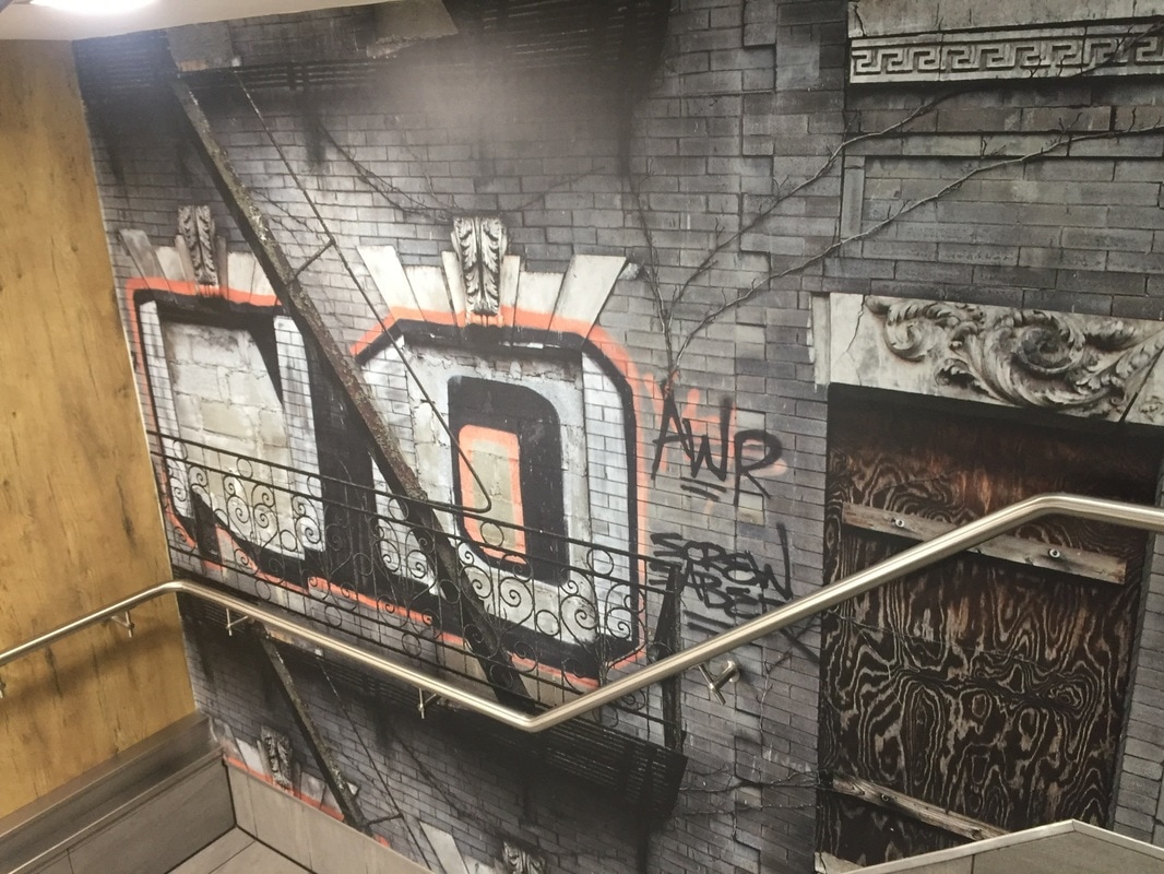
This is some graffiti I found. I like this stencil because of its colours. I also like very much the face. We could say this is a 3D graffiti because of the shadows the flag makes.
It is a political graffiti because it has the Turkish flag with the half moon and the star, and the President's face on it. The artist Resk uses the red, yellow and white collars because they are the flag's colours and because they make great contrast.
The second graffiti is the the one I most like, is the shape of the President's head again, but formed with little Turkish calligraphy in different positions.
This graffiti hasn't been made with spray because of the shapes and forms. Just the light blue circle looks like it has been sprayed. But I think letters have been made either with a pallet or some markers.
I really like this graffiti because it is so different from the rest, shows very well what the artist draw and colours combine between them.
This graffitis are legal as they are in one of the most important squares and they are all showing the Istanbul president at the moment.
I don´t know the function of this graffitis as all the texts are in Turkish. This graffitis could have a political meaning, because they are just now in conflict. It could maybe be just decorative because they were in a grey wall.
It was half term and we went to Istanbul, where I took several photos .
This is some graffiti I found. I like this stencil because of its colours. I also like very much the face. We could say this is a 3D graffiti because of the shadows the flag makes.
It is a political graffiti because it has the Turkish flag with the half moon and the star, and the President's face on it. The artist Resk uses the red, yellow and white collars because they are the flag's colours and because they make great contrast.
The second graffiti is the the one I most like, is the shape of the President's head again, but formed with little Turkish calligraphy in different positions.
This graffiti hasn't been made with spray because of the shapes and forms. Just the light blue circle looks like it has been sprayed. But I think letters have been made either with a pallet or some markers.
I really like this graffiti because it is so different from the rest, shows very well what the artist draw and colours combine between them.
This graffitis are legal as they are in one of the most important squares and they are all showing the Istanbul president at the moment.
I don´t know the function of this graffitis as all the texts are in Turkish. This graffitis could have a political meaning, because they are just now in conflict. It could maybe be just decorative because they were in a grey wall.
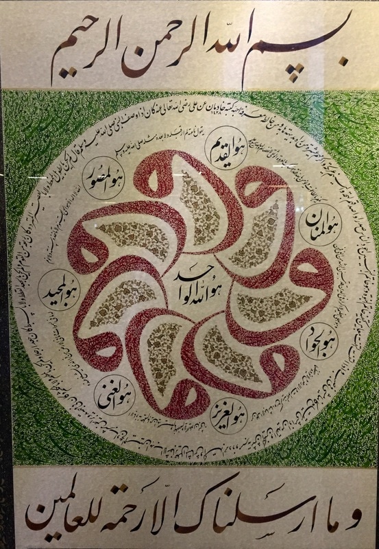
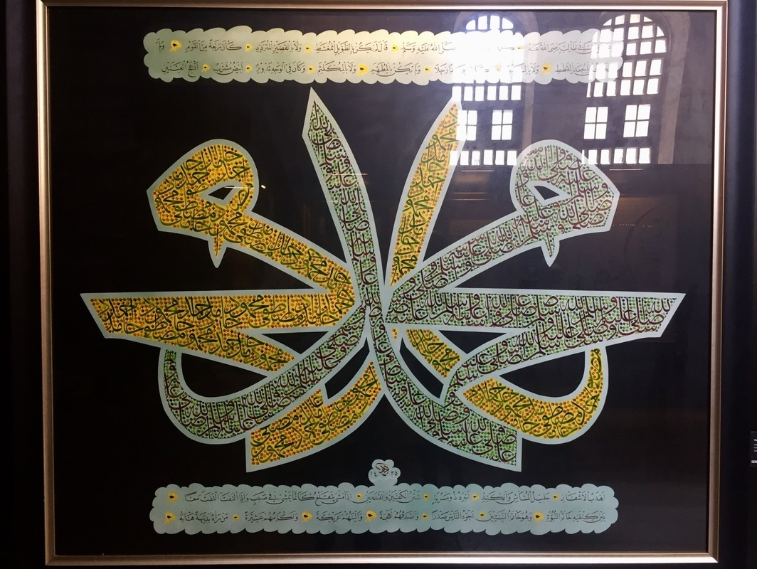
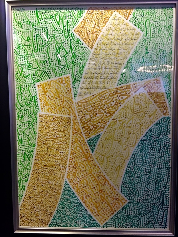
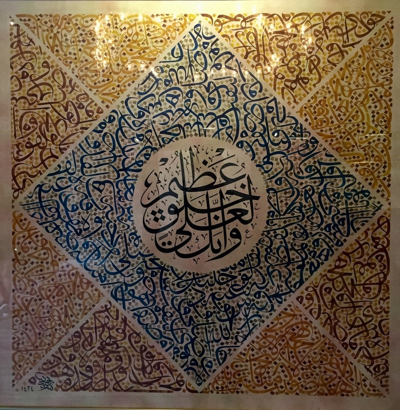
This are some paintings I saw in an exhibition inside the Hagia Sofia. This paintings are absolutely amazing, there seem to be coloured shapes but when you get closer you see it is just arabic mini letters.
|
|
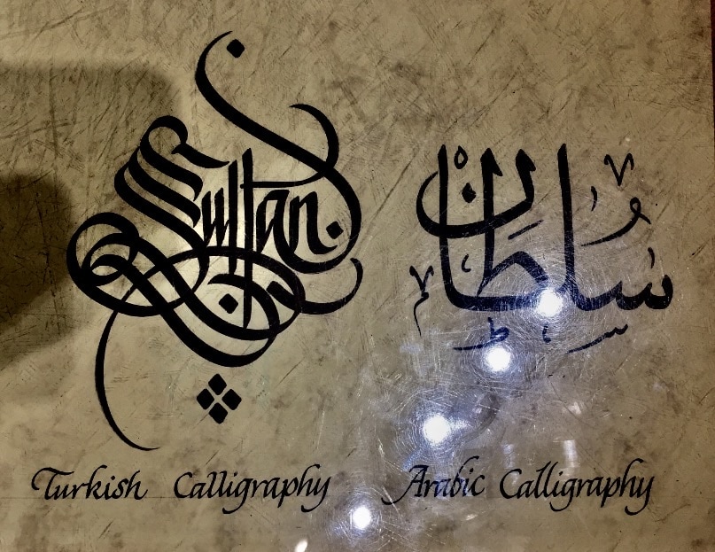
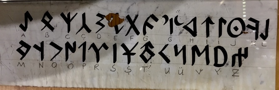
As I really liked Turkish calligraphy, which I learnt and they explaint me is completely different from the Arabic letters. I tried to copy the style, the round shapes, long and straight lines and the difficulty way of reading it.
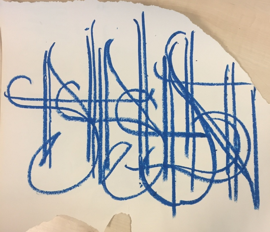
Here are some trials I did on the style converted onto the Latin alphabet. I think it didn´t work bad, maybe too messy.
Here are some trials I did on the style converted onto the Latin alphabet. I think it didn´t work bad, maybe too messy.
|
|

|
|
|
|
|
|
I tried to draw this to see if it worked well as arabic, with that colorsand continuous lines. I thought it could maybe work as the inscriptions because it is totally unreadable, it does´t look at all like the latin alphabet.
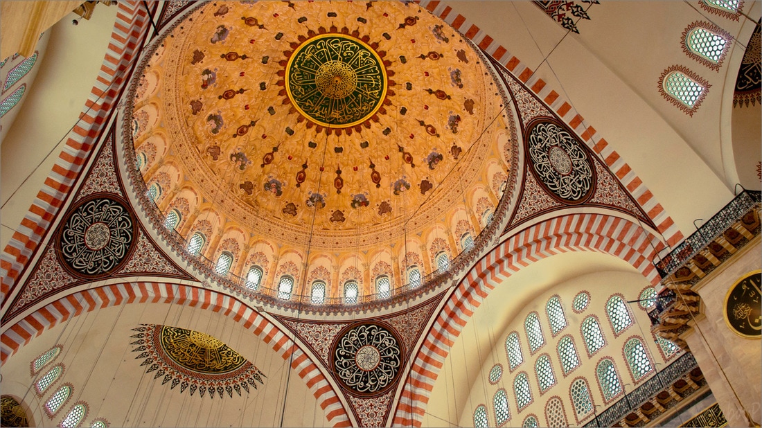
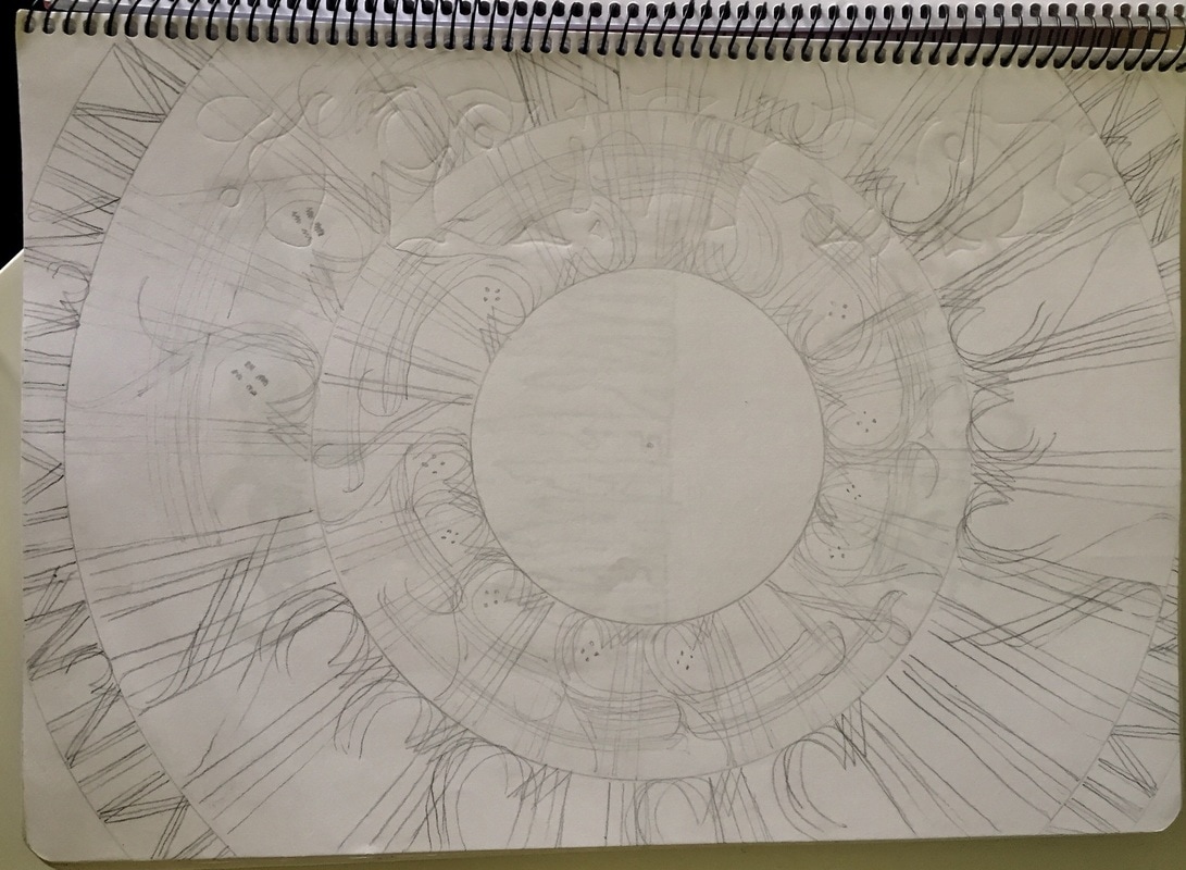
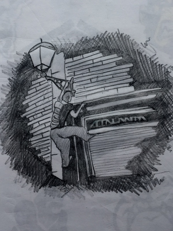
While I was in Istanbul, I got totally impressed with the amazing and giant domes of the mosques, which have been each one constructed along many years. And there are lots of them all along the city. Just in a simple skyline above the city is needed to easily see a minimum of ten mosques.
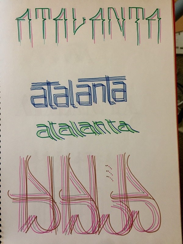
Here I tried to copy or simulate what a mosque´s dome looks like more or less, just by writing Atalanta going round like a dome.
Here I tried to copy or simulate what a mosque´s dome looks like more or less, just by writing Atalanta going round like a dome.
|
|
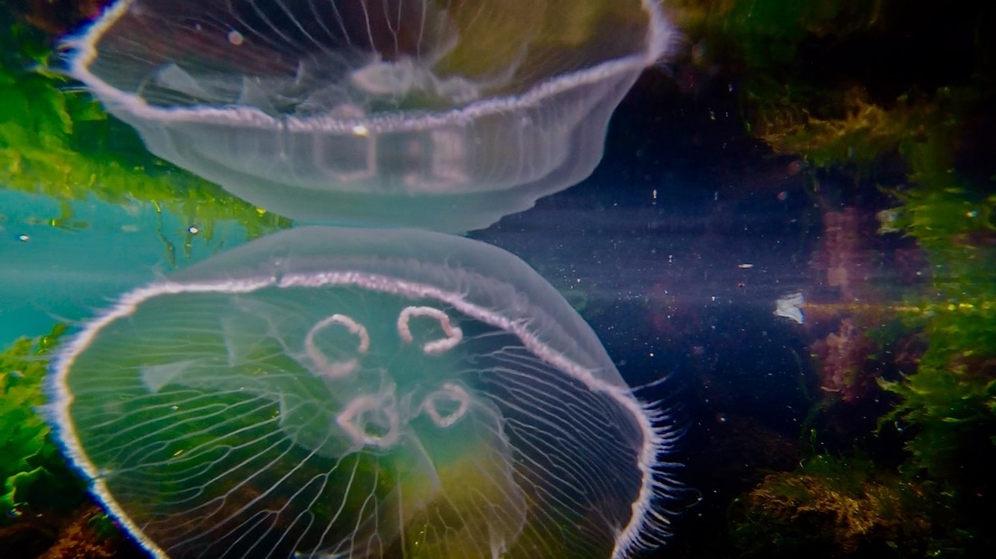
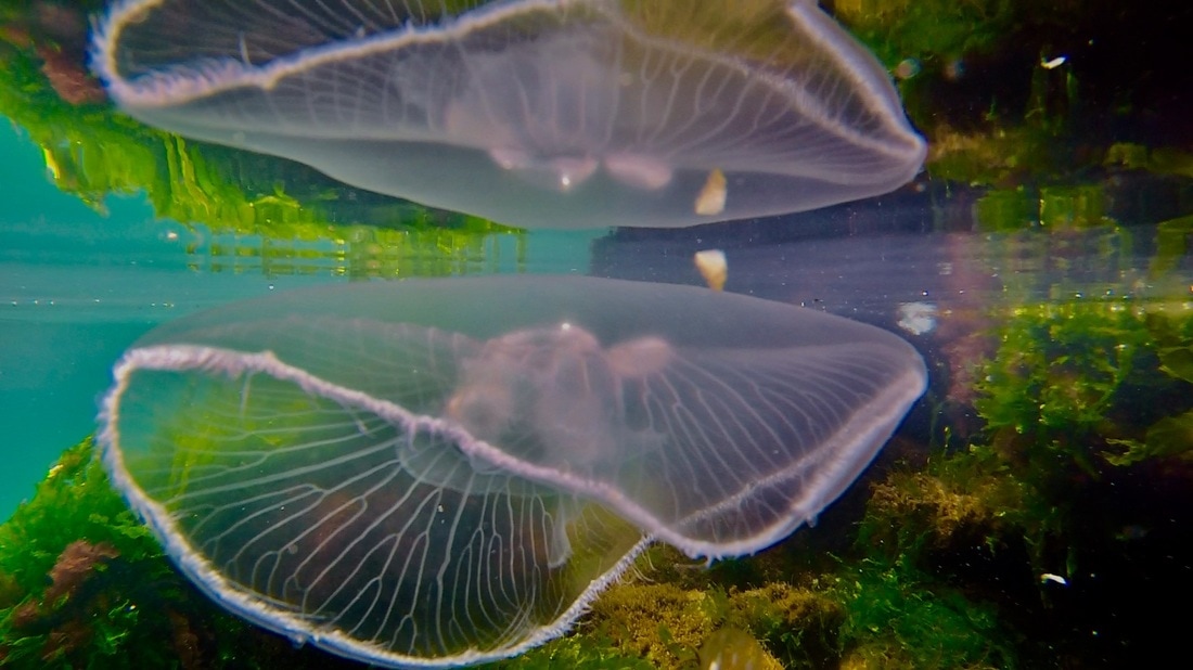
This are other photographs I did while in Istanbul, I have just taken a few of them.
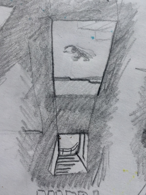
I shot the first one while doing parkour, yes, while doing parkour. It is a video really, I extracted the photo from the video. I thought if you do parkour, and then you just extract a photogram, it will take better the essence. But it didn't work as it looks as if I am sat down.
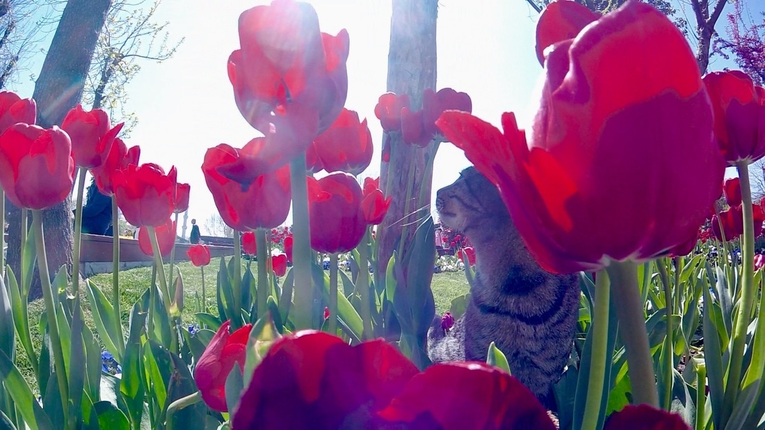
I took the next photos in a parkour spot. I was practising and shooting some videos when I saw the cat, and tried to capture the light of the moment and the cat funny poses.
I shot the first one while doing parkour, yes, while doing parkour. It is a video really, I extracted the photo from the video. I thought if you do parkour, and then you just extract a photogram, it will take better the essence. But it didn't work as it looks as if I am sat down.
I took the next photos in a parkour spot. I was practising and shooting some videos when I saw the cat, and tried to capture the light of the moment and the cat funny poses.
|
|
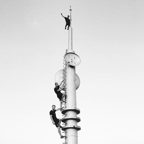
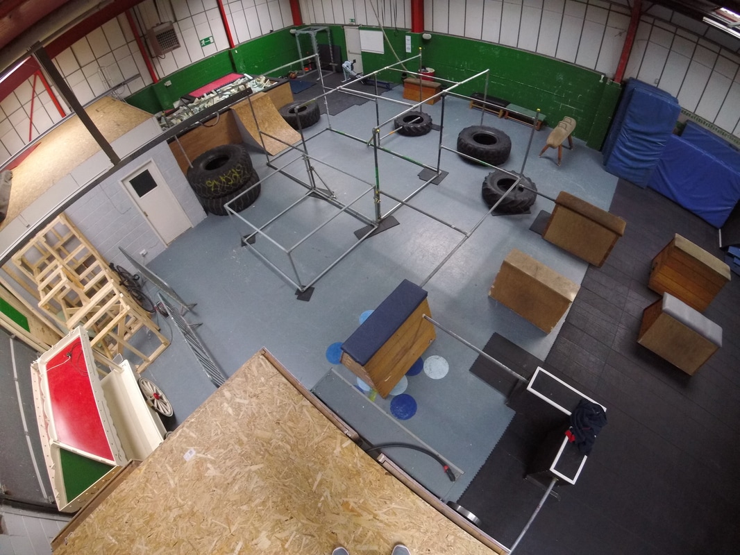
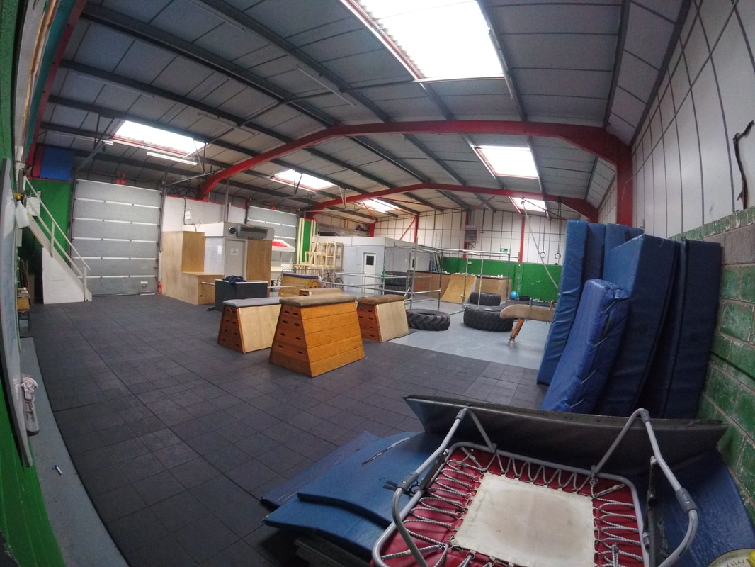
After this photography, I went to a Parkour gym in the Quays called Evolve Manchester. Here, in this gym I took some primary research and evidence. I took several photographs and videos. I also did some drawings to start with fine arts, and leave apart photography.
|
|
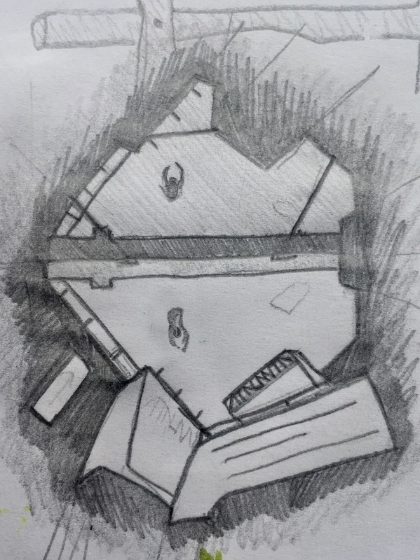
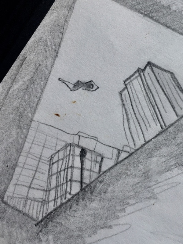
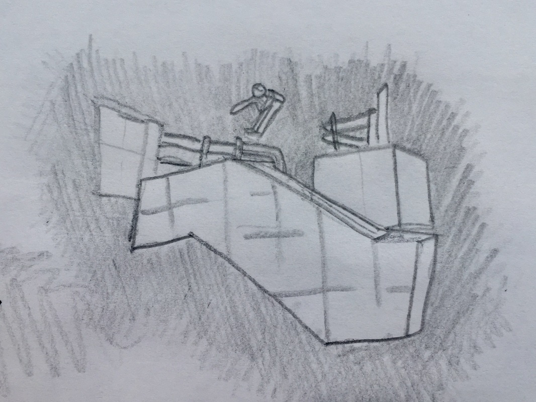
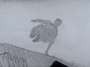
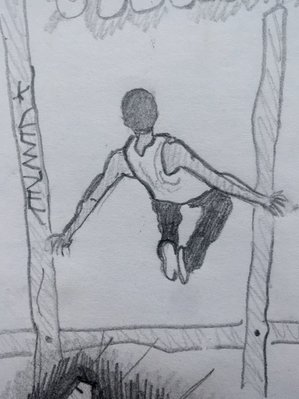
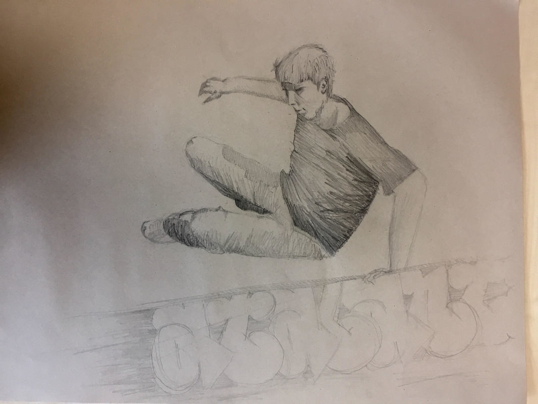
I tried to After this I researched some cool parkour photos on the internet. I looked for some traceurs I already knew and met in Spain.
I enjoyed this step because I like vey much parkour photography. So trying to convert them into pencil drawings was funny. I did them very quickly, just focusing on the person jumping and the structure around. But very sketchy, I didn´t get into detail at all and I have even sometimes change things.
I enjoyed this step because I like vey much parkour photography. So trying to convert them into pencil drawings was funny. I did them very quickly, just focusing on the person jumping and the structure around. But very sketchy, I didn´t get into detail at all and I have even sometimes change things.
|
|
|
|
|
|
|
|
|
|
|
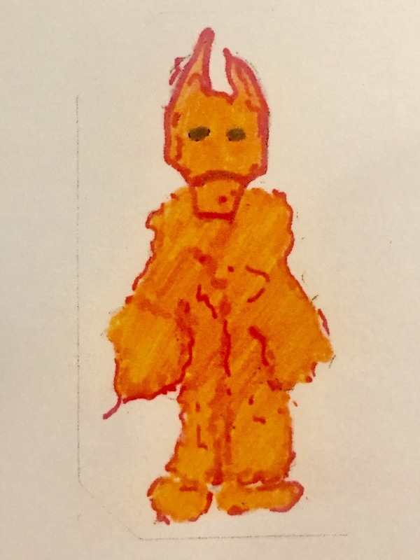
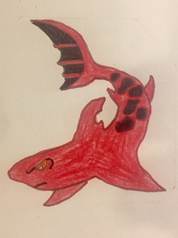
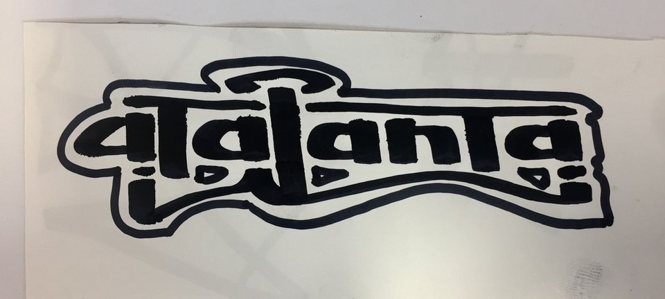
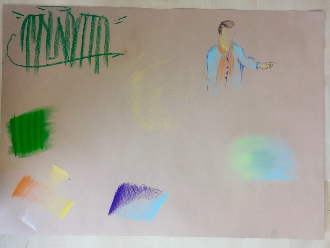
After going to that gym, I decided to introduce Atalanta (my artistic name) as a new part of my FMP.
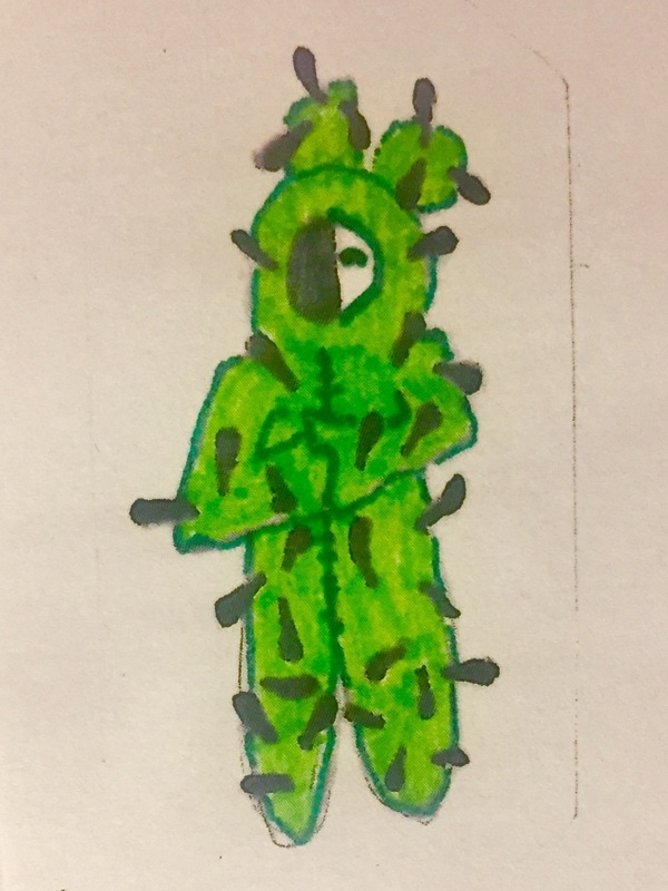
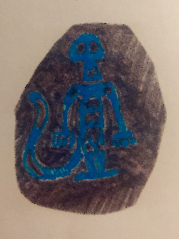
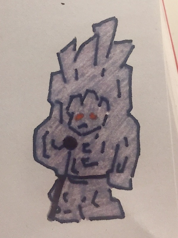
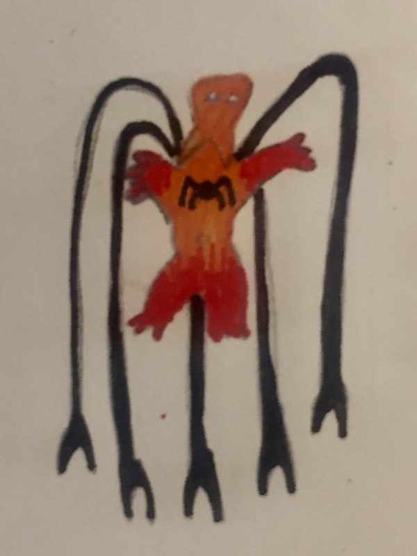
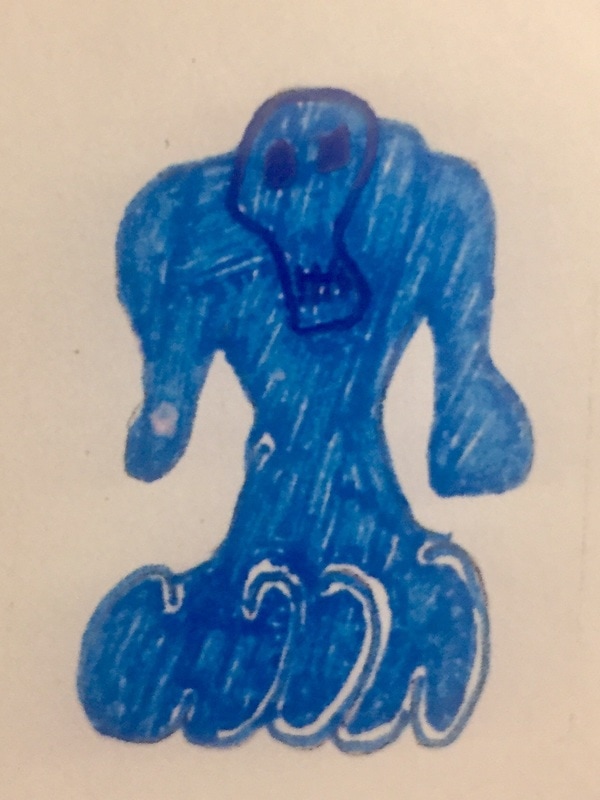
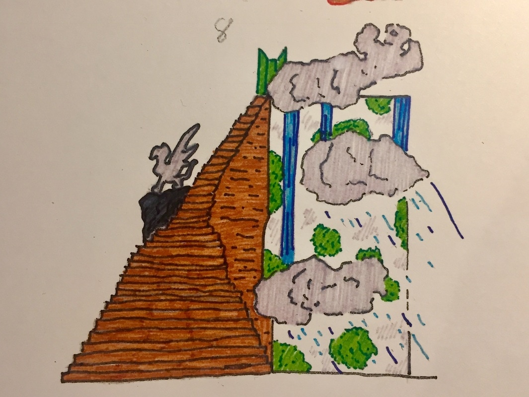
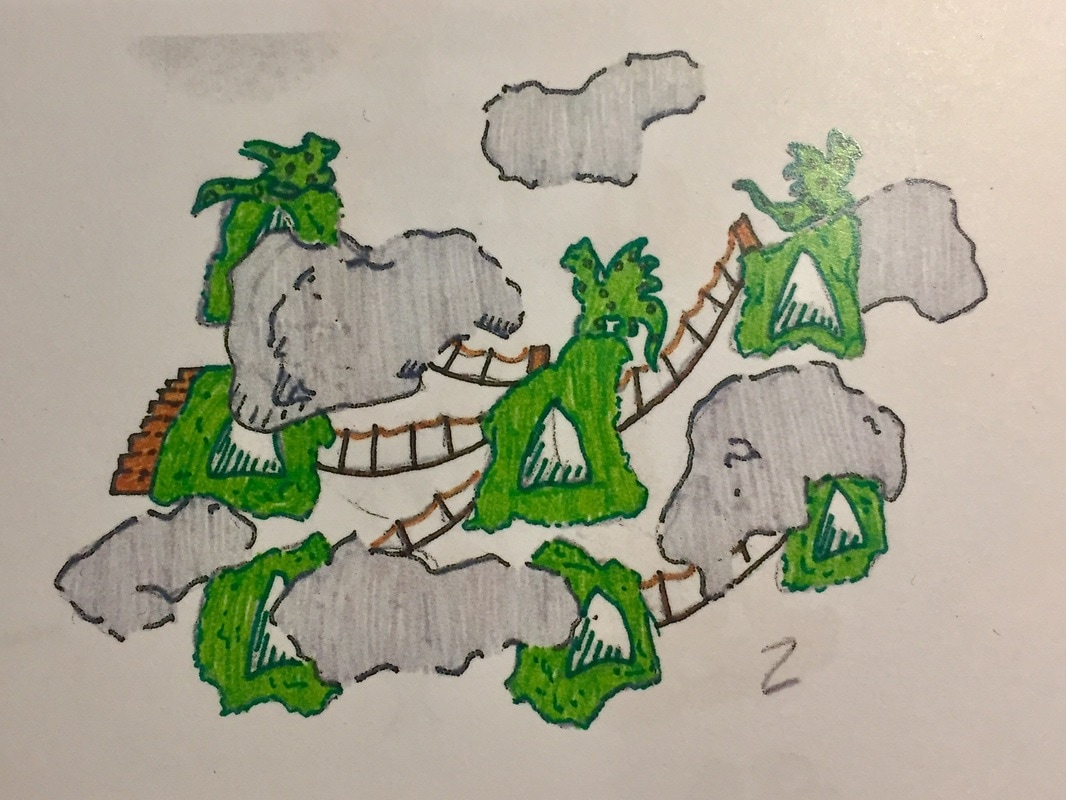
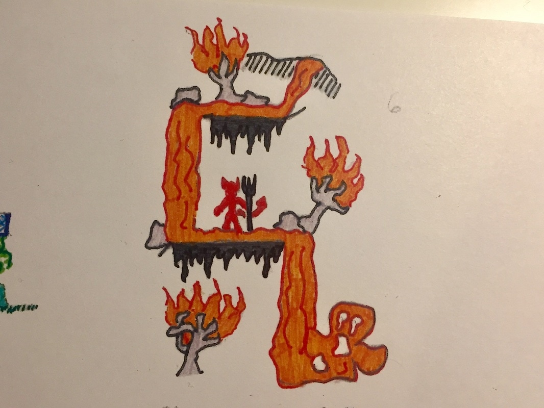
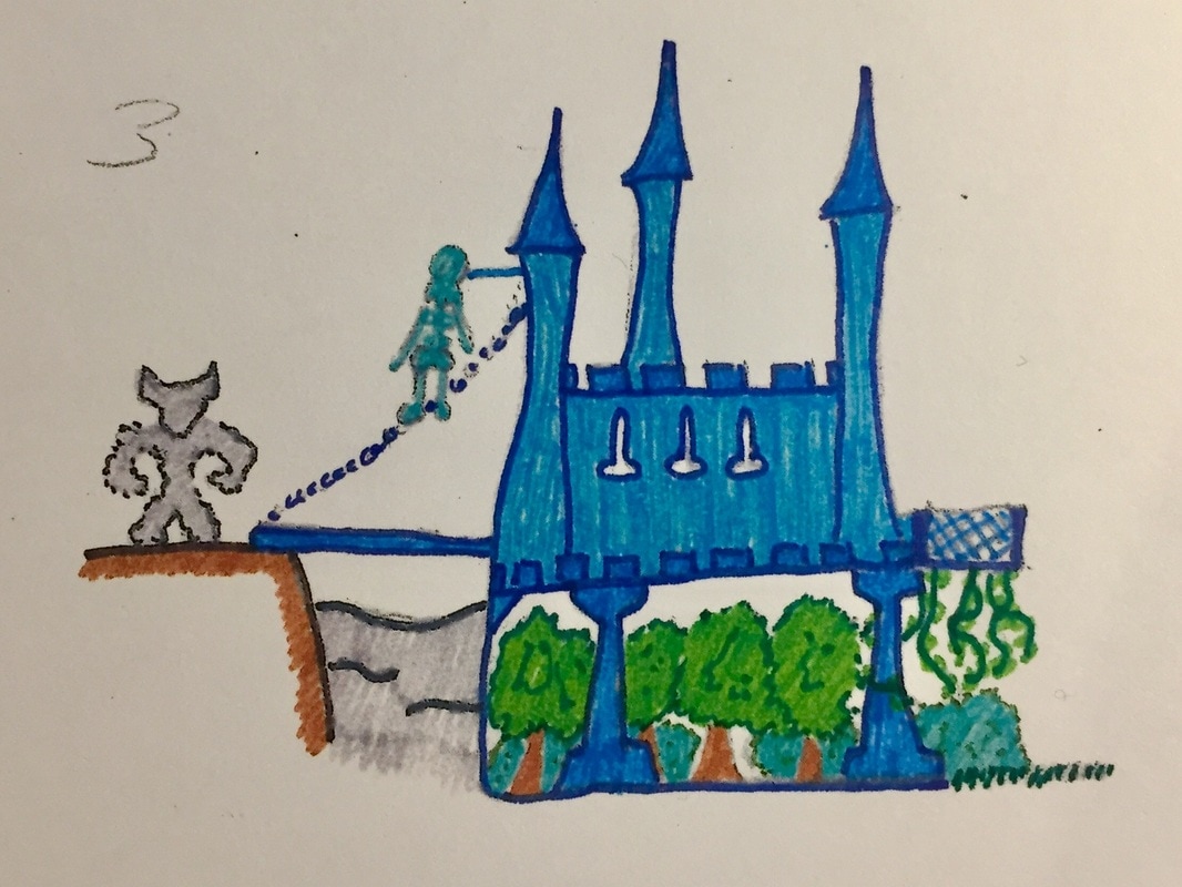
I think Atalanta is strange because writers normally take a really short name or sign such as Naos, FAS, Jies, Tap... But Atalanta is really long, even longer than my real name, Rodrigo, which is also long. I have chosen this name because it is very familiar for me, referring to my art world. Atalanta is an invented World I created in my mind when I was around five years old. It was a game for me, I use to play all day as if I were the little monsters I draw.
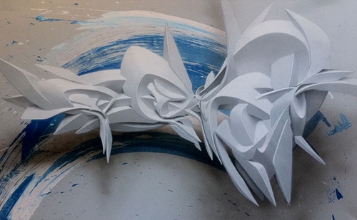
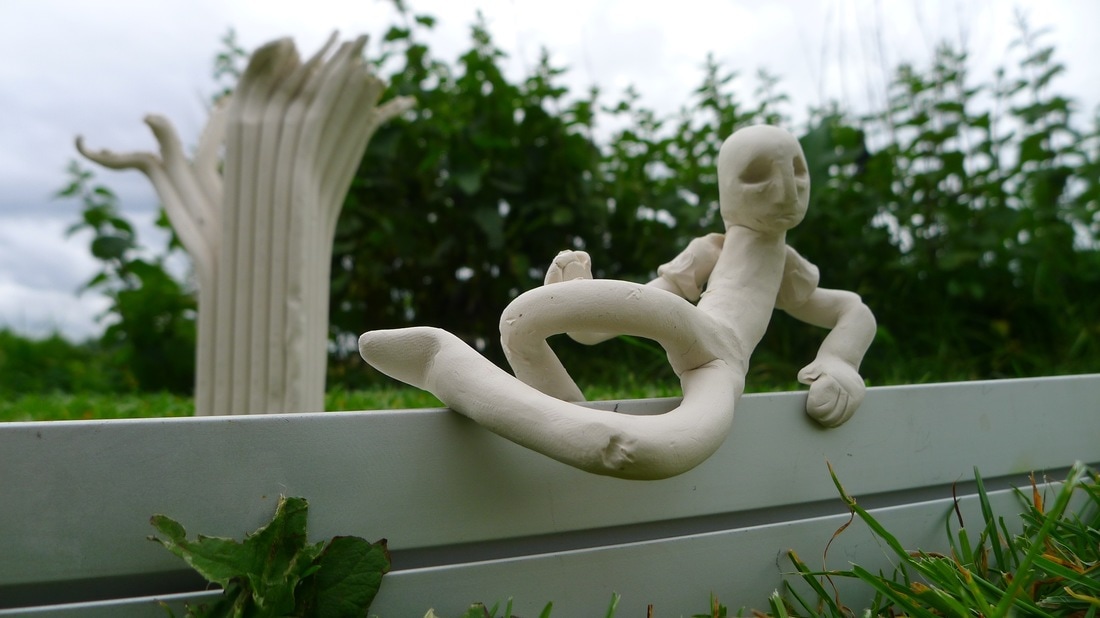
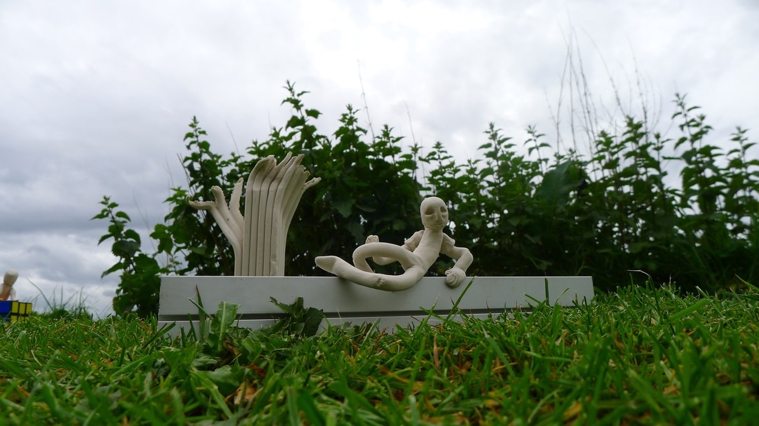
This are some of the 235 figure I made :
I think Atalanta is strange because writers normally take a really short name or sign such as Naos, FAS, Jies, Tap... But Atalanta is really long, even longer than my real name, Rodrigo, which is also long. I have chosen this name because it is very familiar for me, referring to my art world. Atalanta is an invented World I created in my mind when I was around five years old. It was a game for me, I use to play all day as if I were the little monsters I draw.
This are some of the 235 figure I made :
|
|
|
|
Then, I continued and continued it, I draw the planet, and some landscapes in it. I even made a whole project of the planet for the Natural Sciences matter five years ago. And I have also been practising my sign for years so you can understand it is very very familiar for me.
|
|
|
I researched Atalanta and the similarities with parkour are really close. Atalanta is a Greek Goddess. Atalanta is the Goddess of the hunt, nature and wildness.
The bases of parkour are to be 'natural', to be wild and overcome all difficulties in life so Atalanta and parkour have a lot in common.
The bases of parkour are to be 'natural', to be wild and overcome all difficulties in life so Atalanta and parkour have a lot in common.
ATALANTA RESEARCH
Atalanta is a character in Greek mythology.
Atalanta was the daughter of Iasus, a Boeotian princess. King Iasus wanted a son, so when Atalanta was born he got angry and left her alone on the the top of a mountain to die. Some stories say that a bear suckled and cared for Atalanta until some hunters found and raised her but she learned to fight and hunt as a bear would.
Having grown up in the wilderness, Atalanta became a totally fierce hunter and she always happy. She was later reunited with her father.
She took an oath of virginity to the goddess Artemis.
I have read several stories about Atalanta but just this two catches my attention because of the relation with parkour.
The Calydonian Boar hunt.
When Artemis was forgotten at a sacrifice by King Oineus, she was and sent the Calydonian Boar, a wild boar that destroyed the land, men and cattle the crops .
Atalanta joined Meleager and many other famous heroes on a hunt for the boar. Many of the men were angry that a woman was joining them, but Meleager, though married, lusted for Atalanta and he persuaded them to include her. Several of the men were killed before Atalanta was the first to hit the boar and draw blood. After Meleager finally killed the boar with his spear, he awarded the hide to Atalanta.
Meleager's uncles were angry and tried to take the skin from her. As a consequence, Meleager killed his uncles and gave again the skin back to Atalanta.
The footrace.
After the Calydonian boar hunt, Atalanta was discovered by her father. He wanted her to be married, but Atalanta, uninterested in marriage, agreed to marry only if her suitors won her in a footrace. Those who lost would be killed. King Schooners agreed, and many young men died in the attempt until Hippomenes came along. Hippomenes asked Aphrodite for help, and she gave him three golden apples to slow Atalanta. The apples were irresistible, so every time Atalanta got ahead he threw an apple and distract her as she run forward to take them. In this way, Hippomenes won the race and married Atalanta.
They had a son Parthenopaios, who was against Thebes. As a consequence , Zeus turned Atalanta and Hippomenes into lions. At that time the belief lions could just mate with leopards, so they weren't able to be together anymore.
END OF ATALANTA RESEARCH
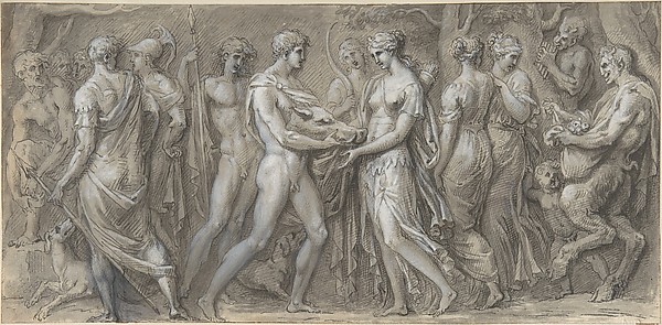
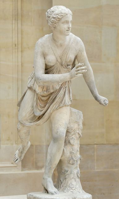
As Atalanta has lots of sculptures and drawing, I started thinking how to combine parkour, Atalanta sculptures and graffiti with my sign.
I got a very good idea, I thought it could be a great idea mixing the most ancient art pieces with the newest art pieces.
I took the Greek god´s sculptures from the ancient art and the graffiti as the newest art forms. So many ideas where on my mind at that point.
I wanted to use the sculpture just as a mural, not as a person filled up with tattoos. This idea comes because I wanted it to look nice, not dirty, as lots of people look to completely tattooed people.
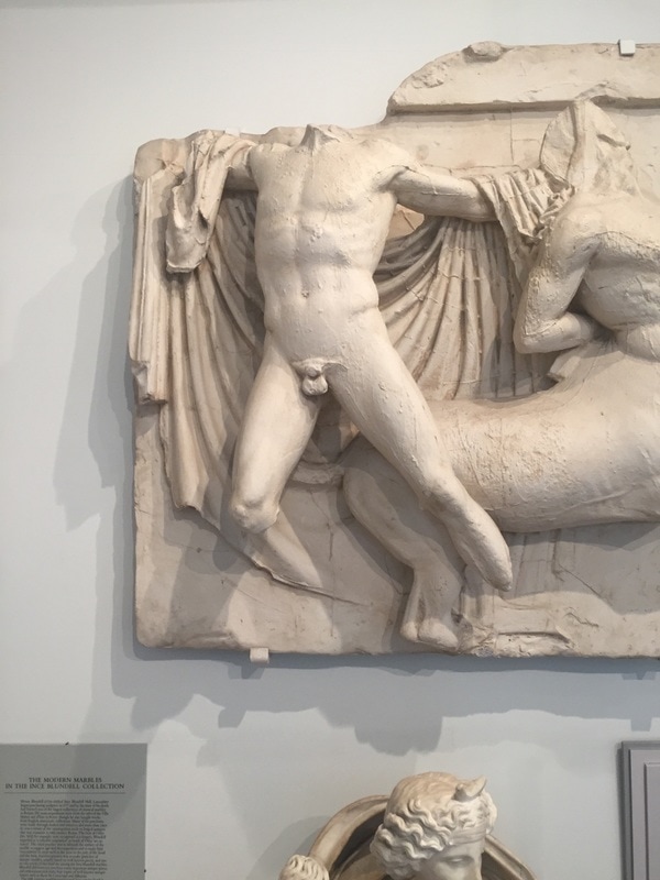
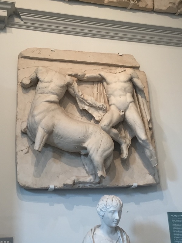
After I thought this, I stated researching Greek God's sculptures.
I got a very good idea, I thought it could be a great idea mixing the most ancient art pieces with the newest art pieces.
I took the Greek god´s sculptures from the ancient art and the graffiti as the newest art forms. So many ideas where on my mind at that point.
I wanted to use the sculpture just as a mural, not as a person filled up with tattoos. This idea comes because I wanted it to look nice, not dirty, as lots of people look to completely tattooed people.
After I thought this, I stated researching Greek God's sculptures.
GREEK GODS SCULPTURES RESEARCH
I did research all the of the major and most important Greek Gods and Goddesses, and write what they were gods of.
APHRODITE - Goddess of beauty, desire and pleasure
APOLLO - God of music, arts, knowledge, healing, plague, prophecy, poetry, manly beauty and archery.
ARES - God of war, bloodshed and violence.
ARTEMIS - Virgin goddess of the hunt, wilderness, animals, young girls, childbirth and plague.
ATHENA - Goddess of reason, wisdom, inteligence, skill, peace, warfare, battle strategy and handicrafts.
DEMETER - Goddess of grain, agriculture, harvest, growth, and nourishment.
DIONYSUS - God of wine, fruitfulness, parties, festivals and nourisment.
HADES - God of the underworld and the dead.
HEPHAESTUS - God of fire, metalworking and crafts.
HERA - Queen of the gods, and goddness of marriage, woman, childbirth, heirs, kings and empires.
HERMES - God of boundaries, travel, comunication, trade, language and writing.
HESTIA - Virgin goddness of the earth, home and charity.
POSEIDON - God of the sea, rivers, floods, droughts and Earthquakes.
ZEUS - King of the gods, ruler of Mount Olympus, and God of the sky, weather, thunder, ligtning, law, order and justice.
After making all this list of the major Gods and Goddesses, I made another one. A selection in which I just took the ones that had relation with my themes and put just what it could be related.
ARES - War, Violence.
ARTEMIS - Hunt, Widerness, Animals.
HERMES - Boundaries, Travel, Trade,.
POSEIDON - Sea, Rivers.
ZEUS - King, Sky, Weather, Thunder, Lightning, Law, Order, Justice.
ARES - War, Violence.
ARTEMIS - Hunt, Widerness, Animals.
HERMES - Boundaries, Travel, Trade,.
POSEIDON - Sea, Rivers.
ZEUS - King, Sky, Weather, Thunder, Lightning, Law, Order, Justice.
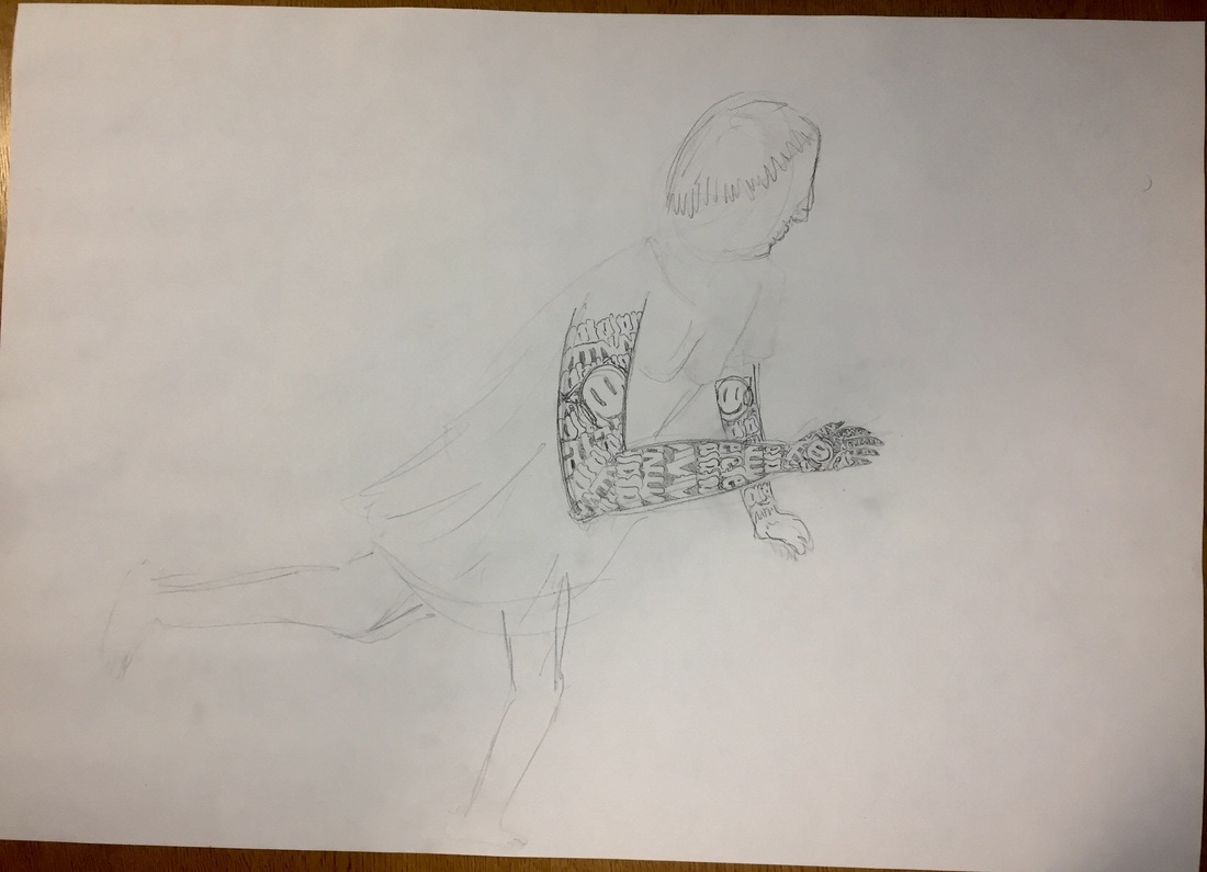
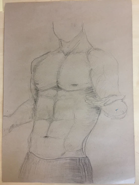
After the research, I started drawingI wanted to use the sculpture just as a mural, not as a person filled up with tattoos. This idea comes because I wanted it to look nice, not dirty, as lots of people look to completely tattooed people.
After I thought this, I stated researching Greek God's sculptures.This is the first sketch I did on this idea and I did it very simple because of the time we had, which was around 20 minutes, so I didn´t complicate it much. I just draw one arm and a bit of the other, and did every Atalanta with the same typography, so it was really boring.
After I thought this, I stated researching Greek God's sculptures.This is the first sketch I did on this idea and I did it very simple because of the time we had, which was around 20 minutes, so I didn´t complicate it much. I just draw one arm and a bit of the other, and did every Atalanta with the same typography, so it was really boring.
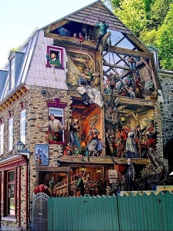
GRAFFITI RESEARCH.
Its origin is related with the start of the human race in the prehistory, with the cavemen.
Humans have always got the need of leaving their marks such as cavemen hands and hunting scenes, egyptian symbolised inside pyramids, greek inscriptions and roman critics on doors and walls.
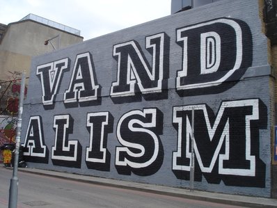
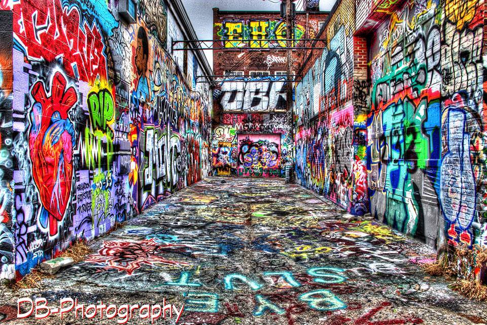
The graffiti is a completely free way of drawing and free theme. Graffiti is characterized normally by its illegality, because of these, many people hate graffiti and see it as a damage to property.
There are many different types of graffiti :
TAG : Tag is the most basic and the most prevalent form of graffiti. It is usually written with marker or spray paint and in one colour. This style is called tag because it is a very easy technique and it requires less time to do it. This technique originated at the beginning of modern graffiti, before the graffiti styles battle appeared. Because of this, writers tried to write them in the most understandable way, and in as many places as they could. There are different types of tags and this are the most common :
BROGWAY ELEGANT : Manhattan's style, very thin, tall and closed letters.
Its origin is related with the start of the human race in the prehistory, with the cavemen.
Humans have always got the need of leaving their marks such as cavemen hands and hunting scenes, egyptian symbolised inside pyramids, greek inscriptions and roman critics on doors and walls.
The graffiti is a completely free way of drawing and free theme. Graffiti is characterized normally by its illegality, because of these, many people hate graffiti and see it as a damage to property.
There are many different types of graffiti :
TAG : Tag is the most basic and the most prevalent form of graffiti. It is usually written with marker or spray paint and in one colour. This style is called tag because it is a very easy technique and it requires less time to do it. This technique originated at the beginning of modern graffiti, before the graffiti styles battle appeared. Because of this, writers tried to write them in the most understandable way, and in as many places as they could. There are different types of tags and this are the most common :
BROGWAY ELEGANT : Manhattan's style, very thin, tall and closed letters.
BROOKLYN : Brooklyn's style, very separated letters with crowns, arrows and spirals.
BRONX : Bronx;s style, it is a mix of the previous two styles.
OUTLINED TAGS : When the fat caps appeared lots of possibilities were open for writers. This gives birth to the outline.
THROW-UP : A throw-up is a little more complicated than a tag, usually having two or three colors, but not nearly as elaborate as a piece. A throw-up is something that can be done quickly and repeatedly, while still identifying the writer. They’re usually done in bubble letters, often in one color with a differently-colored outline. When a graffiti writer goes out bombing, they’re usually either putting up tags or throw-ups all over their area.
|
|
BLOCKBUSTER : A blockbuster is used to cover maximum area in a minimal amount of time. Often consisting of large block letters, the blockbuster can be accomplished with paint rollers and two or three colors of paint. Usually a blockbuster is put up to cover up other work or block other writers from putting anything up on the same area.
|
|
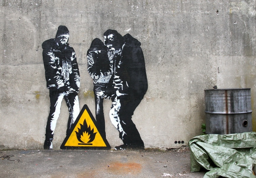
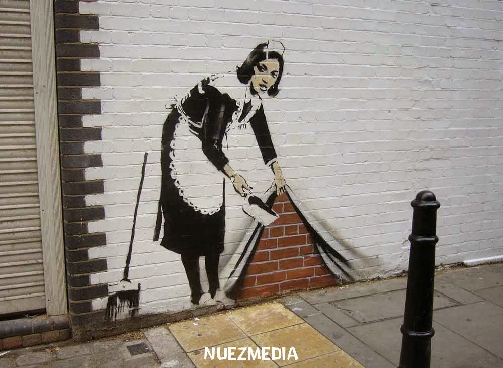
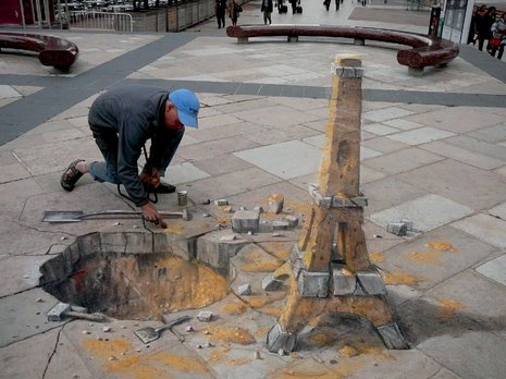
STENCIL : Using stencils is a quick and effective way to put up somewhat-complicated pieces very quickly. By holding the stencil against the wall and spraying, you can get a much more detailed picture than you would be able to with just a spray can. Even if you use two or three layers to make a more colorful and intricate picture, stencil graffiti can be thrown up in a matter of minutes. This is the type of graffiti that was made popular by the likes of Blek le Rat and Banksy and has now taken hold with graffiti writers everywhere.
|
|
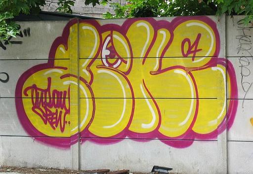
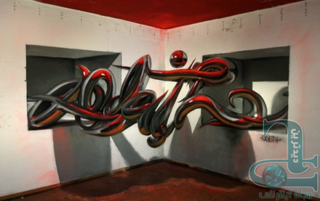
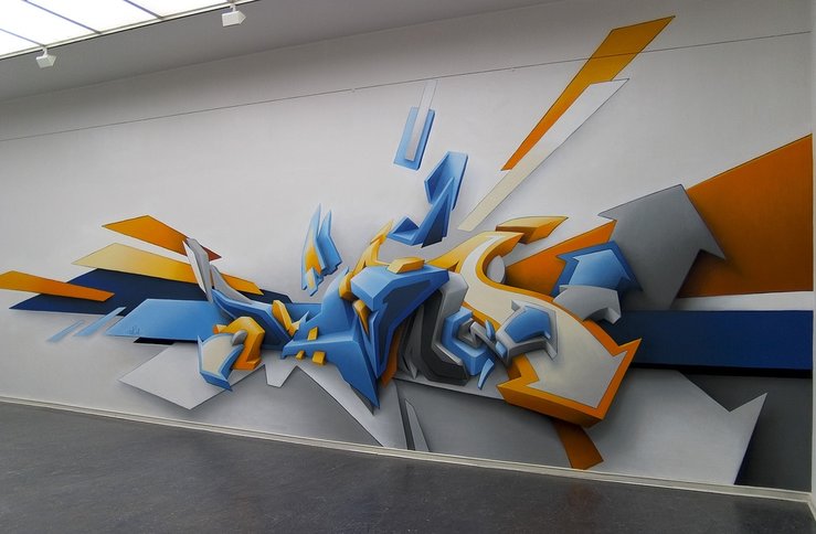
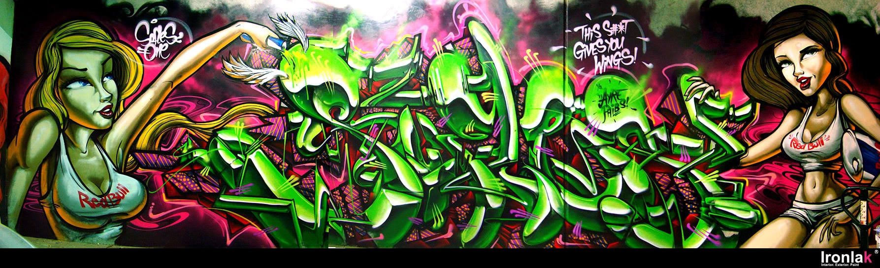
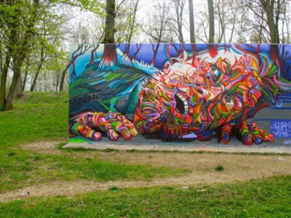
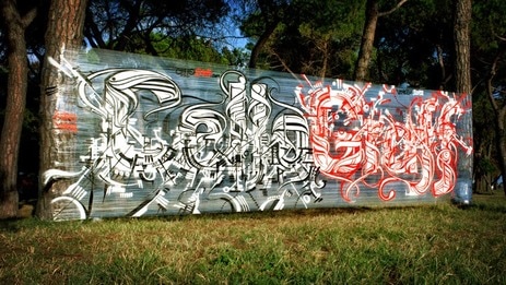
2D WILDSTYLE : Wildstyle is a particular style of writing that was developed and popularized by graffiti artists like Tracy 168, Stay High 149 and Zephyr in New York City. It’s a complicated and extremely stylized form of writing that, to the untrained eye, is not easy to read. Wildstyle writing features arrows, spikes, curves and other elements that non-graffiti artists may have a hard time understanding. Wildstyle pieces are often 3D and considered to be one of the most complicated forms of graffiti.
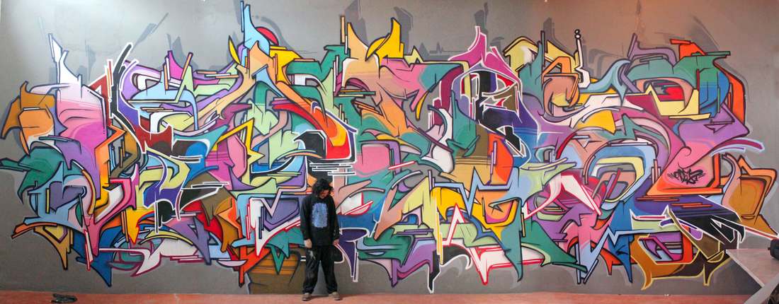
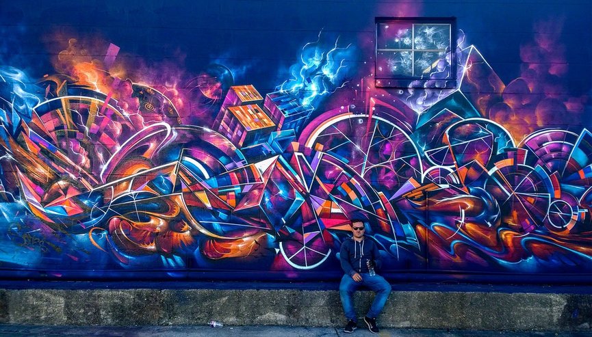
3D WILDSTYLE : In 3D wildstyle graffiti, writers try to capture volume, the find how to make a deep graffiti by adding shadows, reflections, angles, and light.
Very good writers often paint on difficult places such as corners, or they use the floor and the ceiling to demonstrate how good they are, confusing you and making you think its just a straight wall or something else.
Very good writers often paint on difficult places such as corners, or they use the floor and the ceiling to demonstrate how good they are, confusing you and making you think its just a straight wall or something else.
|
|
|
|
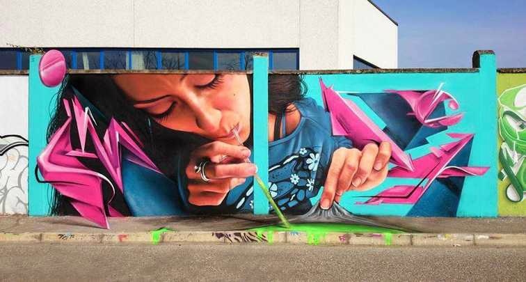
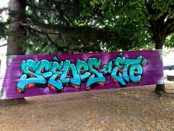
PIECE : A piece is a graffiti painting, much more complex than a tag and having at least three colors. Pieces are hard to do illegally because of the time and effort involved, so a good piece will gain a lot of respect for that particular graffiti artist. As graffiti has gotten more respect as a legitimate art form, a lot of pieces have been commissioned or at least the artists given permission to put them up.
|
|
END OF GRAFFITI RESEARCH.
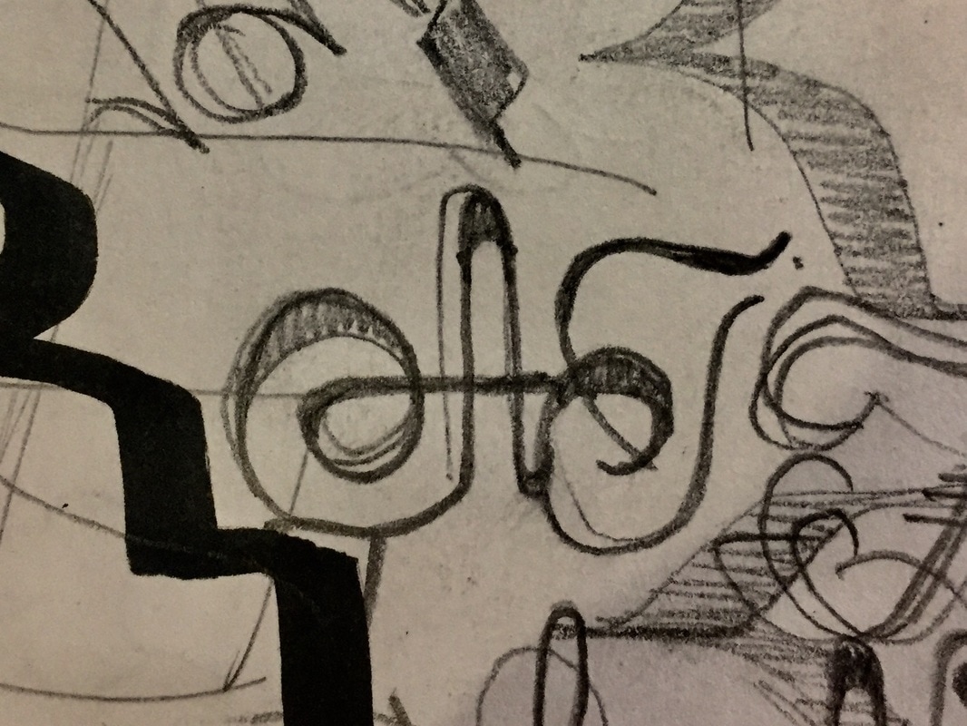
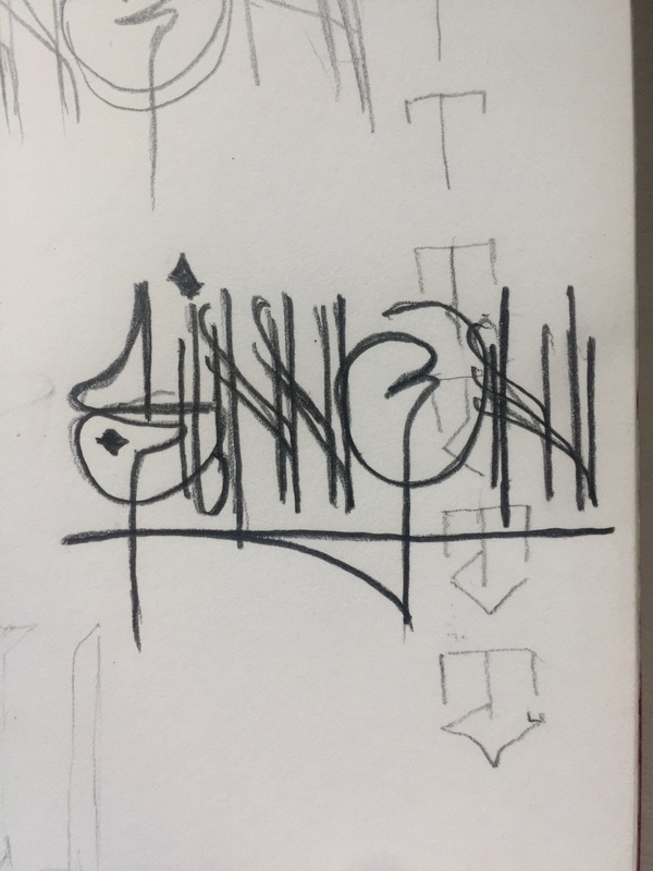
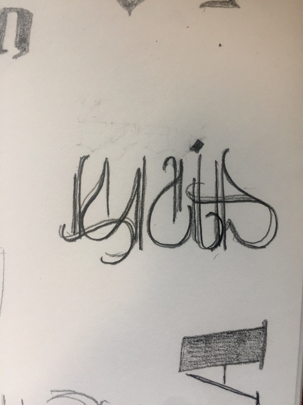
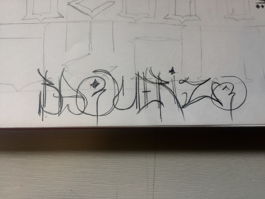
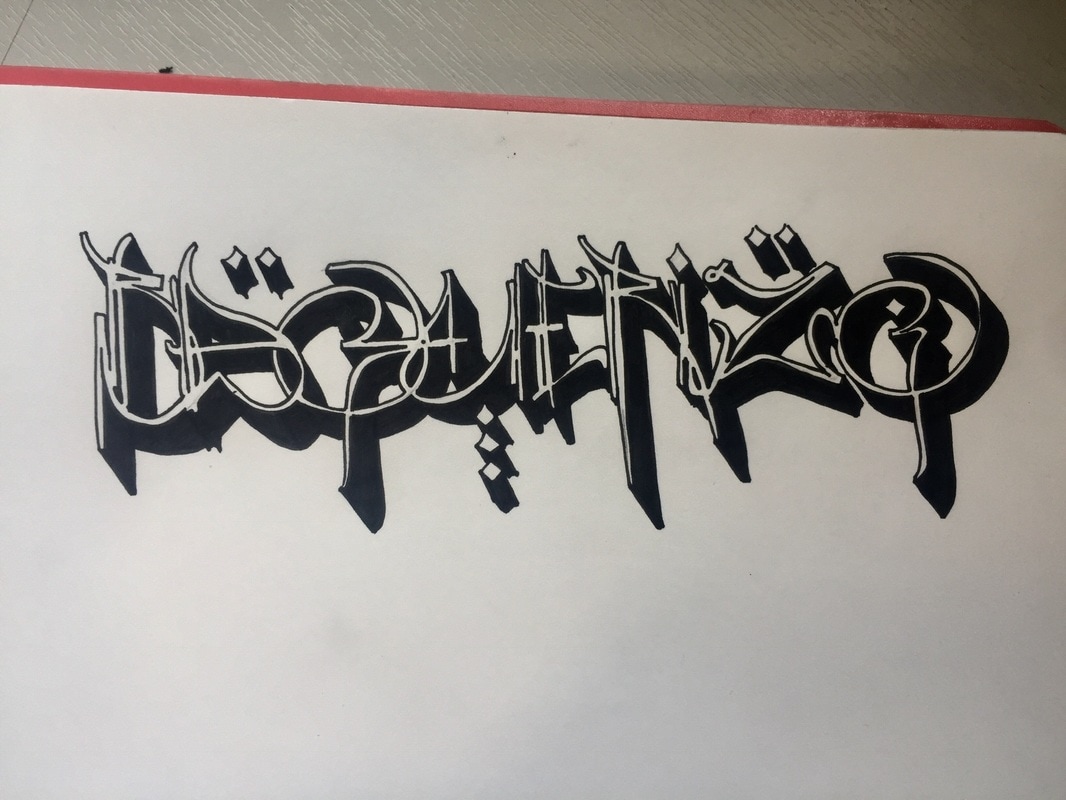
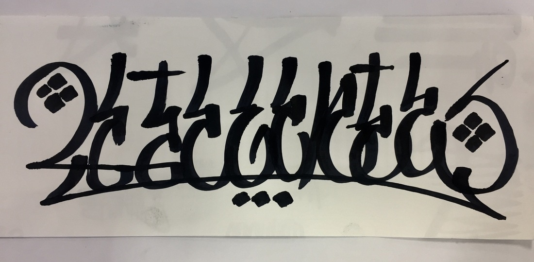
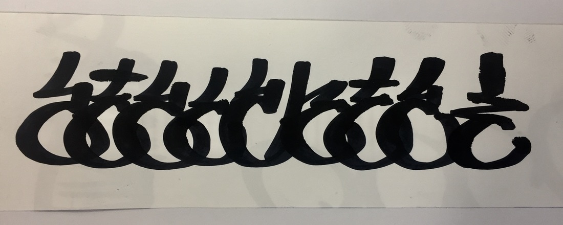
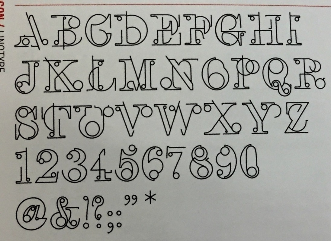
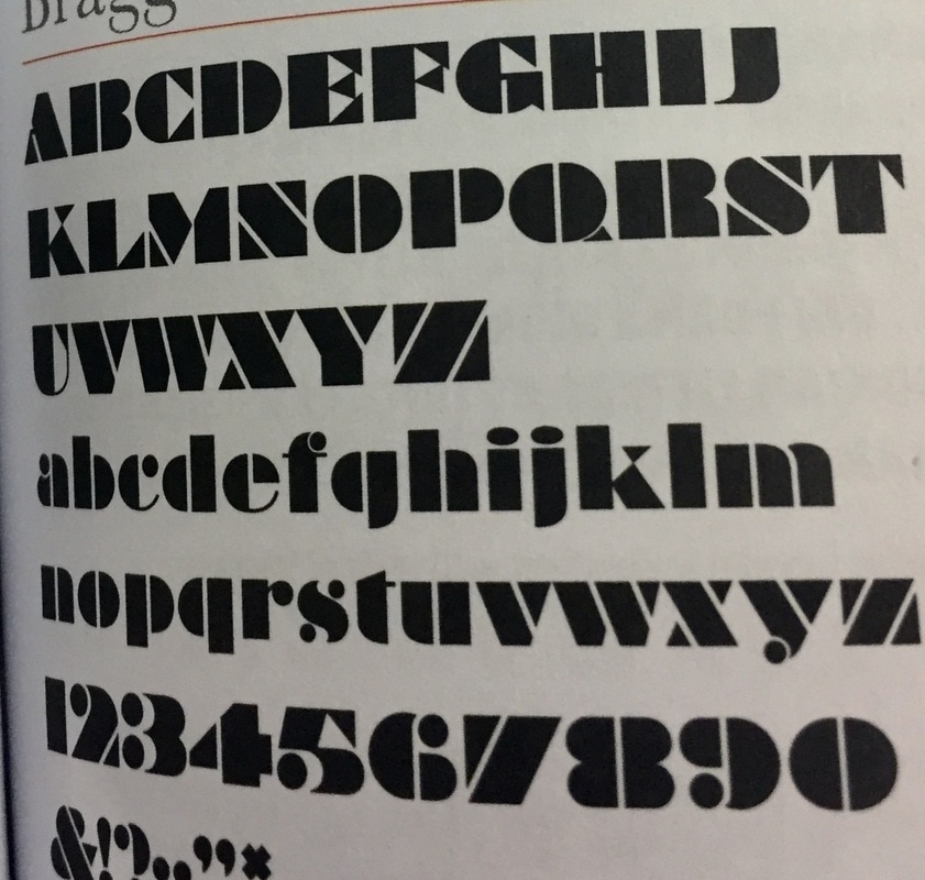
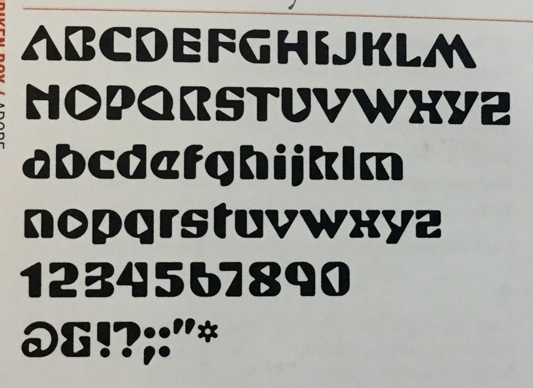
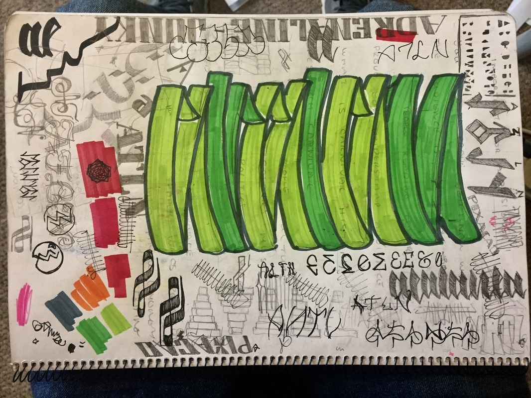
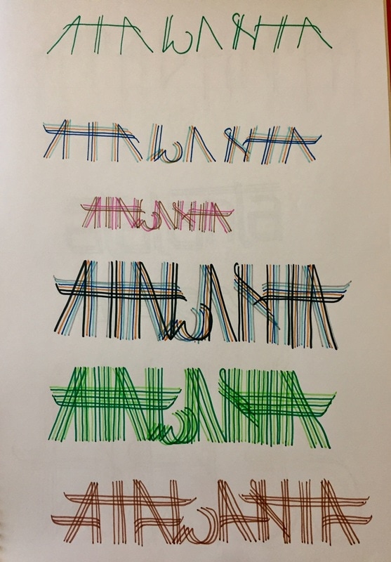
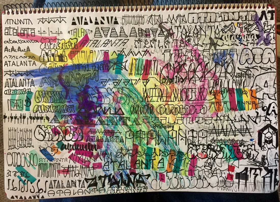
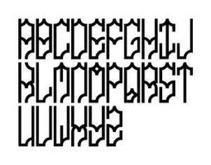
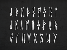
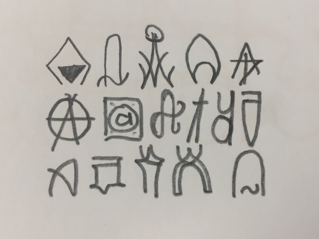
As in the previous drawing was everything the same typography, I investigated typography books in the library and found lots of different ways of writing.
The most important aspect I looked for in the new abecedaries, was mainly, difference. I wanted completely different letters, thin, thick, small, tall, rounded, pointy...
I also looked for different uses, even elegant, poster letters or just fonts.
The most important aspect I looked for in the new abecedaries, was mainly, difference. I wanted completely different letters, thin, thick, small, tall, rounded, pointy...
I also looked for different uses, even elegant, poster letters or just fonts.
|
|
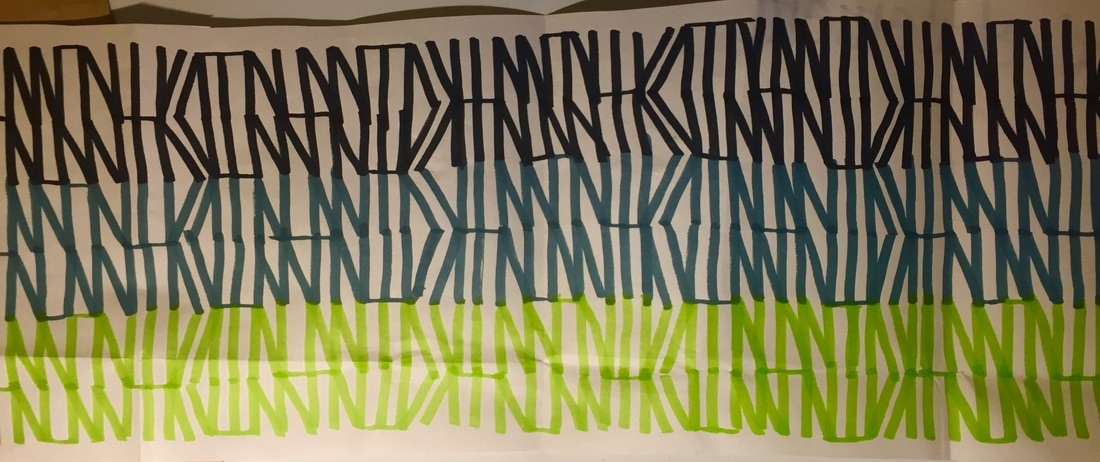
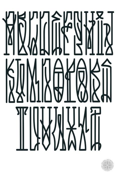
Many of them, are invented by me, but they are all mixed up as I just used it to find new ways to then reproduce it in another place.
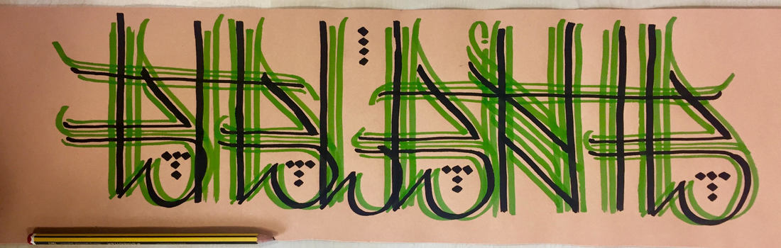
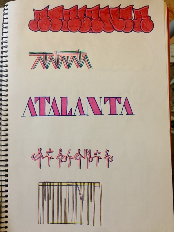
As it is just sketches, I have in many cases just write the four letters of my sign, Atalanta -ATLN- to occupy less space and save time.
As it is just sketches, I have in many cases just write the four letters of my sign, Atalanta -ATLN- to occupy less space and save time.
|
|
|
|
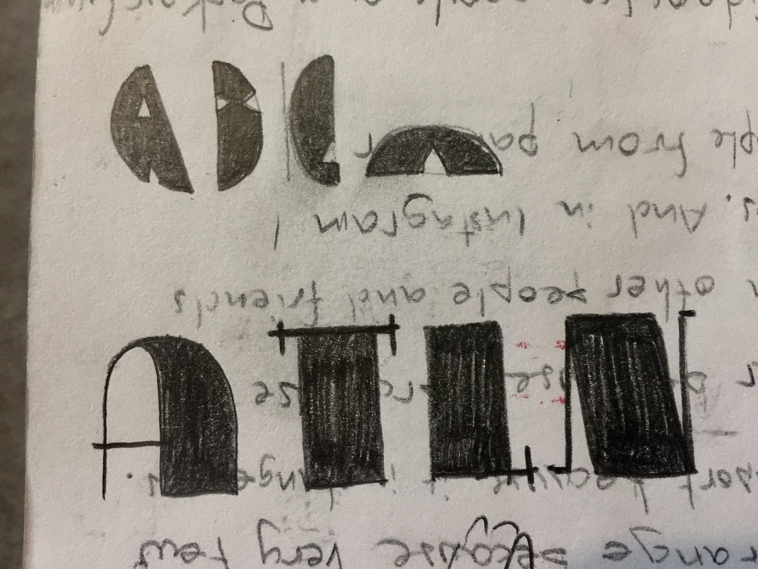
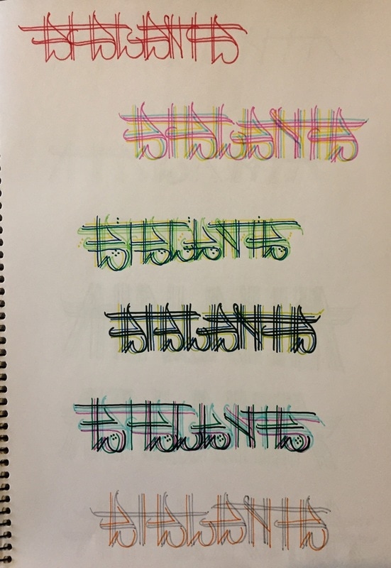
This is a study I did just for the letter A, they are all different unless there are some very similar. It is logical that the 3D letters are much more different between them than the 2D ones.
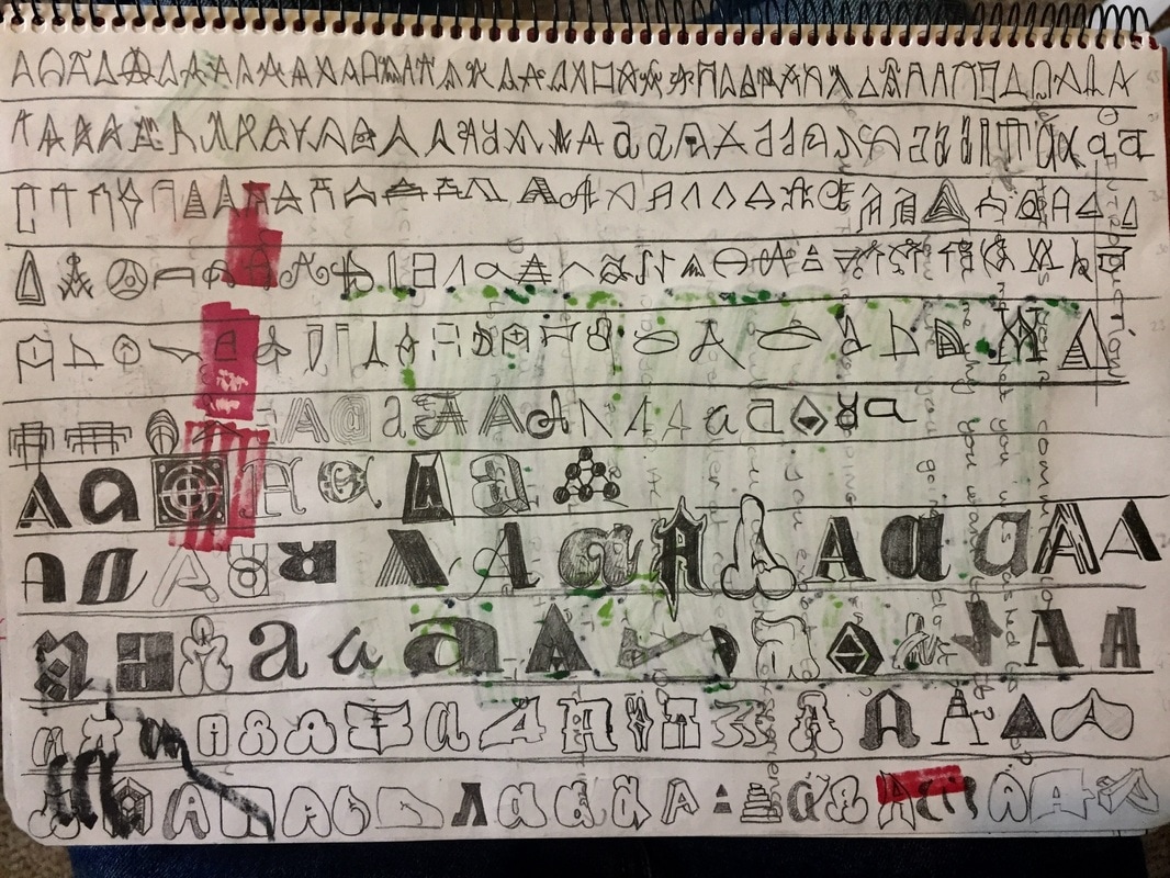
As I suppose you will understand, I haven´t tried to draw them all in a very understandable way, I just wanted to take as many forms as possible, and to draw them as different as possible.
This step was very hard, I spent a lot of time searching books, in internet or other places such as comics and brands. Hopefully I like this very much so it has been interesting and nice.
This step was very hard, I spent a lot of time searching books, in internet or other places such as comics and brands. Hopefully I like this very much so it has been interesting and nice.
I have always loved typography, writing letters, doing all the project titles since I was a little kid, and making names for my friends.
As letters and colour were so important for me, graffiti catched very well my attention, so I started searching, looking other people videos and copying first other's, but always in paper. I have never supported the idea of illegal painting, and even more if its just tags and throw-ups, which are dirty and completely damaging. I didn't even understand why would people like to show how bad they paint, but I understood it when I started researching graffiti.
There are some branches in graffiti which I have´nt mentioned before. This styles don't give importance at all to esthetic, such as the one born in Brazil called Pixacao or lots of New York bands, which use graffiti just to mark their territory.
I saw all this information in a 1:30 hour long documentary called Infamy. This video really shocked me, and I even thought of leaving all my graffiti and my drawings. But after a while of thinking, I just realised it was confirming my idea of the Gentleman Graffiti ( I will explain after ), so I just continued.
This is the Pixacao in Brazil and some territorial graffiti bands in New York. This type of graffiti is the reason why all the people hate graffiti. It is a pity but it is the most common so everybody sees this everywhere, and characterize it as a horrible movement.
|
|
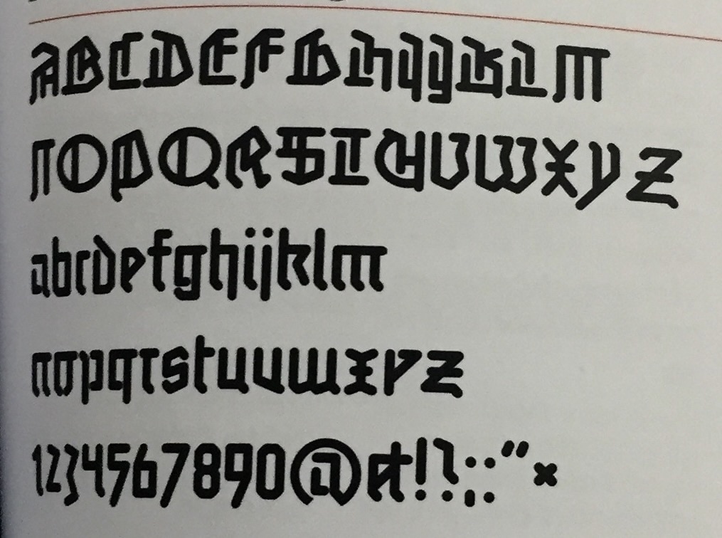
PICHACAO RESEARCH
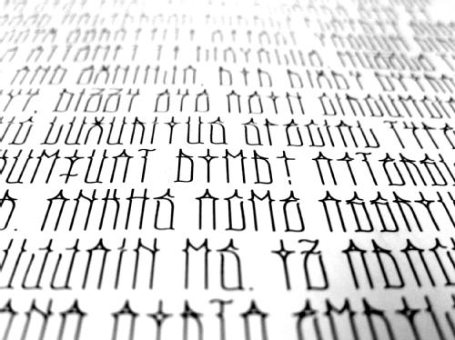
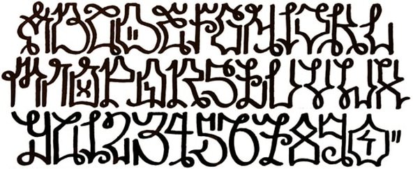
Pichacao, sometimes misspelt as Pixacao, is the name given to a branch of graffiti created and extended in the cities of Sao Paulo and Rio de Janeiro in Brazil. I t consists of tagging in a distinctive and cryptic style, mainly on walls and vacant buildings. The Pichacao uses vey high and thin letters normally, they write their letters in a vey pointy way, lots of angles and few round shapes. The lettering originally reflected the typography of heavy metal record covers, but its style have evolved over time.
I really think Pichacao letters could be vey nice if they write them in a nicest way.
The pichadores try to write on the most dangerous places, unless they are taking risk of their lives.
Pichadores have their own methods to reach the highest places, they use to climb or descend with ropes as rappel, they do also normally use parkour to reach their locations.
Pichacao is mostly condemned by the society and the government, as it is a crime. However, there is a huge difference between Pichacao and graffiti in Brazil, as graffiti is very well considered as a form of art. The main difference between them, is that the society sees the Pichacao as a completely damage of property, which it is, while they see graffiti as a generous community service. Graffiti writers in Brazil are often given permission to paint while Pichacao is always illegal. Some pichadores have even write all over graffiti murals paid by the government to protest against the legal graffiti.
Pichacao, also known as wall writings, began in the 1940s and 50s as political statements written in tar, in response to the slogans painted by political parties across the streets. Piche is the Portuguese word for pitch or tar, and Pichacao originally meant writing in pitch.
In the 1970s Pichacao almost disappeared, but it was revived in the 1980s by a young group who began writing their names, and their crew names instead of political parties.
Pichacao has been described as a vehicle for the youth of the city to prove their existence, and to do it loudly. As a social protest, Pichacao is brutal, effective but also without violence. There is no country with a worse wealth distribution than Brazil. For the rich, there are nice buildings, for the poor there are shanty towns. Pichacao exists just on the rich and nice buildings, and promises to keep on punishing until there is more equality.
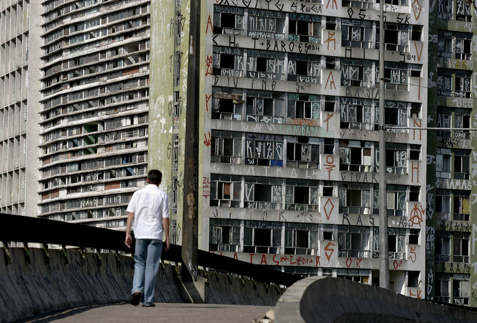
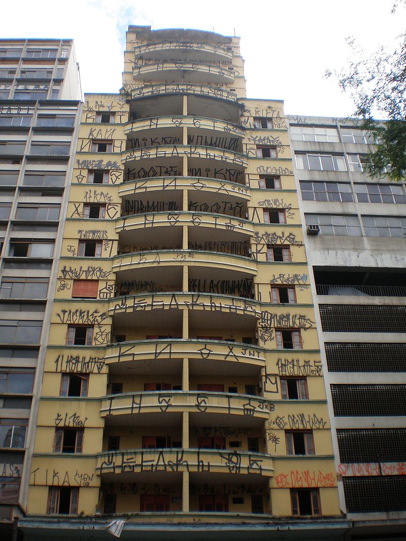
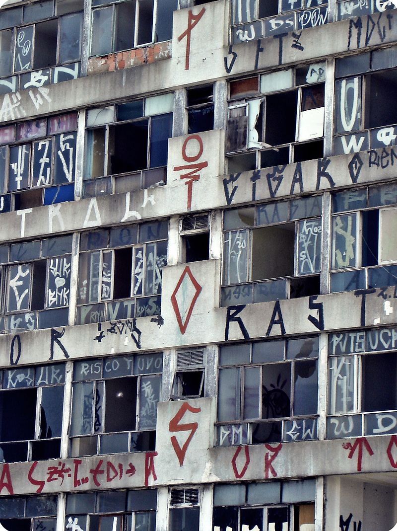
This is how they leave the rich city part, they destroy everything.
Pichadores have their own methods to reach the highest places, they use to climb or descend with ropes as rappel, they do also normally use parkour to reach their locations.
Pichacao is mostly condemned by the society and the government, as it is a crime. However, there is a huge difference between Pichacao and graffiti in Brazil, as graffiti is very well considered as a form of art. The main difference between them, is that the society sees the Pichacao as a completely damage of property, which it is, while they see graffiti as a generous community service. Graffiti writers in Brazil are often given permission to paint while Pichacao is always illegal. Some pichadores have even write all over graffiti murals paid by the government to protest against the legal graffiti.
Pichacao, also known as wall writings, began in the 1940s and 50s as political statements written in tar, in response to the slogans painted by political parties across the streets. Piche is the Portuguese word for pitch or tar, and Pichacao originally meant writing in pitch.
In the 1970s Pichacao almost disappeared, but it was revived in the 1980s by a young group who began writing their names, and their crew names instead of political parties.
Pichacao has been described as a vehicle for the youth of the city to prove their existence, and to do it loudly. As a social protest, Pichacao is brutal, effective but also without violence. There is no country with a worse wealth distribution than Brazil. For the rich, there are nice buildings, for the poor there are shanty towns. Pichacao exists just on the rich and nice buildings, and promises to keep on punishing until there is more equality.
This is how they leave the rich city part, they destroy everything.
|
|
All I have shown above about Pichacao was completely negative, now, I should say I really like the letters when they are in a paper. I like very much some of the Pichacao fonts so I am showing some of them :
|
|
END OF PICHACAO RESEARCH
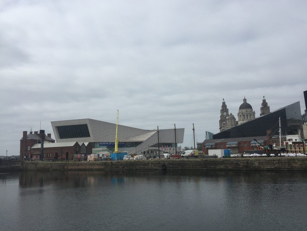
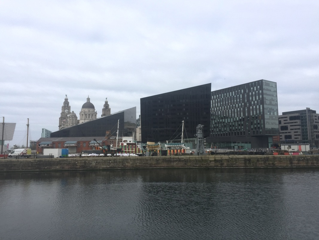
TRIP TO LIVERPOOL
I took the following photographs in the trip to Liverpool. We were in Liverpool just a few hours but we found and saw lots of things.
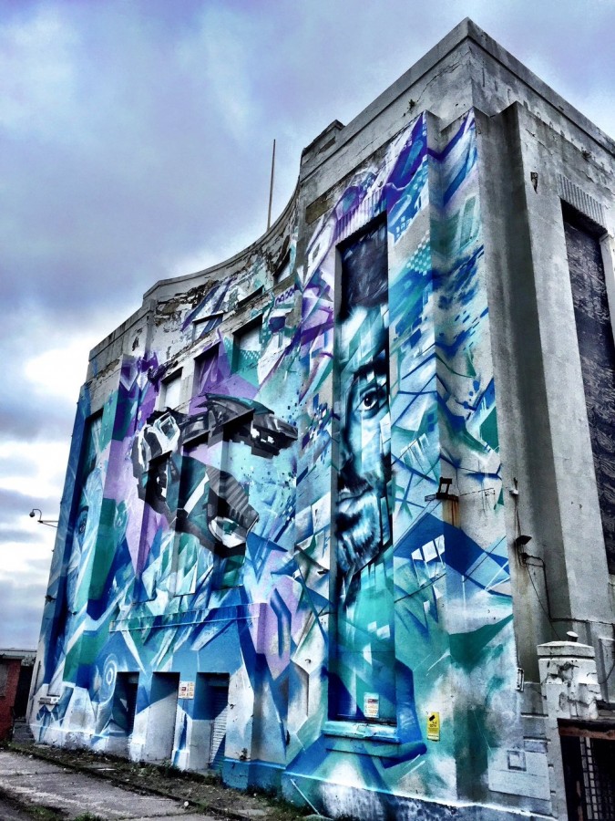
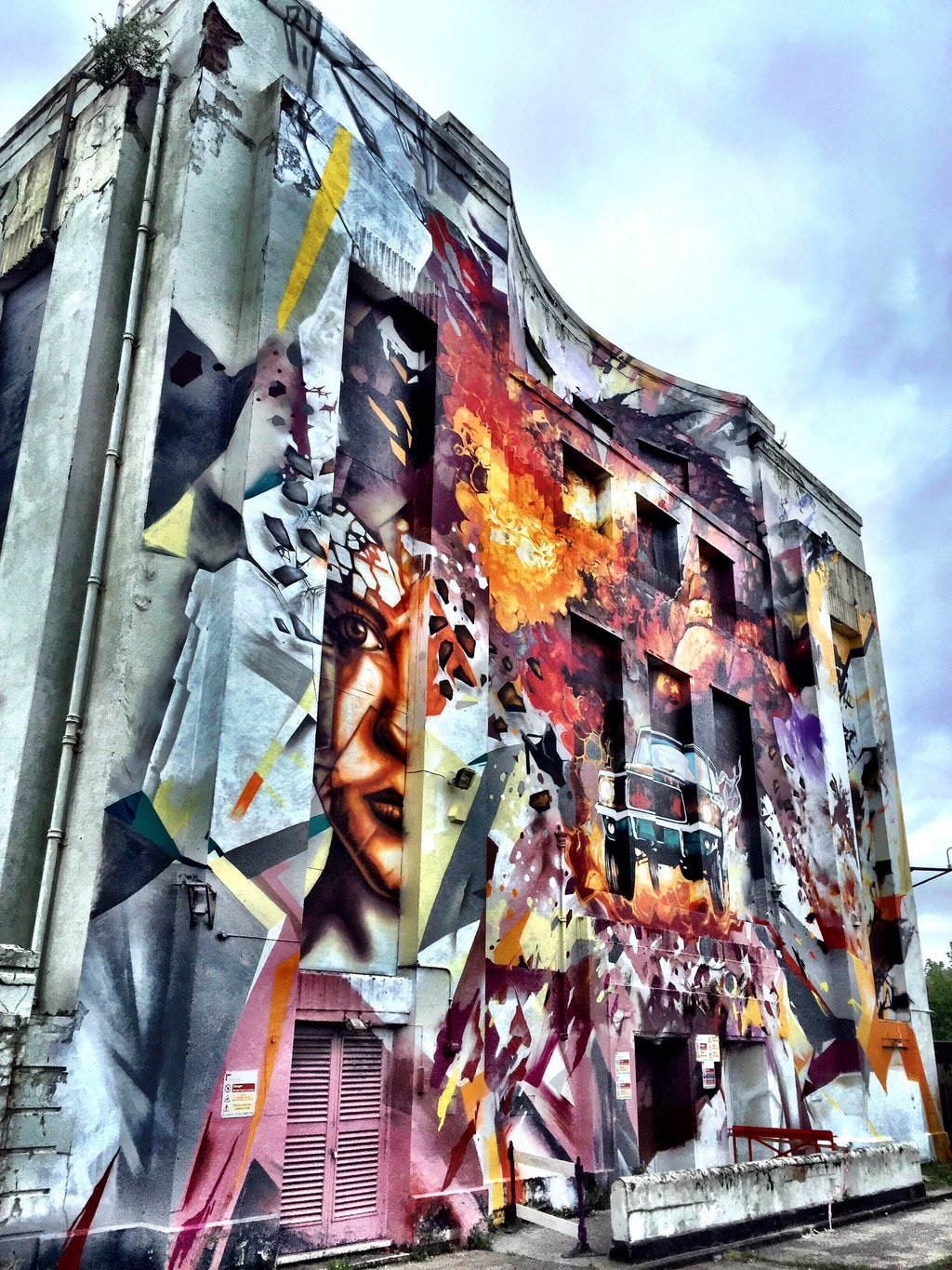
First of all, we had a little tour in the bus through Liverpool. While this tour I saw two giant graffiti murals on two different facades.
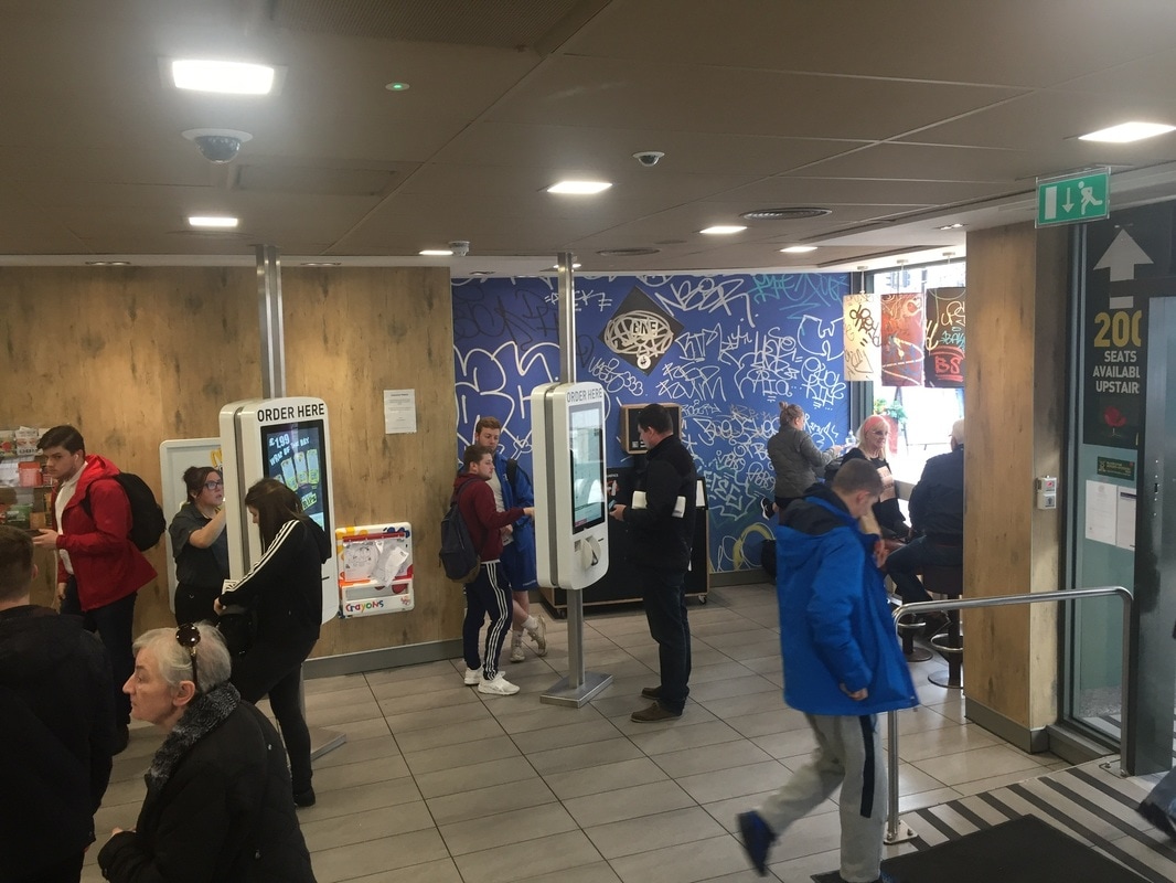
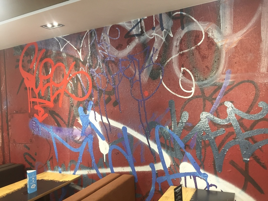
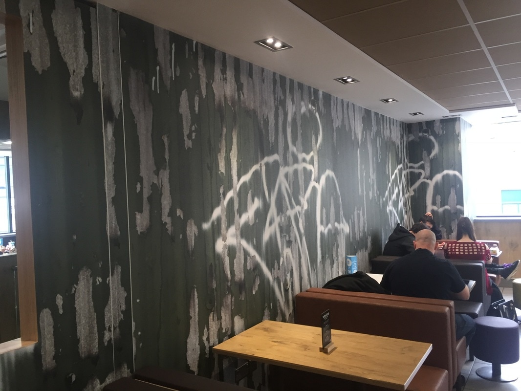
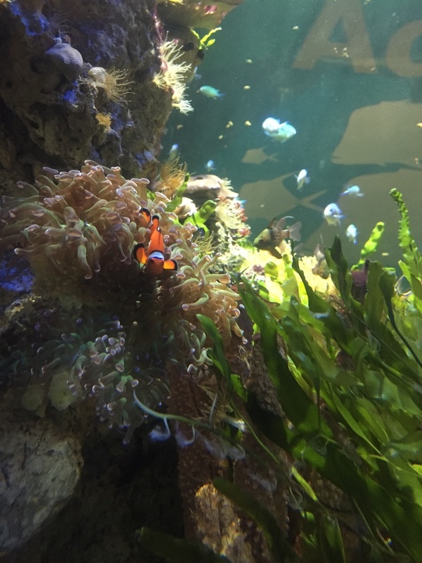
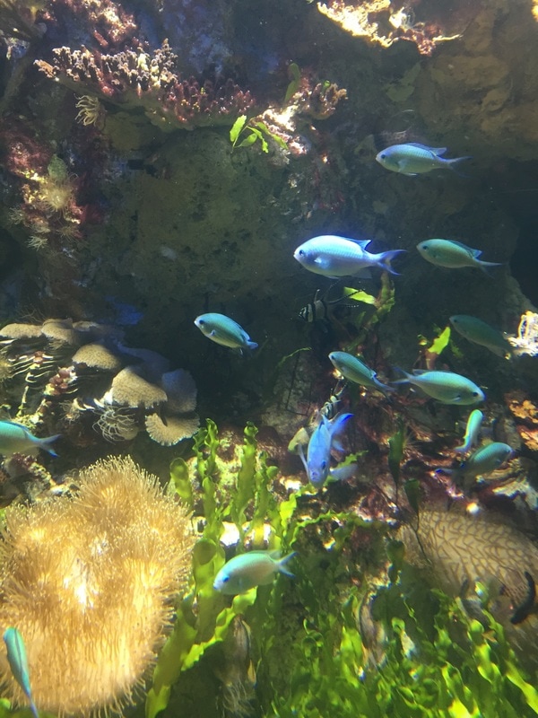
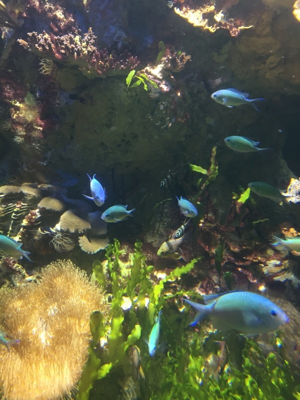
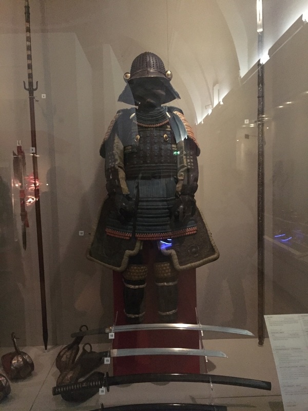
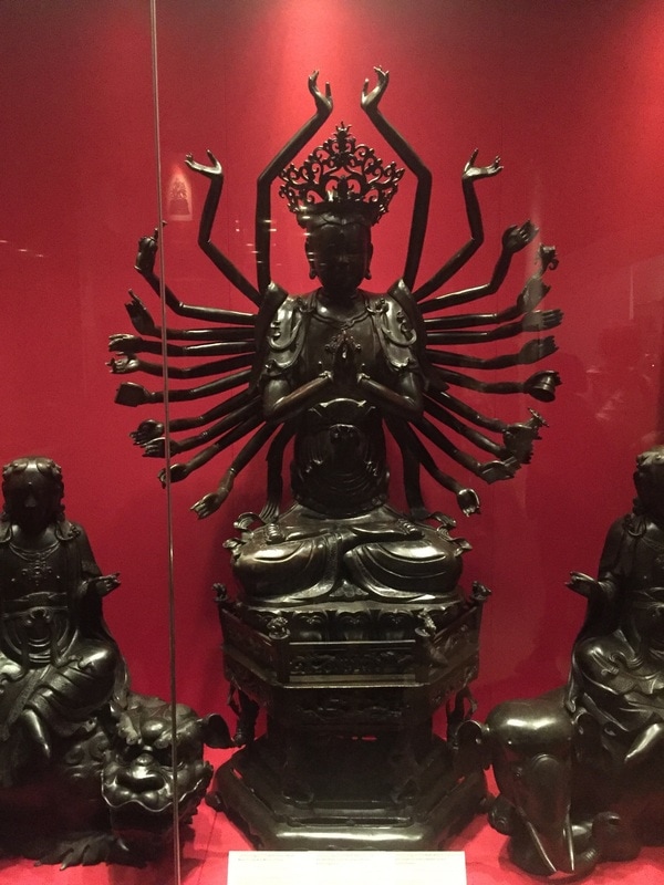
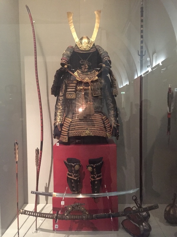
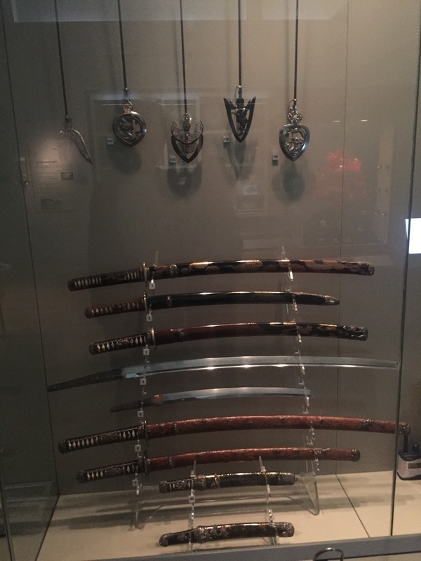
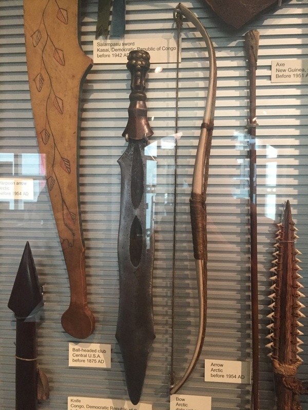
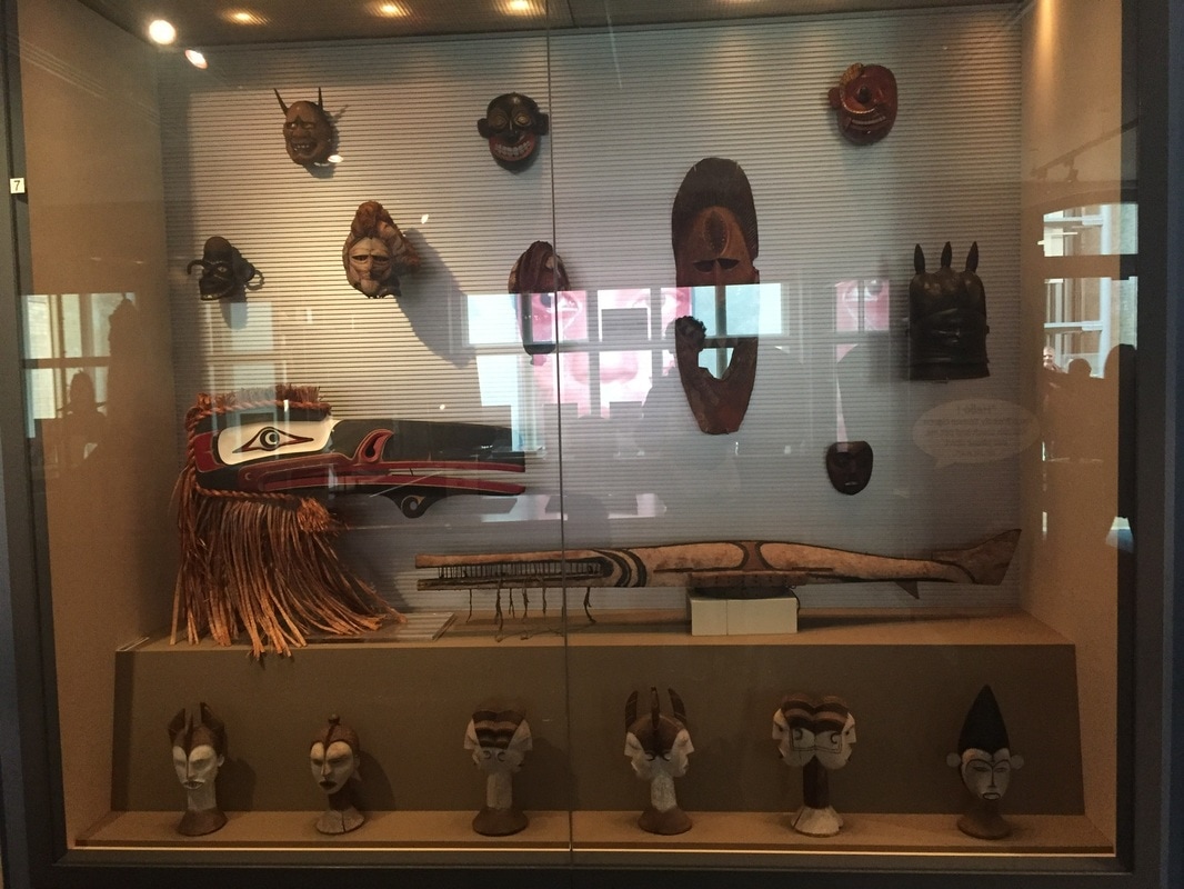
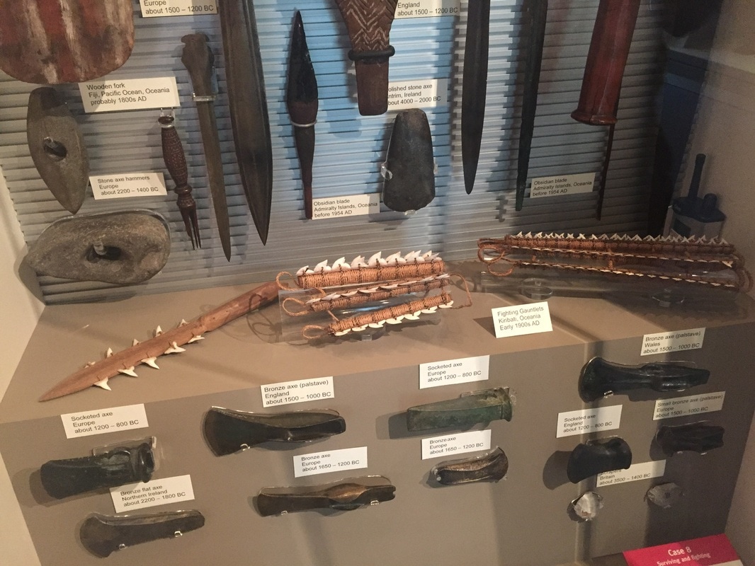
After the trip and the tour, we went first to the Walkers Art Gallery, in second place we went to the Liverpool´s library. After this, we went to a Mc Donalds in the centre, were I saw all this graffiti decorations all over the walls. Then we went for a long time to the World Museum of Liverpool, were we saw even aquatic, land animals, dinosaur´s skeletons, samurai armors, chinesse culture references and some weapons.
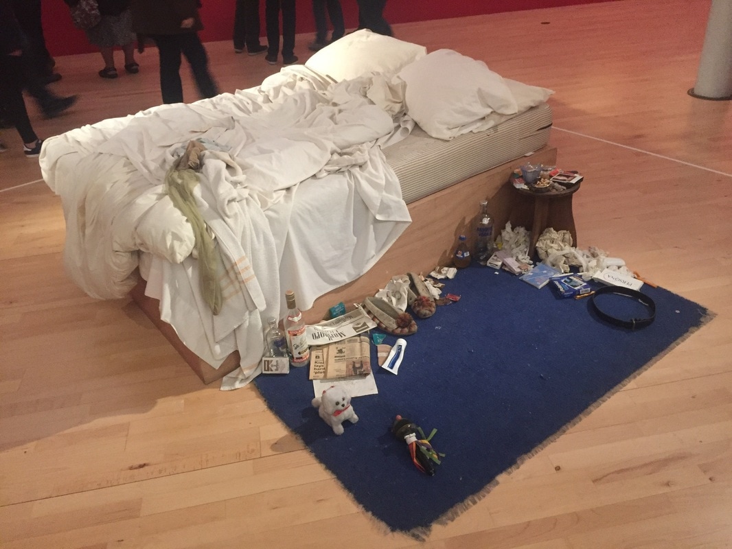
We finally went to the Tate Museum, and took lots of references to my work.
I took the following photographs in the trip to Liverpool. We were in Liverpool just a few hours but we found and saw lots of things.
First of all, we had a little tour in the bus through Liverpool. While this tour I saw two giant graffiti murals on two different facades.
After the trip and the tour, we went first to the Walkers Art Gallery, in second place we went to the Liverpool´s library. After this, we went to a Mc Donalds in the centre, were I saw all this graffiti decorations all over the walls. Then we went for a long time to the World Museum of Liverpool, were we saw even aquatic, land animals, dinosaur´s skeletons, samurai armors, chinesse culture references and some weapons.
We finally went to the Tate Museum, and took lots of references to my work.
This first two photos are not very good because we were in the bus and could´nt stop, but the murals are incredible. This murals are obviously legal, as they may have needed a crane or scaffolding, and many days.
|
|
This drawings are in a very small scale. I did it on Liverpool´s Walker Art Gallery. My favourite and the best is the first one, has the best proportions, shadows and I also like the position, but it is very simple because of the time I had to draw it, which was really short, as it happened with the next two drawings.
I must say this three drawings were really difficult as we can appreciate in some parts because the portraits were sculptures. Pictures are much easy to draw as they are already in 2D, but I think I captured really well the 3D after erasing everything several times.
The easiest part of this drawings was the scale. As I took a din a5 sketch book, the scale of the drawings were very little.
|
|
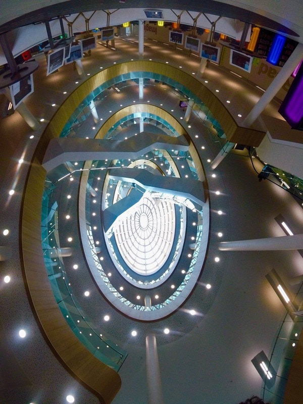
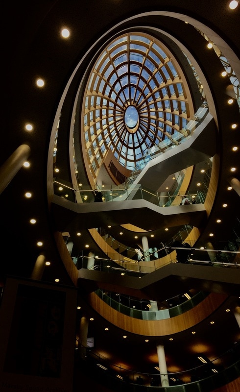
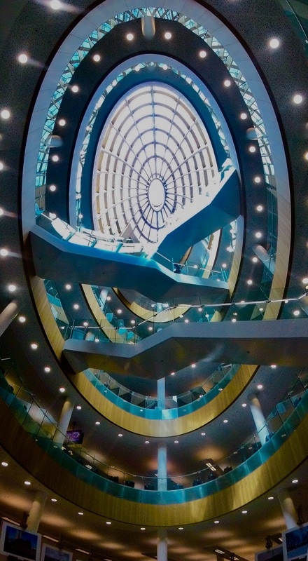
This is the Liverpool´s library. I was quite impressed with this library. I like very much this modern architecture, how they let the light enter in the room with that oval dome.
|
I like very much this photo because when you just see it, you may think it is turned around. But if you have a deeper look into, you may see its ok at some point.
I achieved this effect using my Gopro Session 5, putting it practically vertical. I also like the colors it has from the computers. |
|
|
|
|
|
|
|
|
|
|
|
|
|
|
|
|
|
|
|
|
|
|
|
|
|
|
|
END OF LIVERPOOL TRIP
|
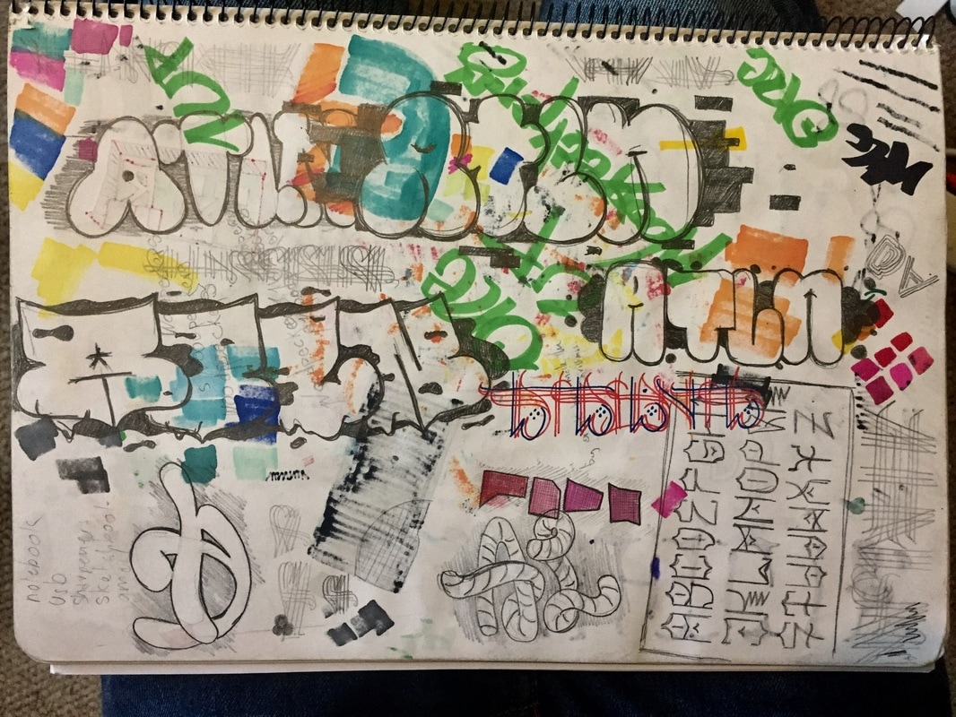
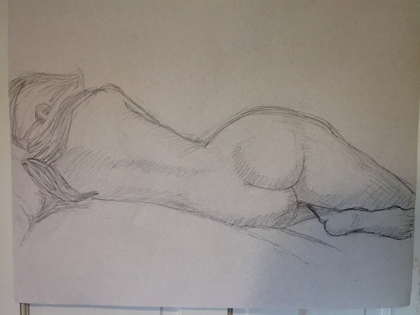
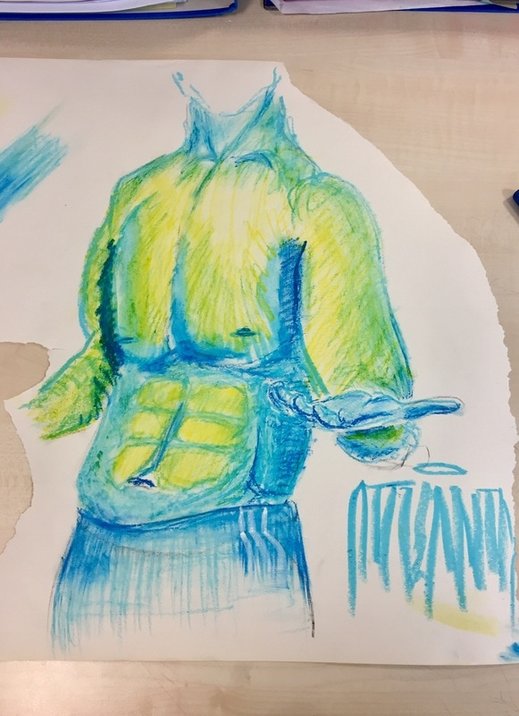
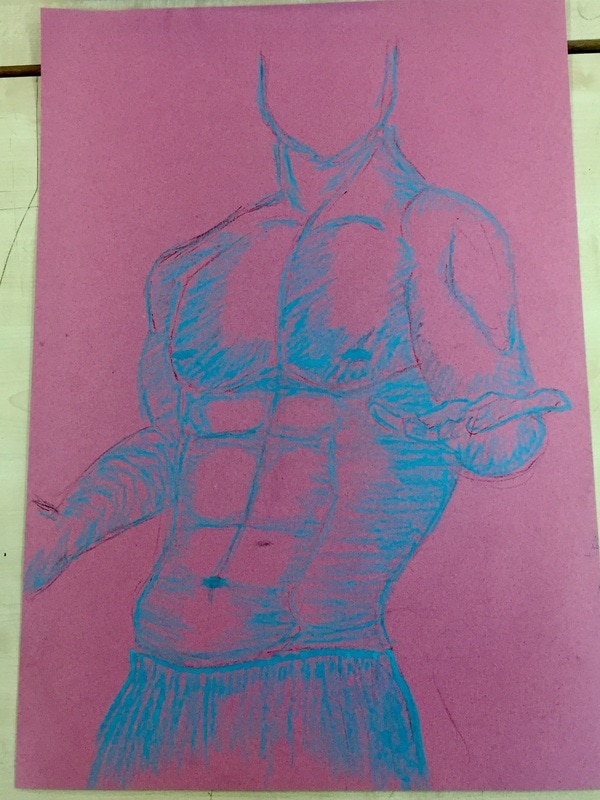
This second drawing is just copied from the fist one, as it is a very big drawing copied from a very little drawing, there are many muscles and details that were very complicated, and as I did just wanted it to fill it with letters and graffiti, it finished very sketchy.
|
|
I also did this two photos on the trip to Liverpool because it´s similar to what I have done. This is architectural and mine is painting, but both are combining old art with the modern art, and when things are done correctly they can combine in a perfect way. Here in the photos, they are combining the old church with very modern structures such as that long white building.
|
|
|
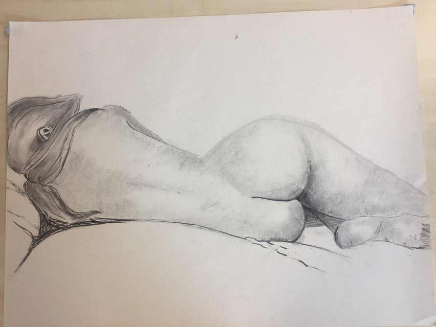
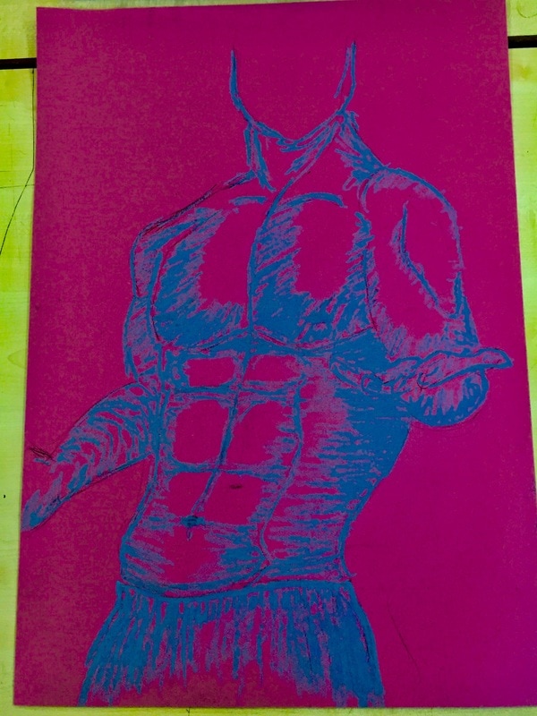
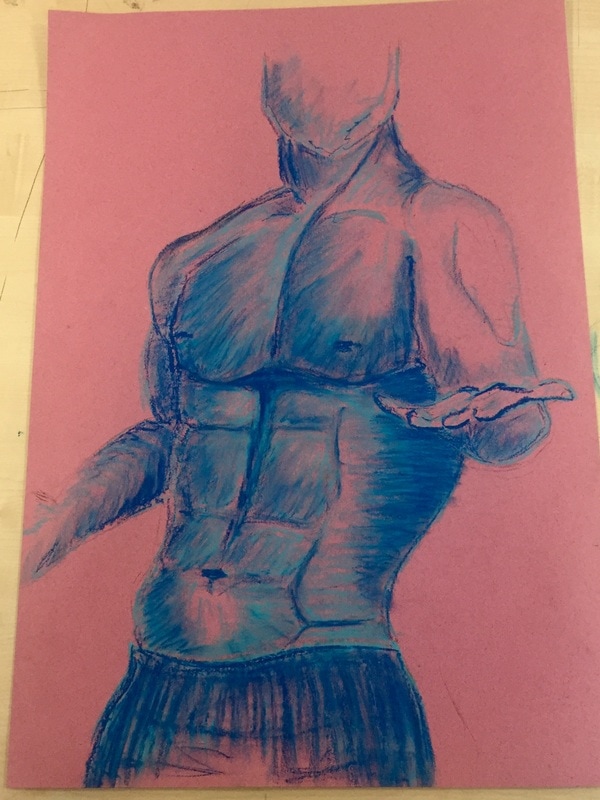
This third drawing is again copied from the first one, it is also in a bigger scale, but this time done with charcoal, so I could have a deeper impression.
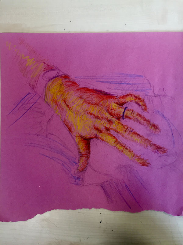
I difuminated the background to give more importance to the figure. I mainly focused on the body muscles, the shapes, the forms in human body and the shadows it produces. |
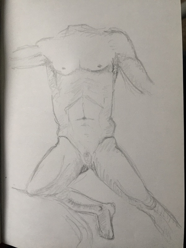
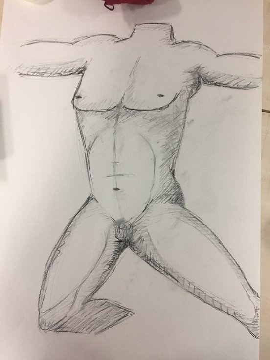
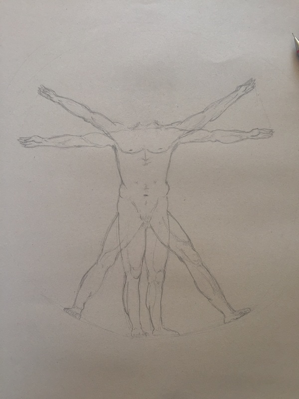
After the drawings of this bodies and muscles I thought it would be a great idea to research Da Vinci and try to copy some of his pencil drawings, to try to adapt to his way of drawings and sketching bodies, which everybody likes from him.
DA VINCI RESEARCH
|
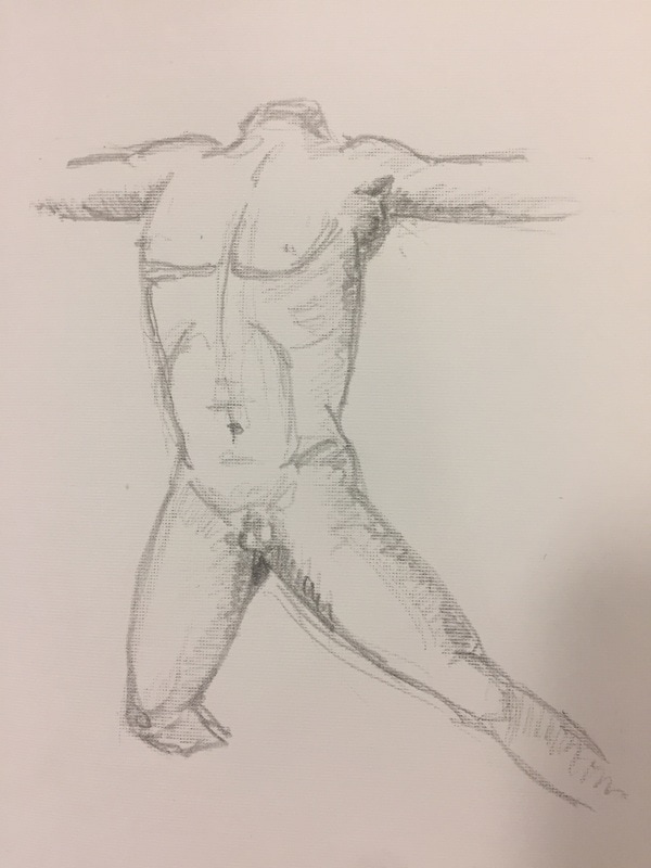
I think this first attempt of copying the Man of Vitruvio with the perfect anatomy went really good, unless I didn´t make any proportion scale or grid. I just went drawing , which can be reflected mainly on the knees. But taking the whole drawing and seeing it at some distance makes me feel really proud because I am not used to paint bodies.
In this first drawing of Da Vinci, I just focused on the body and the muscles. |
|
|
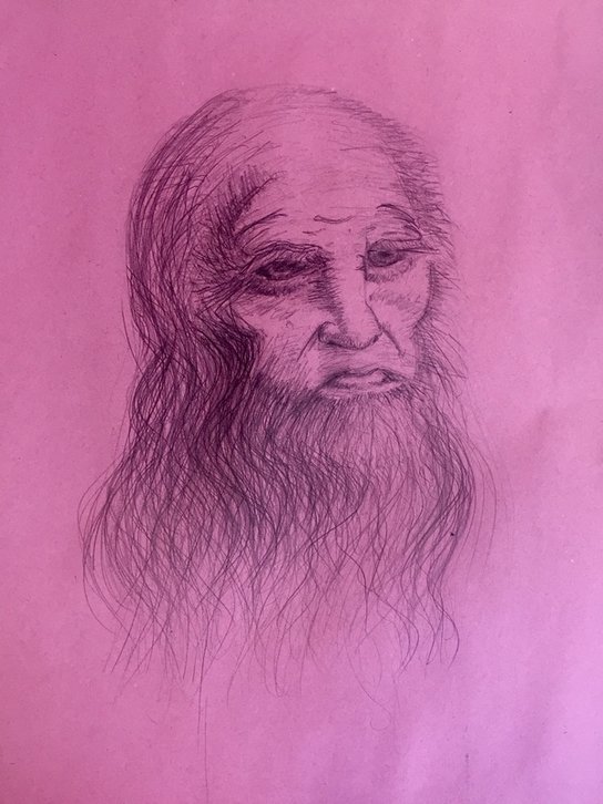
In this second Da Vinci´s drawing, I am also really proud as I catches really well the strong and deep Da Vinci´s face expression.
I8t was a completely different way of drawing from the last one and I think both went good. I can obviously still see defects on it, but with the help of many days retouching it when I saw anything I didm´t like. I think it´s near the real one. It could maybe have been better if I used a wider pencil instead of a mechanical pencil, but maybe it is what it gives that effect. |
I took the photo, where the drawing has been copied of, from the internet. I think this peace also worked well taking into account I did it in less than five minutes. That is why everything is so sketched and there´s no many detail on it.
This is the same as the previous one, but with no-time limit and charcoal again, which gave the possibility to make and play with all the shadows on the body.
I enjoyed making this drawing because it was one of the first times using charcoal and difuminating drawings. This is possibly one of the drawings I most like, unless there are many different styles and techniques.
I like taking some distance from the drawing and bluring my eyes to see much clearly the proportions, shadows. I use to do it a lot because I can focus on big errors. This specific charcoal drawing is a very good example and I think is the best technique to practise this blurring action.
I normally see or prefer drawing man with straight and pointy lines while woman with curved lines. I think this drawing has followed very good my thoughts.
|
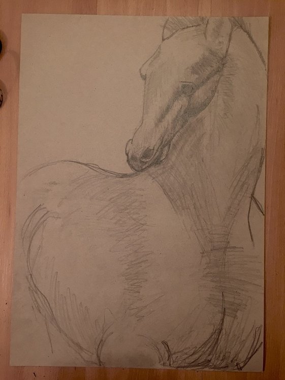
I like this drawing because I just wanted to focus on the horse´s head and I achieved what I wanted, because if you blur your eyes the first place you will look at, will be the head and then the body. I have achieved this by filling the head with more dark mass and more detail.
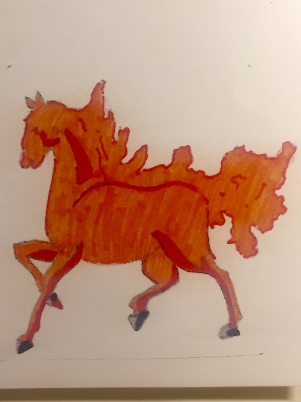
If I could start this drawing again, I would change the horse´s snout. I think it isn´t as wide as it should be. I have used for this drawing and I have been using tone for all this drawings except for the Man of Vitruvio, because I think it´s the most important element in a realistic drawing. Every drawing I have made till now has been realistic because I have been trying to learn shadows and muscles. |
|
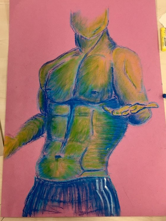
In this paper, I just tried to get used to pastels. This are just a few trials I did.
I didn´t like very much pastels, however the pastels I used were very hard, and it was really hard to use them.
I didn´t like very much pastels, however the pastels I used were very hard, and it was really hard to use them.
|
I took this picture again from the internet, I don´t quite like very much this drawing, maybe because of the picture, I have drawn the muscles too exaggerated and pointy.
I did this pencil drawing in a few minutes. I draw the basis to then copy it and see the the difference between few-time pencil drawing and long-time pastels. I normally think simplicity is everything and unless I like more or less next drawings, good pencil drawings are the best in my opinion. You could be very good with mixing colors, with pastel´s technique...at the end, pencil drawing shows quality. |
|
This is just a really quick sketch I did to try and see how oil pastels work as I had never used them.
It´s obvious that proportions are not correct and oil pastels are too hard. I didn´t try a perfect man as I just imagined what I remember from the last one. In the bottom, there are some steps of the final drawing. The fist and the second ones are the same but the first is just an edited photo, which gives such an interesting colors and shadows. I like that first photo because it looks like a printing. |
|
|
|
|
|
This is the finished oil pastel drawing. I don´t like it much because of several reasons. First of all, I have used too much dark blue so it takes all the attention. As I said before muscles are too exaggerated, everything on the drawing is too pointy. To finish I don´t think that blue and yellow combine very good like this. For the rest, I think I catched very well proportions and the pose of the man.
|
Here I tried to use some acrylics, how they worked between them, mixing of colors and difuminations of color scales.
I also made several attempts to get used to pallet painting but I didn´t like it at all. It is too unprecise, it takes too much paint and it´s very difficult to paint details.
I also made several attempts to get used to pallet painting but I didn´t like it at all. It is too unprecise, it takes too much paint and it´s very difficult to paint details.
|
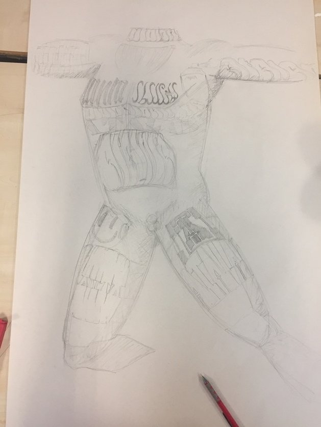
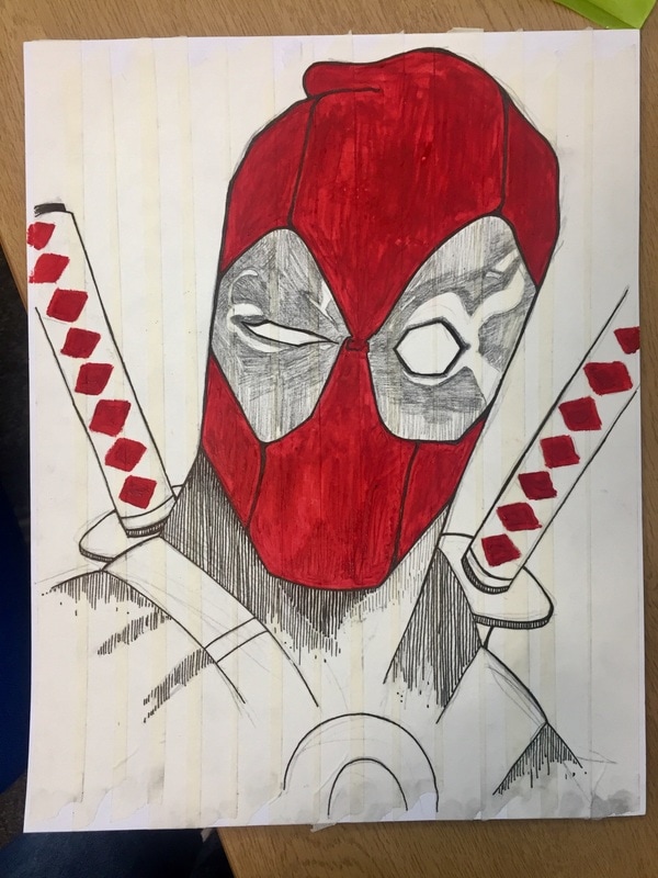
This is a Marvel superhero called Deadpool. I have drawn this because it is probably one of the superheroes that does more parkour in films.
I have also taken him because he wears a mask, so he does´t want to show his face as graffiti writers. They are mostly anonymous. To draw this I have used three techniques : acrylic paint for the mask and the Katana rhomboids, black fine liners with different widths depending on the shadows, and pencil for the eye surrounding parts. I have drawn onto tape sripes put all together going down. That´s the reason why I have drawn vertical lines. The purpose of this is to simulate a poster that can be easily and quickly sticked in a wall. Posters are other common type of graffiti used by many artists. |
|
|
|
At this point, I started having an idea. I started developing it and I reach a huge idea or art movement that I could work on for my FMP. This idea consists on art (that could be graffiti like mine or not), but always thinking and feeling empathy with people, to don´t bother or destroy property as graffiti normally does.
The mainly idea comes from graffiti, which is :
- leaving your name or sign all over the city to get known by people, demonstrate your existence and maybe be famous.
- make art. feel good seeing how people interact with your paintings and feel good doing what you like.
- leave your mark, to show people you have been there.
This type will include all this main purposes but with an extremely important point :
- empathy, thinking first in other people.
- non bothering or destroying property such as walls, cars, trucks, or bridges.
This movement could be huge, with lots of different branches. As I researched a lot in this theme, I found some of the branches I was telling. Specifically this one consists in putting tape around and around two vertical structures such as a tree or a streetlight. Then you paint over it.
These are some examples :
|
|
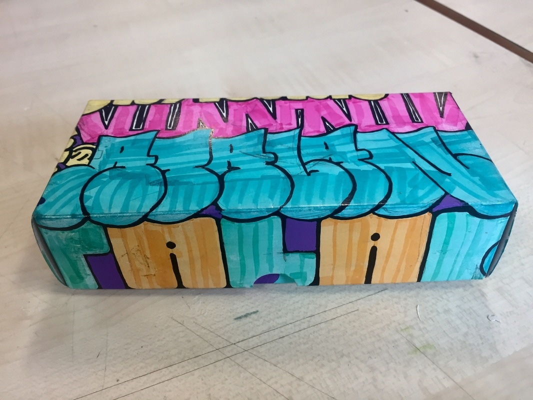
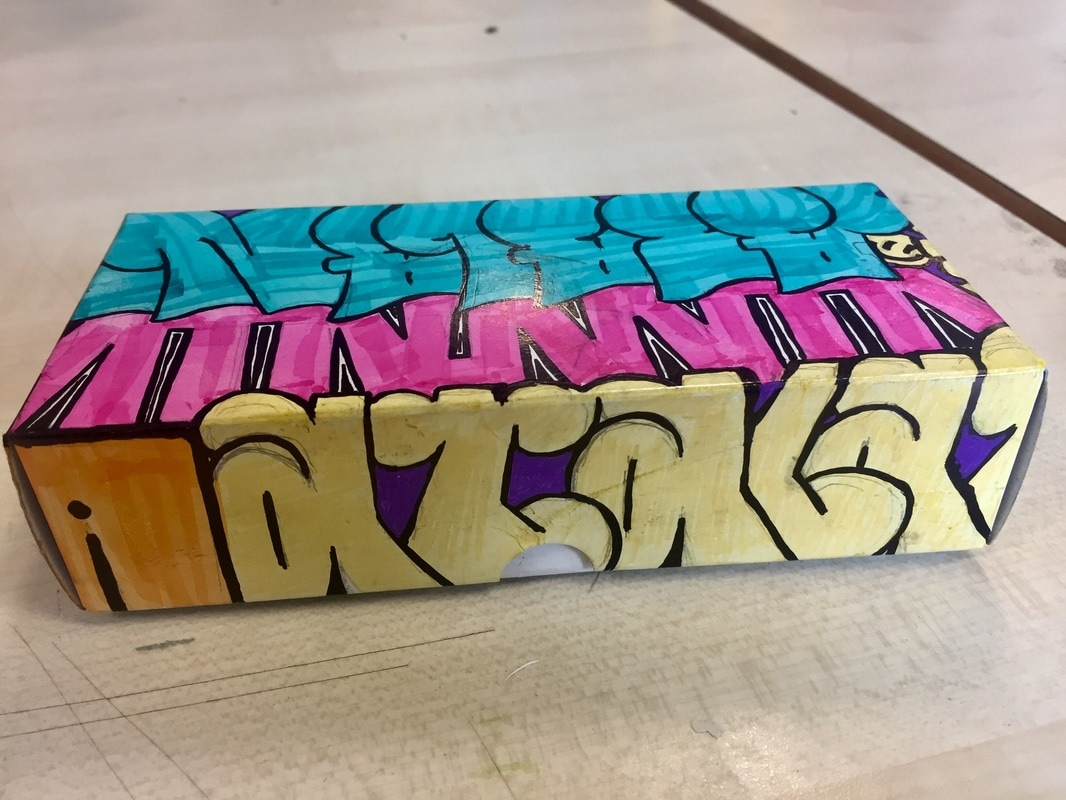
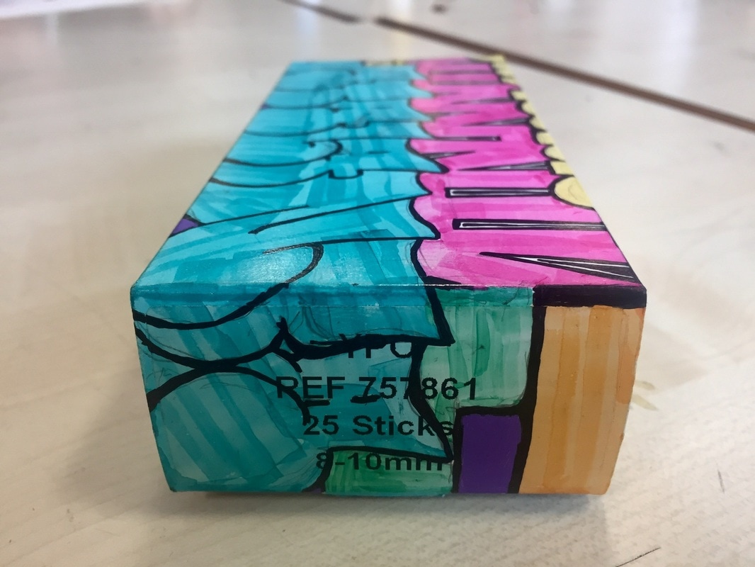
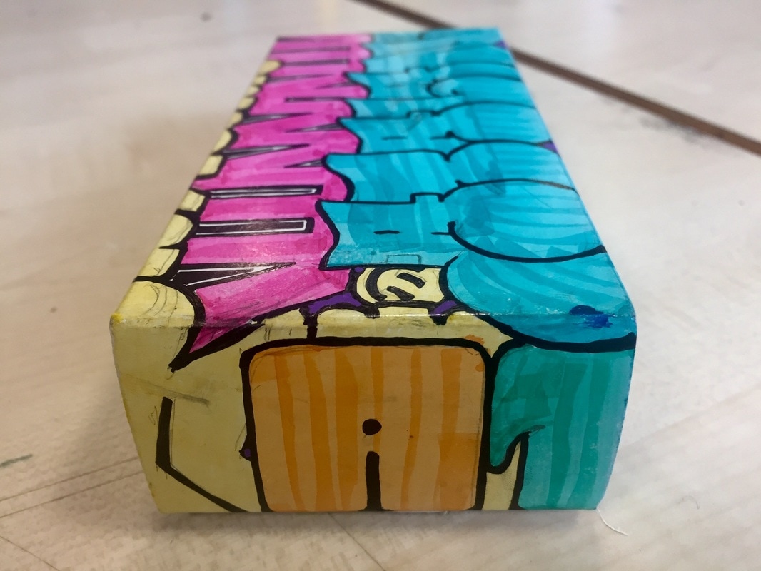
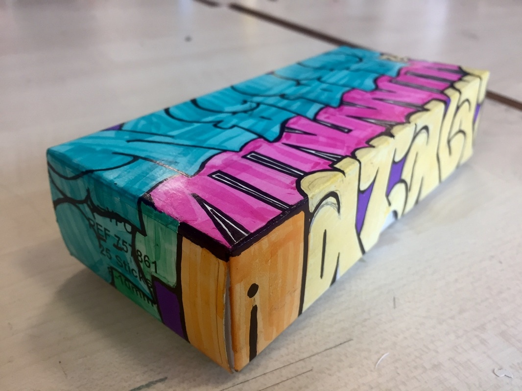
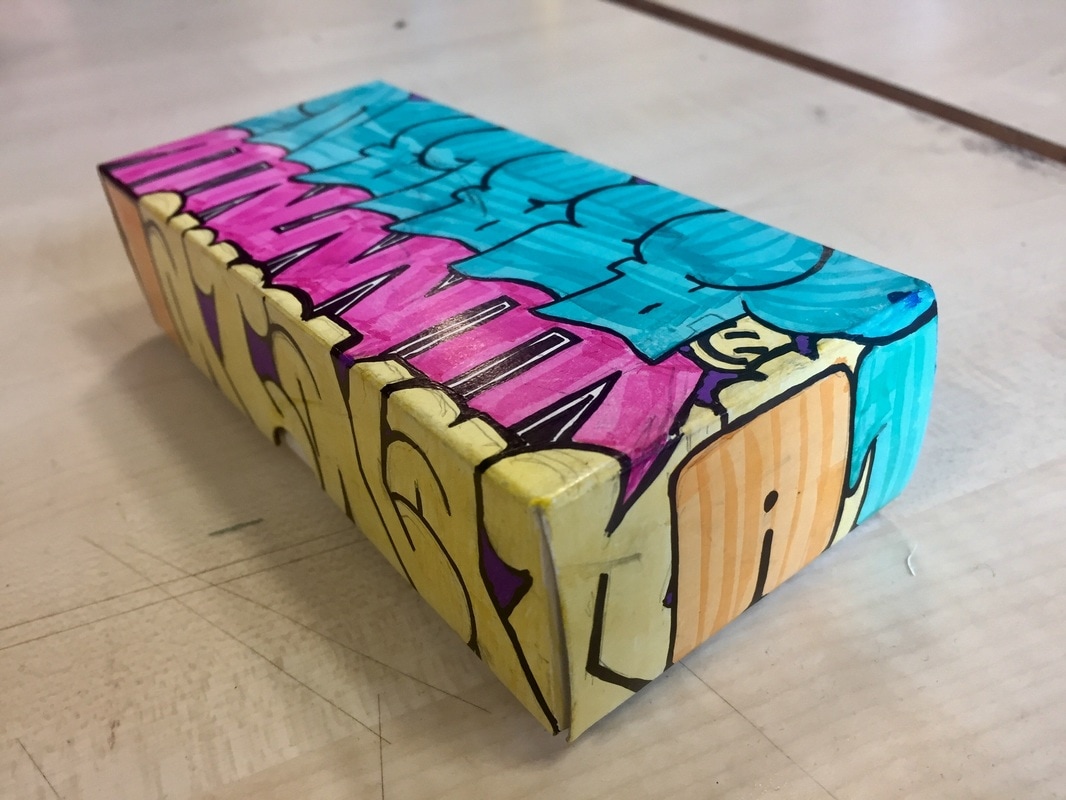
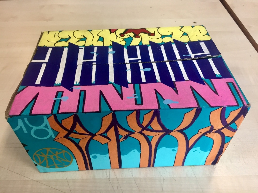
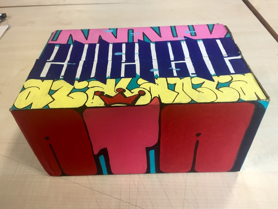
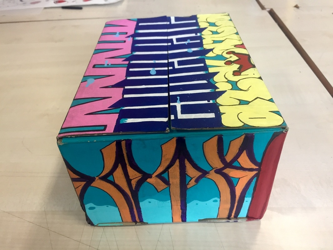
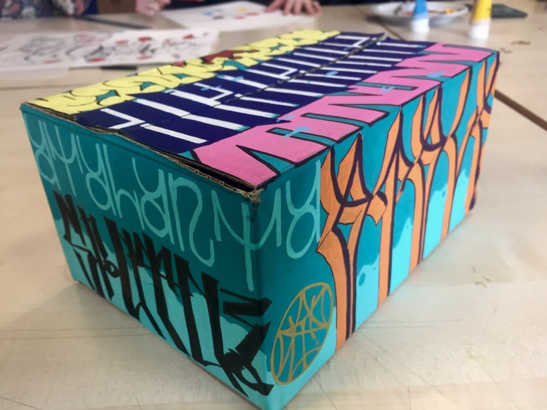
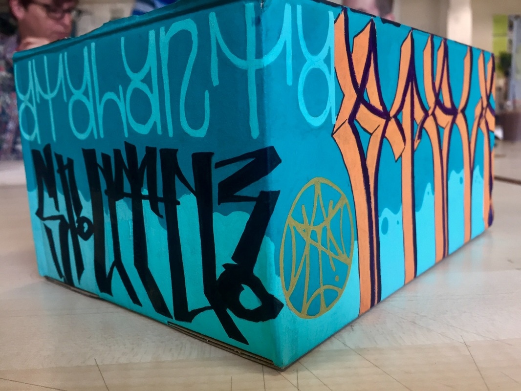
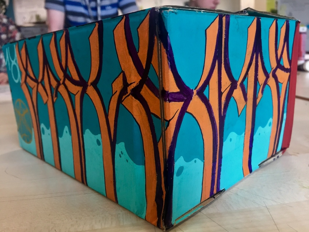
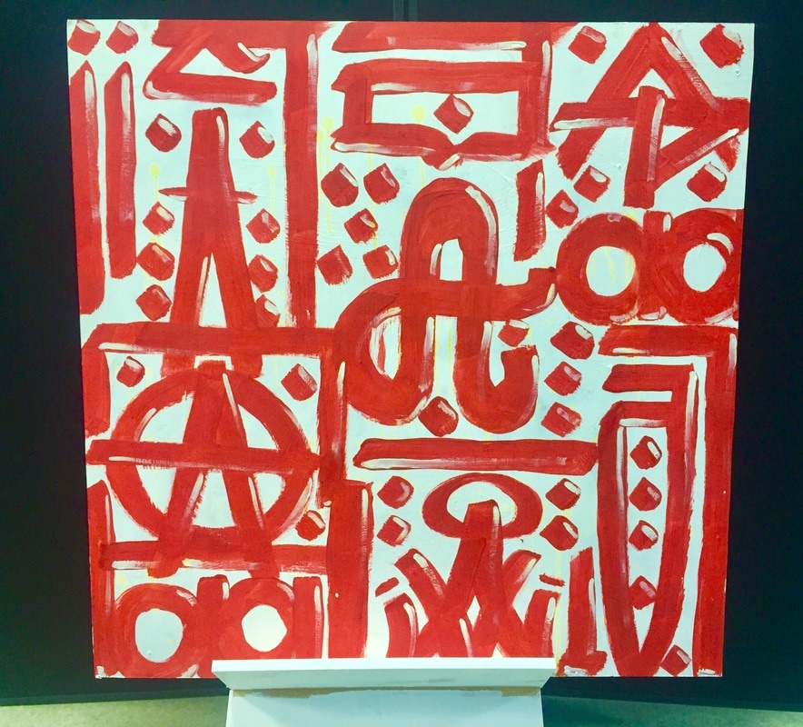
This was the first 3D object I completely painted. It is a little plastic box, that´s why there are so many light reflections on the top. As the surface was was plastic and it didn´t absorb well ink, you can see all the marker lines.
It took me a lot of time to finish this box. As I tried the graffiti to look everything as a whole piece, making the graffiti look as if it has layers in it. I superposed graffitis and draw the ones on the top go down and mix with the sides to mix it better.
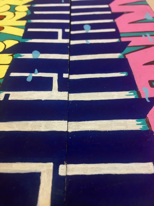
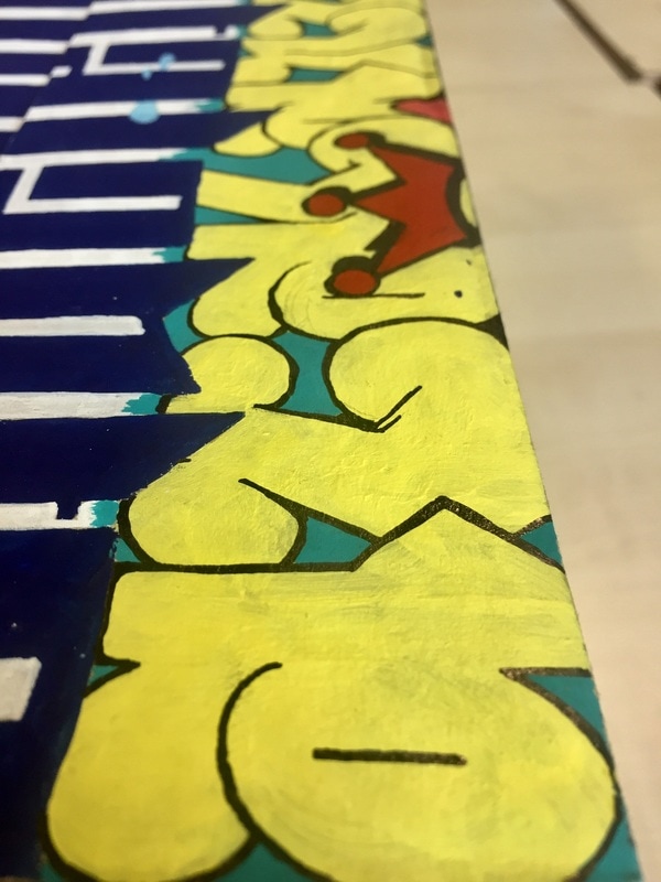
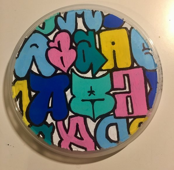
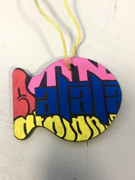
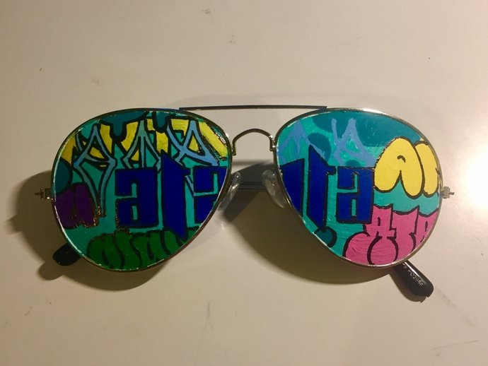
In all the painted objects below I tried to write Atalanta always in different calligraphies and with different and combining colors.
It took me a lot of time to finish this box. As I tried the graffiti to look everything as a whole piece, making the graffiti look as if it has layers in it. I superposed graffitis and draw the ones on the top go down and mix with the sides to mix it better.
In all the painted objects below I tried to write Atalanta always in different calligraphies and with different and combining colors.
|
|
|
|
|
|
It wasn´t difficult but it took me a lot of time to complete it because as it is plastic, the surface didn´t absorb ink well. I had to give many layers
|
|
|
|
|
|
|
|
|
TAG
PICHACAO
|
ICON - SYMBOL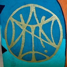
BLOCKBUSTER
|
|
|
|
|
|
|
|
|
|
|
|
|
|
|
|
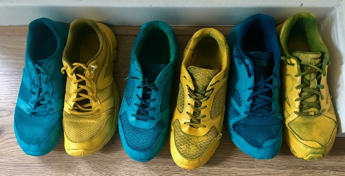
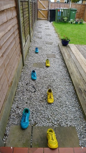
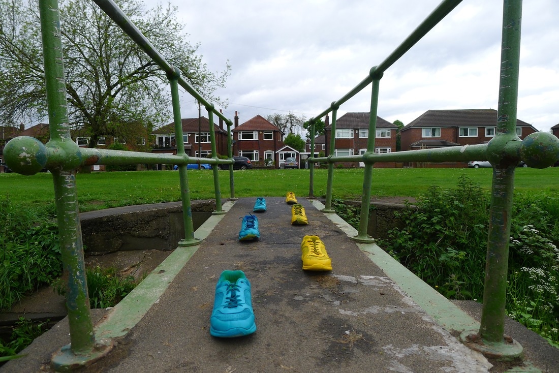
This step was probably the easiest "art work" I did on this whole project and even the whole course. But the one people seemed to like more, or react more strange. Maybe because it is so simple, or because of the places where I did put all the footsteps.
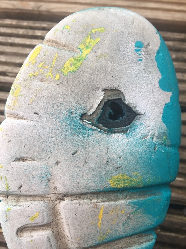
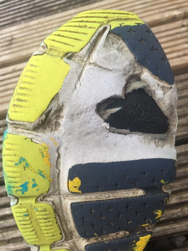
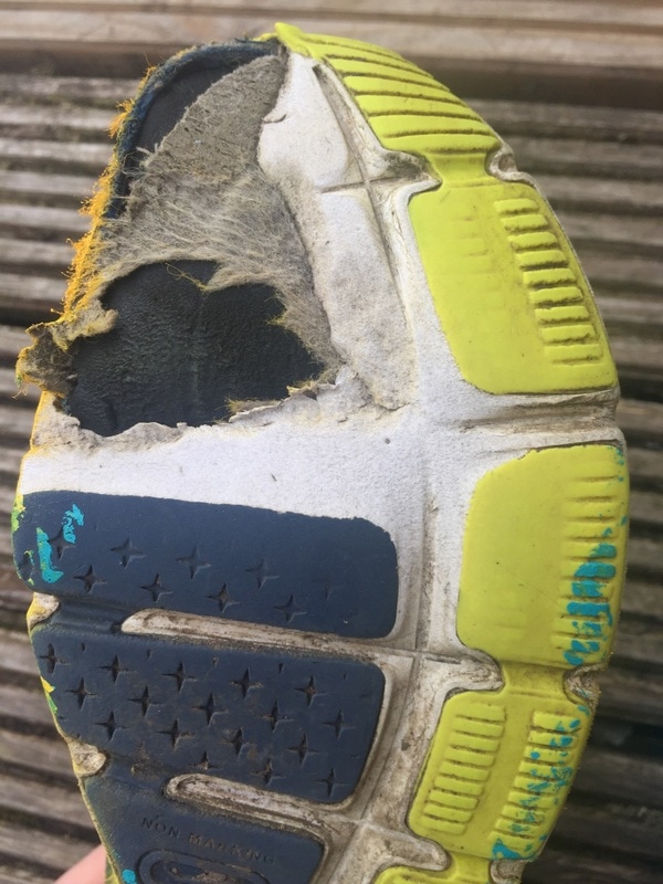
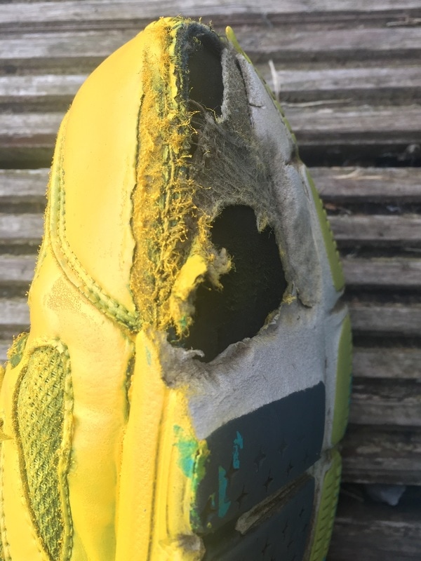
To make this, I just sprayed some parkour old shoes I had, they were completely destroyed as you can appreciate below. I let them dry and went out.
This was really funny, when I had them ready I went to some crowded places and put them as footsteps or just as people waiting or doing something.
To make this, I just sprayed some parkour old shoes I had, they were completely destroyed as you can appreciate below. I let them dry and went out.
This was really funny, when I had them ready I went to some crowded places and put them as footsteps or just as people waiting or doing something.
|
|
|
|
|
|
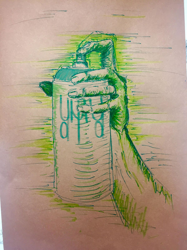
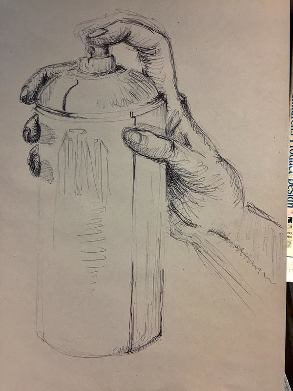
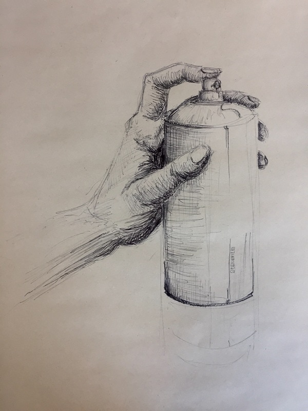
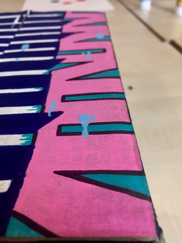
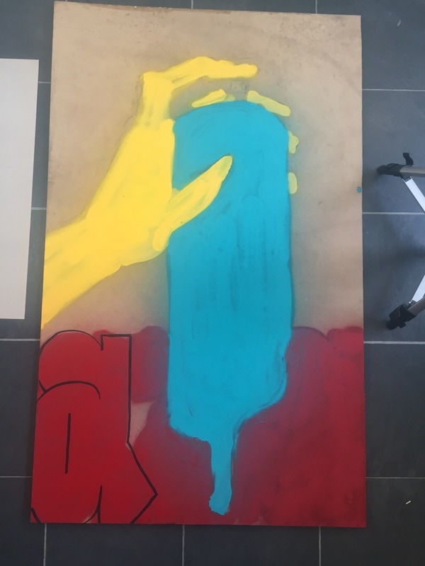
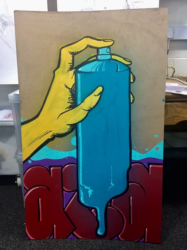
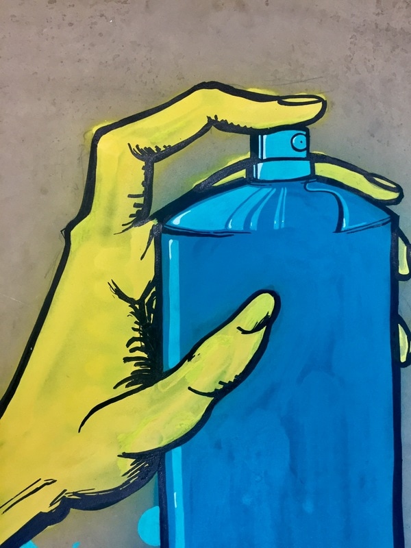
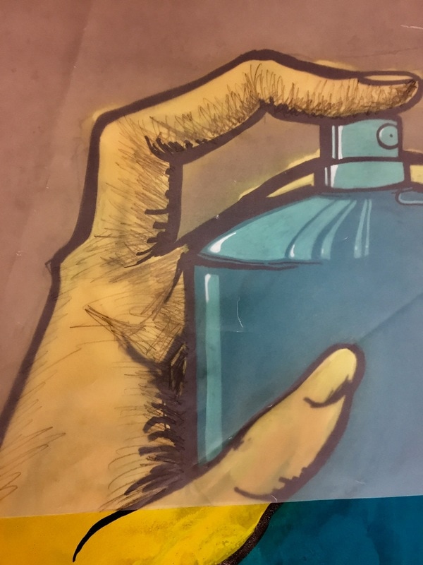
This is the biggest piece I have done for this project. I have made it with graffiti sprays for the bright colors, a black permanent pen for the outlines to give strength to the drawing and some posca color markers to give that flashes and shines on the letters and the can.
I think this painting is not very good in terms of drawing, but it copies the graffiti style with that glow colors and that poor background simulating a wall.
I think this painting is not very good in terms of drawing, but it copies the graffiti style with that glow colors and that poor background simulating a wall.
|
|
Here I tried to see with an acetate paper how the painting could be if I made the shadows with a pencil, but it seemed to look horrible so I left it.
|
|
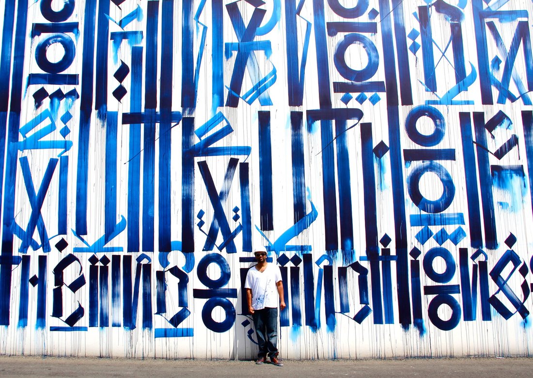
RETNA research.
|
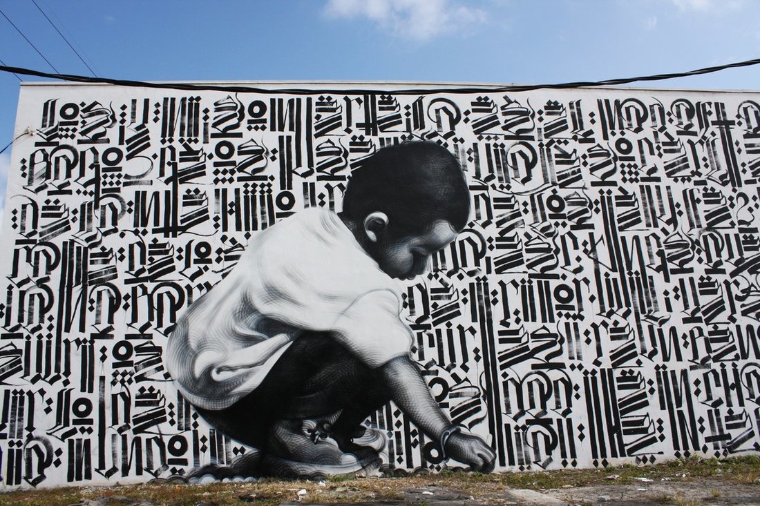
|
I think this final piece is perfect for the project because it is strange and familiar.
I think it is familiar because of graffiti, we are used to see graffiti everywhere and everyday, but not like this. Not in this way, normal graffiti damages, and this don't. I have never seen a wooden plank graffitied in the middle of the street, or a painted shoes... That is really strange, so I think I have followed as requested very good.
I think it is familiar because of graffiti, we are used to see graffiti everywhere and everyday, but not like this. Not in this way, normal graffiti damages, and this don't. I have never seen a wooden plank graffitied in the middle of the street, or a painted shoes... That is really strange, so I think I have followed as requested very good.
Please view my finished video below
Thank you for reading
REFERENCE :
- unknown. (Curent). Graffiti designs and styles. Available: http://weburbanist.com/2009/09/24/graffiti-designs-styles-tagging-bombing-painting/. Last accessed 24th May 2017.
- Unknown. (unknown). Styles of graffiti. Available: https://graffitocanberra.wordpress.com/styles-of-graffiti/. Last accessed 19th May 2017.
- Unknown. (Unknown). Tipos de graffiti. Available: http://www.tiposde.org/arte/1047-tipos-de-graffitis/. Last accessed 19th May 2017.
- Ju. (Unknown). Tipos de graffitis. Available: http://www.elpinceldeju.com/graffitis/. Last accessed 28th May 2017.
- Unknown. (2014). Estilos de graffiti. Available: http://www.taringa.net/posts/arte/17832750/Estilos-de-Graffiti.html. Last accessed 18th May 2017.
- Unknown. (Unknown). Tipos de graffitis. Available: http://www.tipos.co/tipos-de-graffitis/. Last accessed 82h May 2017.
- Matt Randal. (Unknown). Ten graffiti terms to remember. Available: http://www.widewalls.ch/10-graffiti-terms/. Last accessed 29th May 2017.
