|
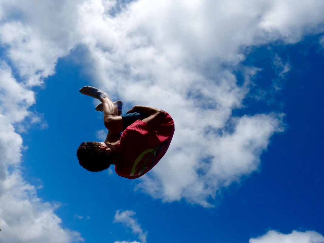
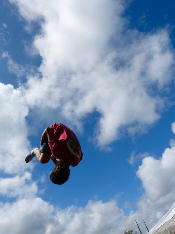
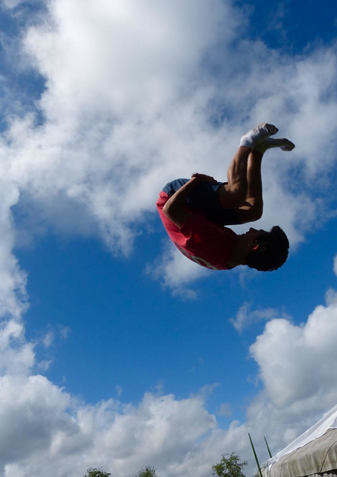
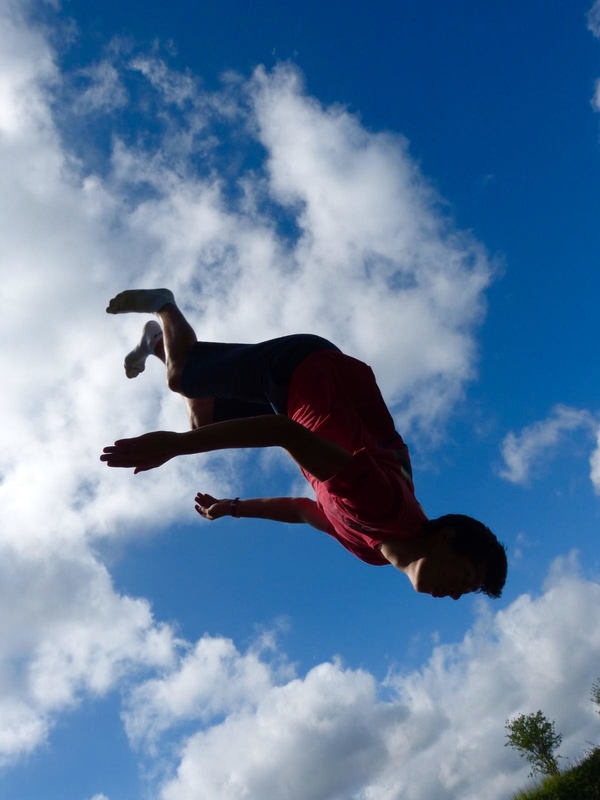
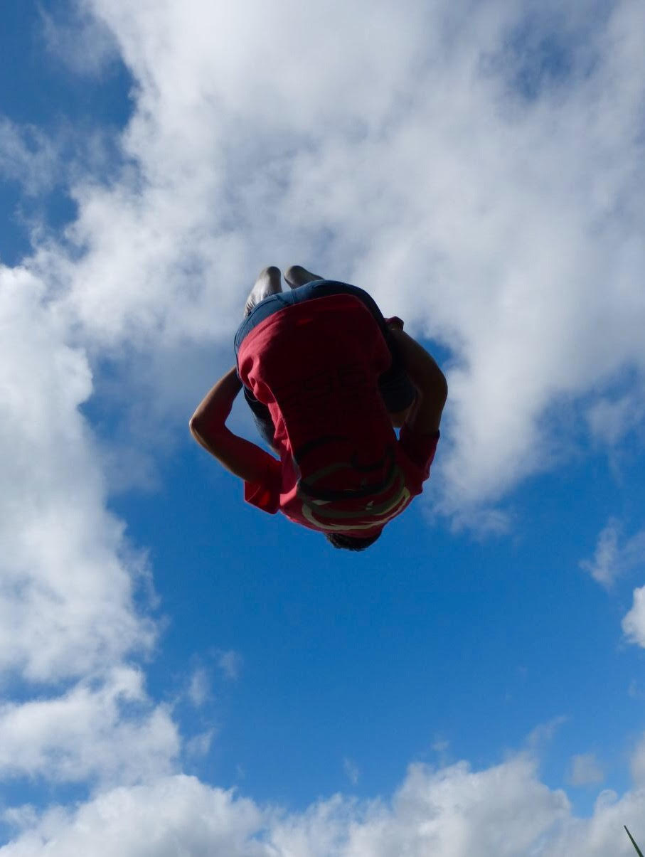
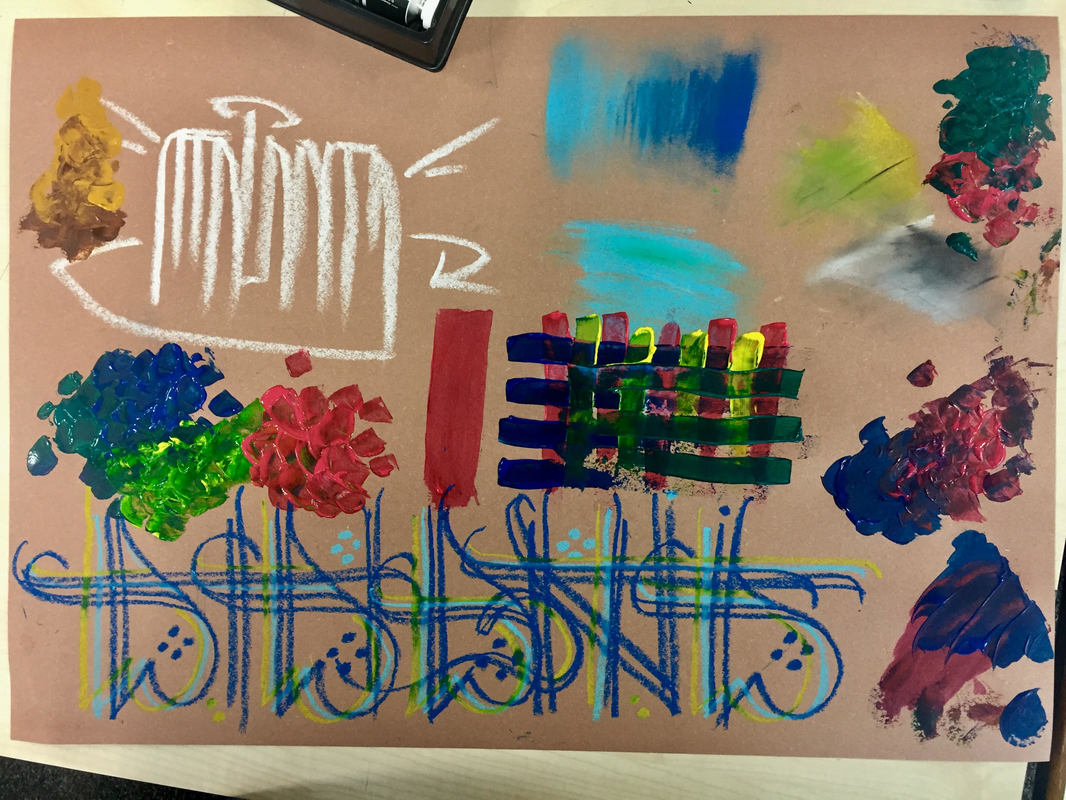
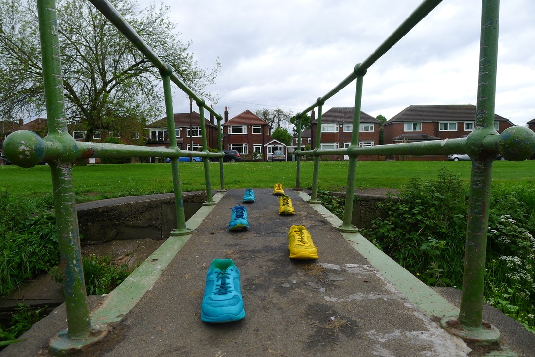
We start writing on a board familiar things and strange things that came to our mind. Then we mixed and wrote strange and familiar, which was quite an easy step. After this we start thinking about the theme we will choose for the final project. This was a very hard step as it envolved all the work. All we do and all of our art pieces will have to be related to that, or it will be focus mainly on that theme. I´ve chosen parkour as my strange but familiar theme and write the Project Proposal. I would like to explore and make various pieces of art, and make them in various ways and styles of art. My strengths are fine art, photography and moving image. It could be considered as weaknesses portraits, realistic drawings and project management. For me, danger or adrenaline are strange and familiar because it´s difficult to achieve that state or feeling and means you´re trying something risky but in my case, as I practise everyday it´s normal so familiar. My theme for Strange but familiar is Parkour. Parkour is a dangerous sport and it could be even a lifestyle. I´ve chosen this sport because it is not normal, it is really unusual (strange) due to its short elderly. It was created around 1990 but it has become very famous so fast as it is very visual, and some photos impact many people for their impossibility, but that impossibility is only achieved with constance and hard training everyday. That´s why it is familiar. I use to practise it everywhere, even in my house when it´s raining. As I chose parkour I went to my cousins house in Nottingham and took some photos flipping on a trampoline to give that huge jump impression. I really love this session because it looks like if I am flying, and thanks God it was a sunny day.
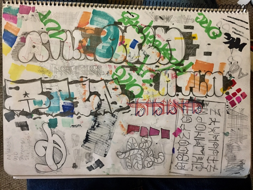
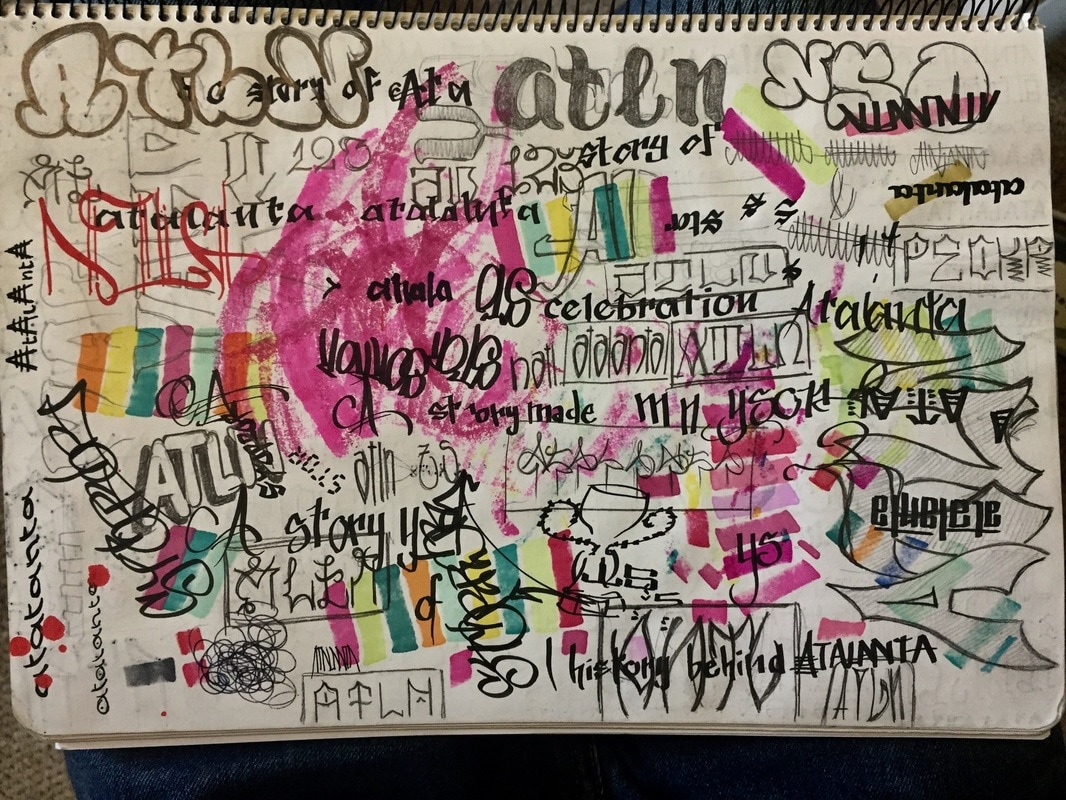
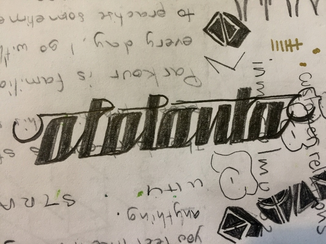
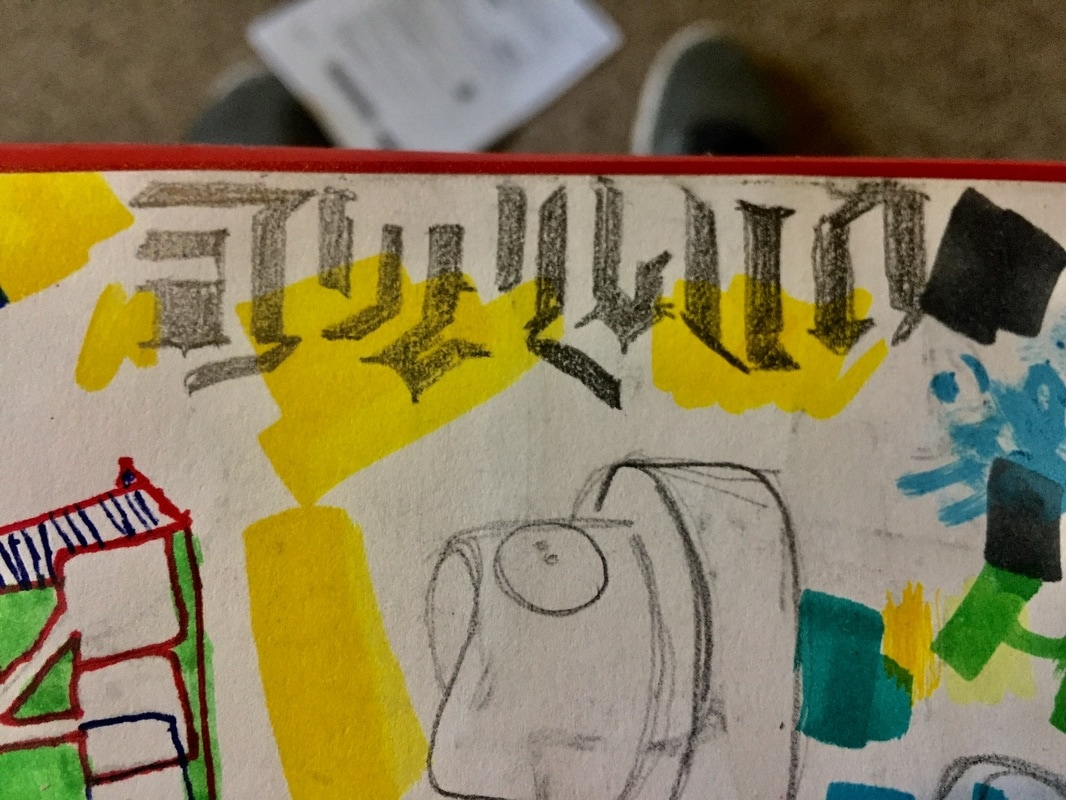
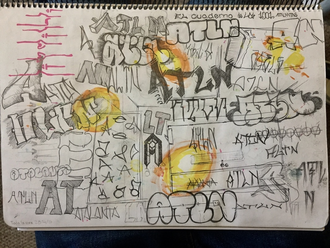
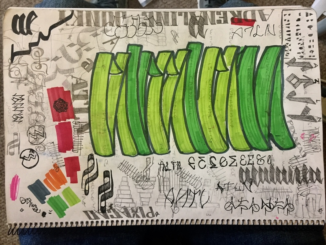
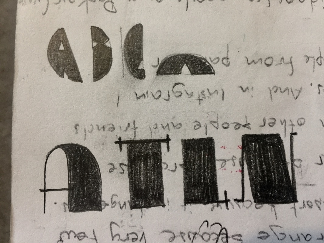
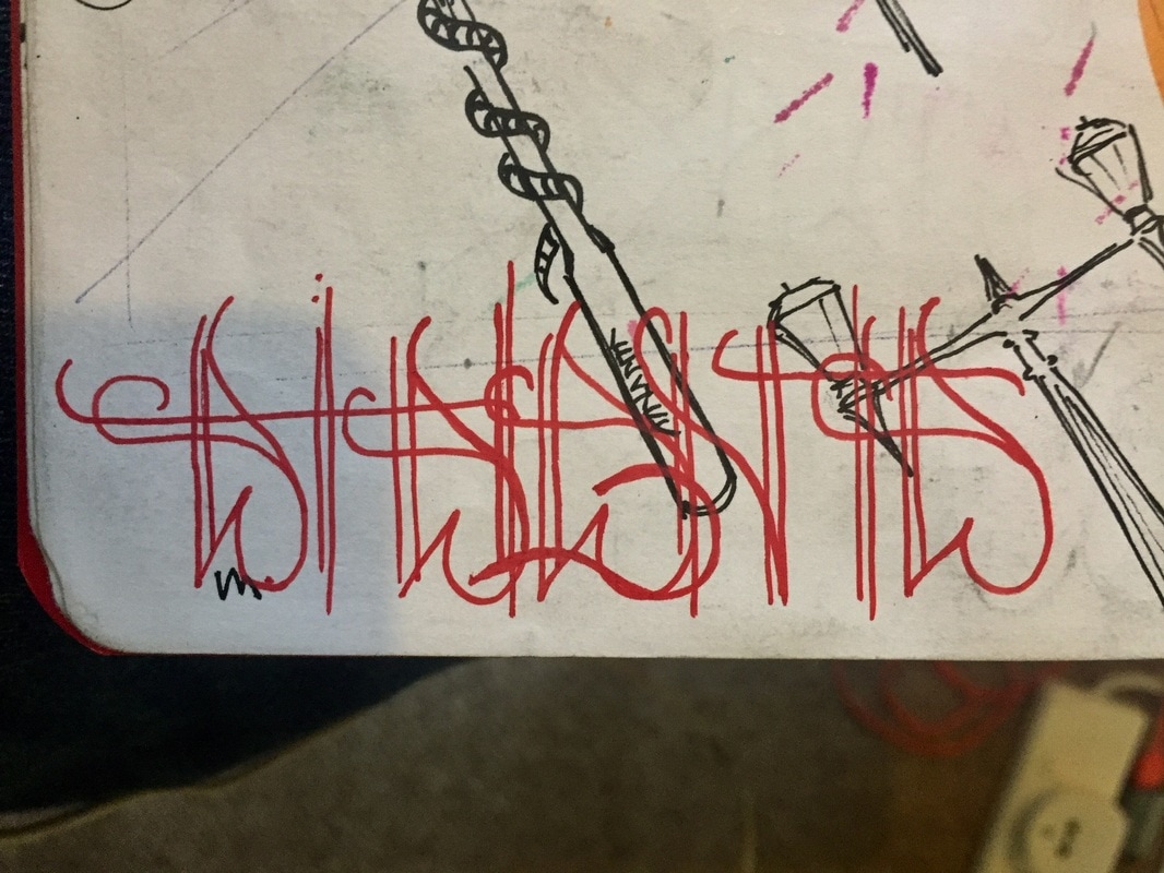
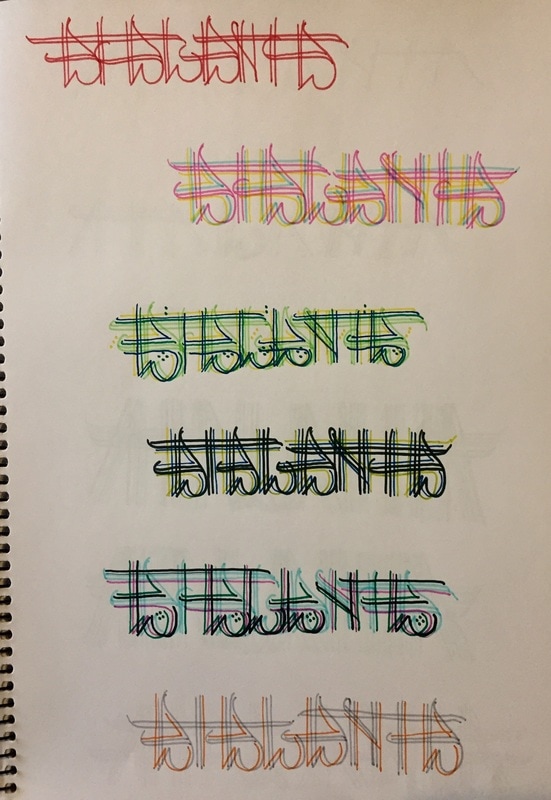
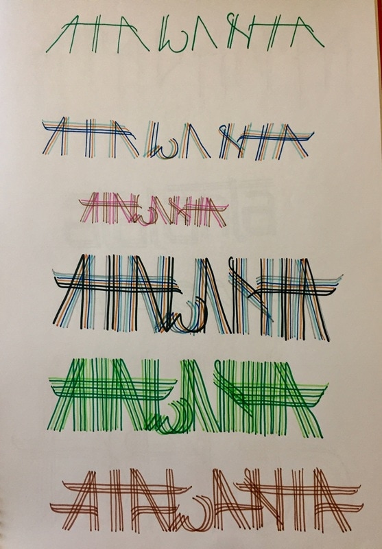
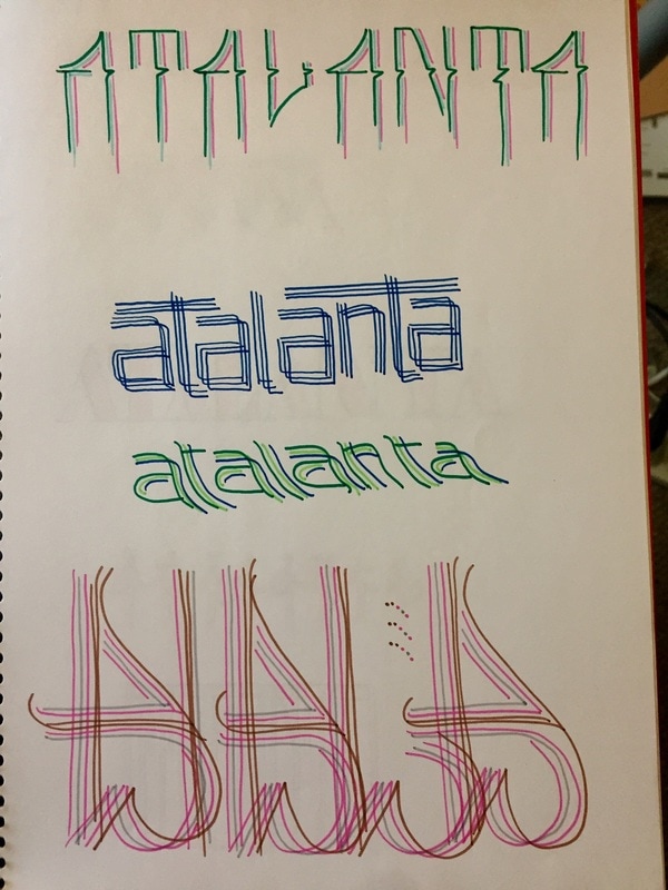
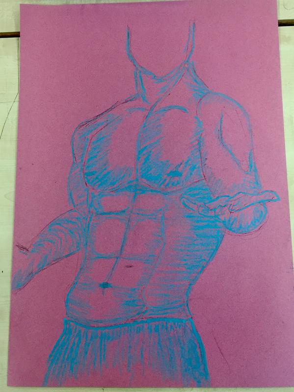
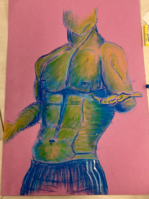
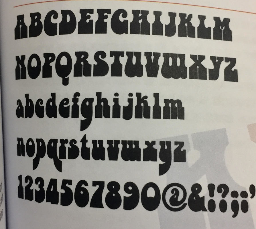
 I thought it could be a great idea mixing the most ancient art piece with the newest art pieces. I took the Greek god´s sculptures from the ancient art and the graffiti as the newest art forms. So many ideas where on my mind at that point. I used the sculpture just as a mural, not as a person filled up with tattoos. This idea comes because I wanted it to look nice, not dirty, as lots of people look to completely tattooed people. This is the first sketch I did on this idea and I did it very simple because of the time we had, which was around 20 minutes, so I didn´t complicate it much. I just draw one arm and a bit of the other, and did every Atalanta with the same typography, so it was really boring. 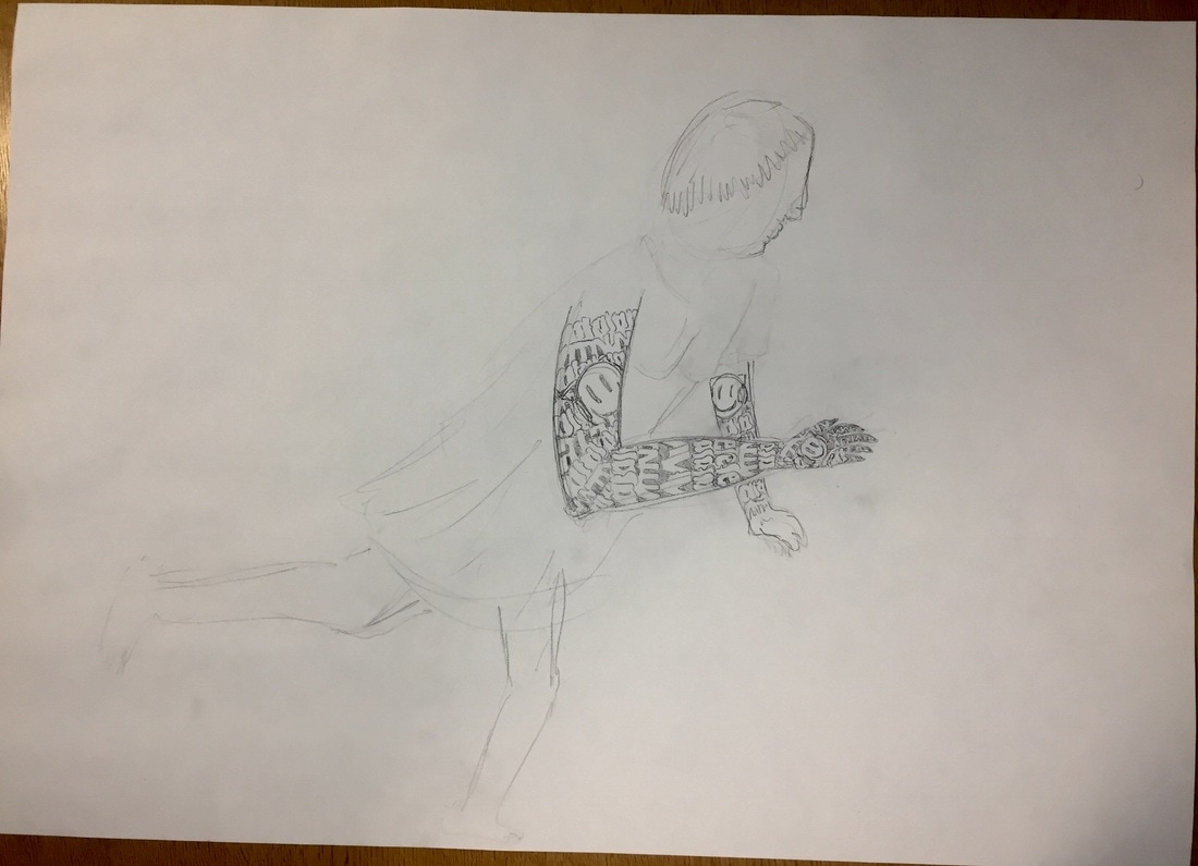 GRAFFITI RESEARCH. Its origin is related with the start of the human race in the prehistory, with the cavemen. Humans have always got the need of leaving their marks such as cavemen hands and hunting scenes, egyptian symbolised inside pyramids, greek inscriptions and roman critics on doors and walls. The graffiti is a completely free way of drawing and free theme. Graffiti is characterized normally by its illegality, because of these, many people hate graffiti and see it as a damage to property. There are many different types of graffiti : TAG : Tag is the most basic and the most prevalent form of graffiti. It is usually written with marker or spray paint and in one colour. This style is called tag because it is a very easy technique and it requires less time to do it. This technique originated at the beginning of modern graffiti, before the graffiti styles battle appeared. Because of this, writers tried to write them in the most understandable way, and in as many places as they could. There are different types of tags and this are the most common : BROGWAY ELEGANT : Manhattan's style, very thin, tall and closed letters. 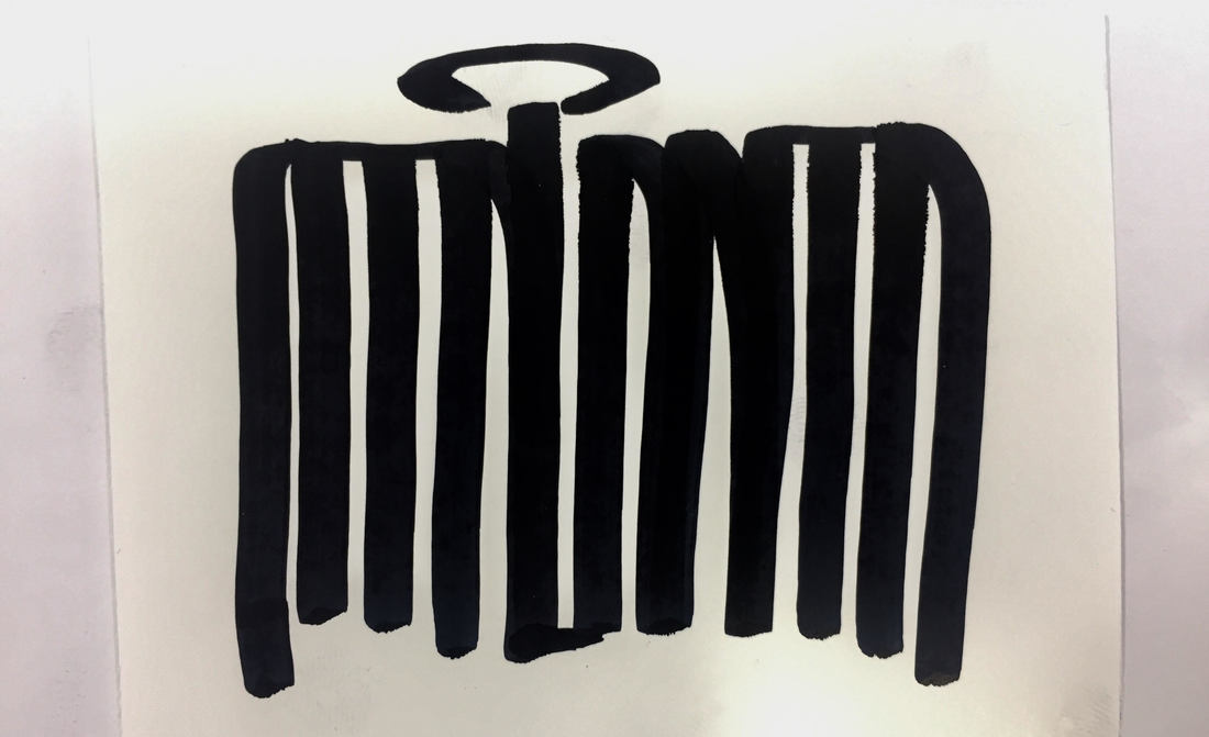 BROOKLYN : Brooklyn's style, very separated letters with crowns, arrows and spirals. 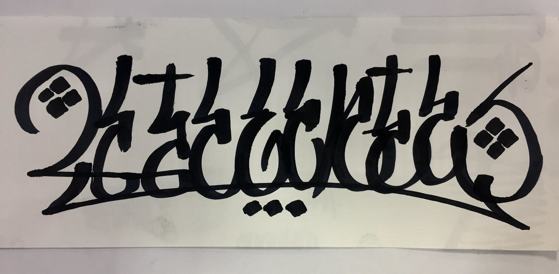 BRONX : Bronx;s style, it is a mix of the previous two styles.  OUTLINED TAGS : When the fat caps appeared lots of possibilities were open for writers. This gives birth to the outline. 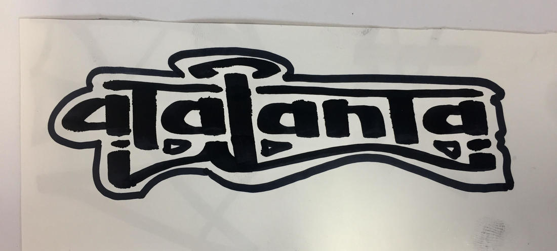 THROW-UP : As in the previous drawing was everything the same typography, I investigated typography books in the library and found lots of different ways of writing. Many of them, are invented by me, but they are all mixed up as I just used it to find new ways to then reproduce it in another place. As they were just sketches, I have just write the four letters of my sign, Atalanta -ATLN- to occupy less space and save time. I have always loved typography, writing letters, doing all the project titles since I was a little kid, and making names for my friends. As letters and colour were so important for me, graffiti catched very well my attention, so I started searching, looking other people videos and copying first other's, but always in paper. I have never supported the idea of illegal painting, and even more if its just tags and throw-ups, which are dirty and completely damaging. I didn't even understand why would people like to show how bad they paint, but I understood it when I started researching graffiti. There are some branches in graffiti which don't give importance at all to esthetic, such as the one born in Brazil called Pixacao or lots of New York bands, which use graffiti just to mark their territory. I saw all this information in a 1:30 hour long documentary called Infamy. This video really shocked me, and I even thought of leaving all my graffiti and my drawings. But after a while of thinking, I just realised it was confirming my idea of the Gentleman Graffiti, so I just continued.
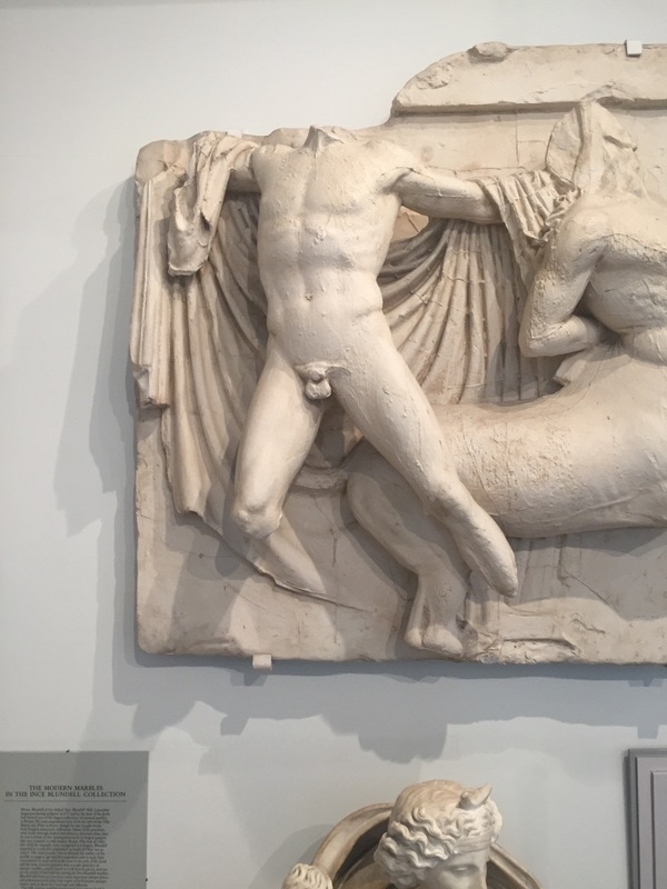
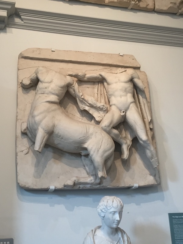
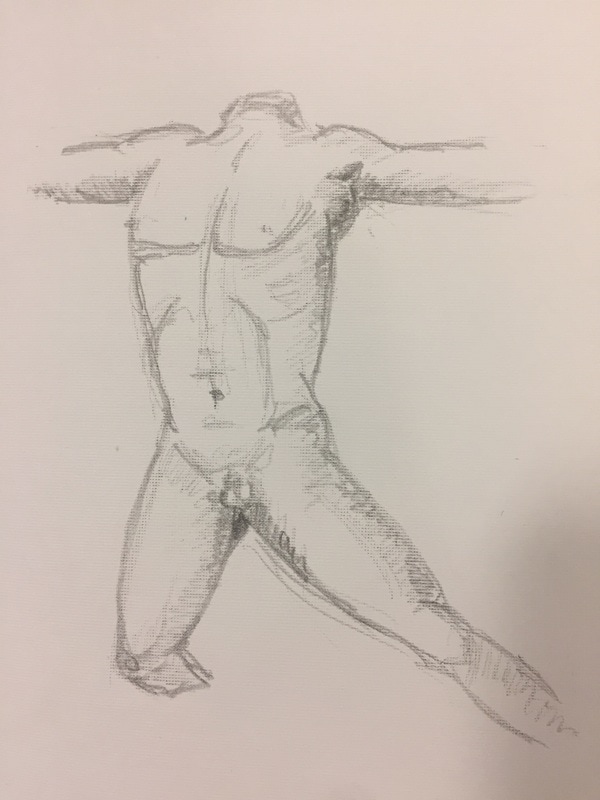
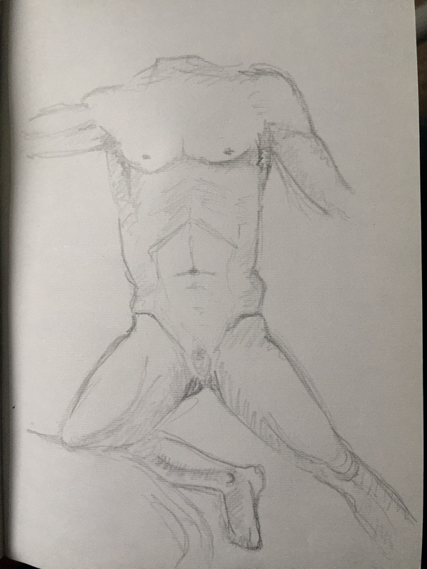
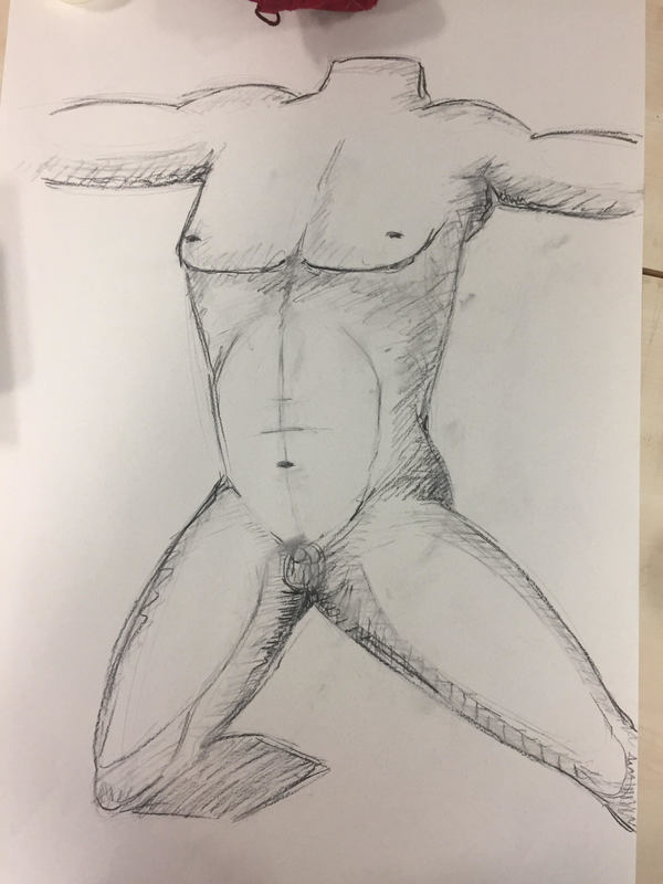
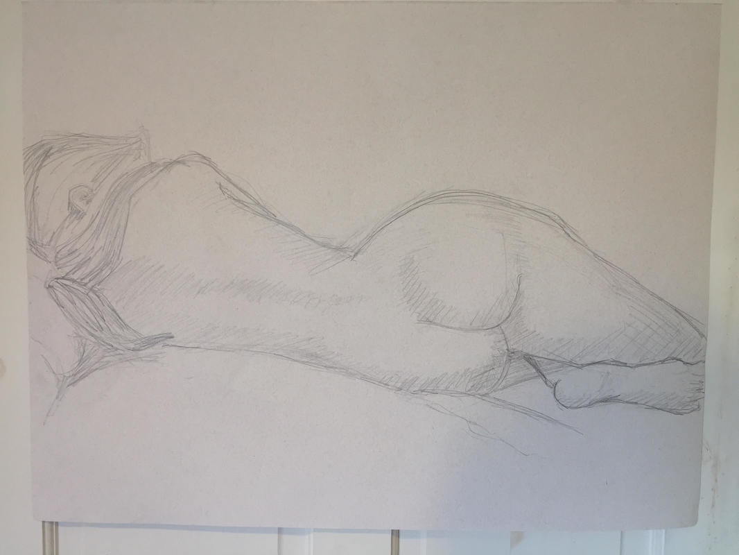
This drawings are in a very small scale. I did it on Liverpool´s Walker Art Gallery. My favourite and the best is the first one, has the best proportions, shadows and I also like the position, but it is very simple because of the time I had to draw it, which was really short, as it happened with the next two drawings. I must say this three drawings were really difficult as we can appreciate in some parts because the portraits were sculptures. Pictures are much easy to draw as they are already in 2D, but I think I captured really well the 3D after erasing everything several times. The easiest part of this drawings was the scale. As I took a din a5 sketch book, the scale of the drawings were very little.
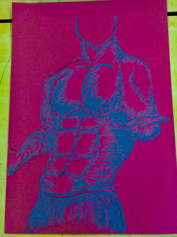
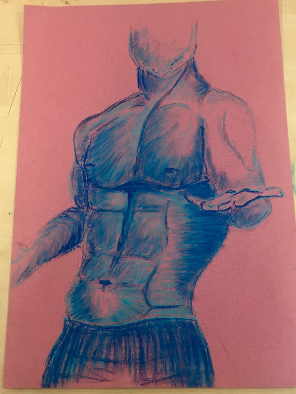
This second drawing is just copied from the fist one, as it is a very big drawing copied from a very little drawing, there are many muscles and details that were very complicated, and as I did just wanted it to fill it with letters and graffiti, it finished very sketchy. 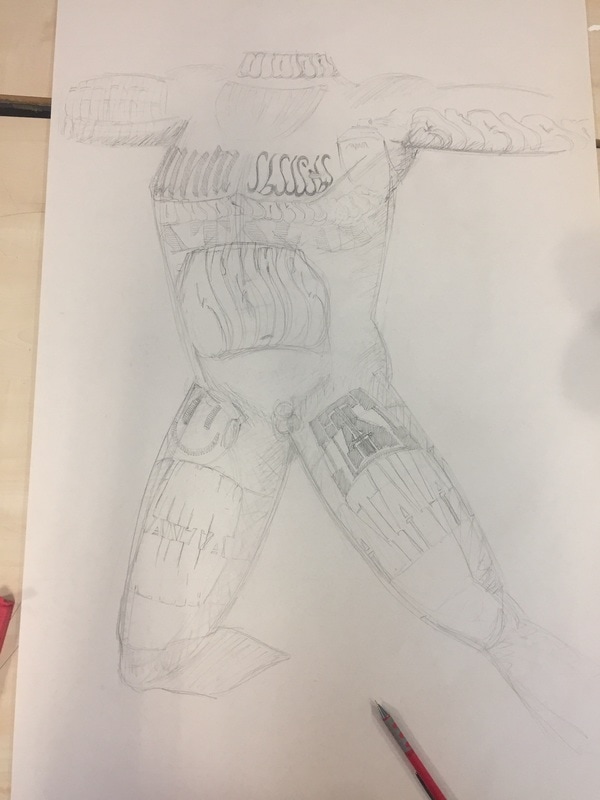
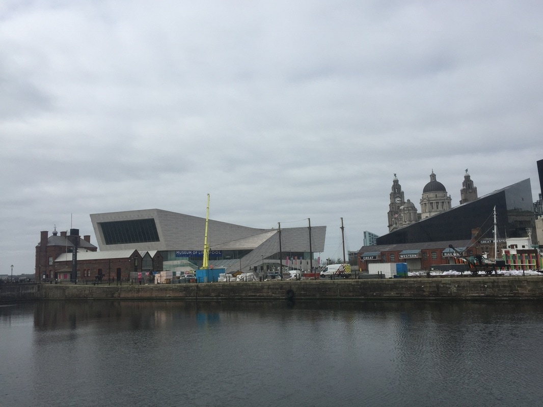
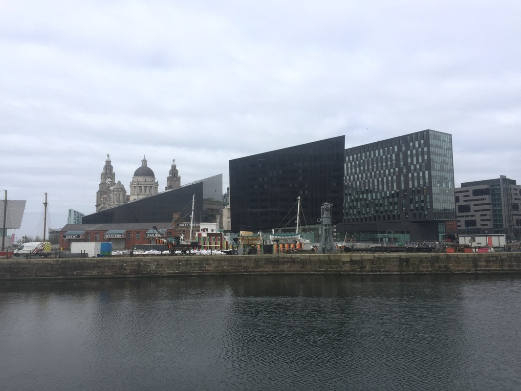
I also did this two photos on the trip to Liverpool because it´s similar to what I have done. This is architectural and mine is painting, but both are combining old art with the modern art, and when things are done correctly they can combine in a perfect way. Here in the photos, they are combining the old church with very modern structures such as that long white building. Paragraph. Haz clic aquí para editar. 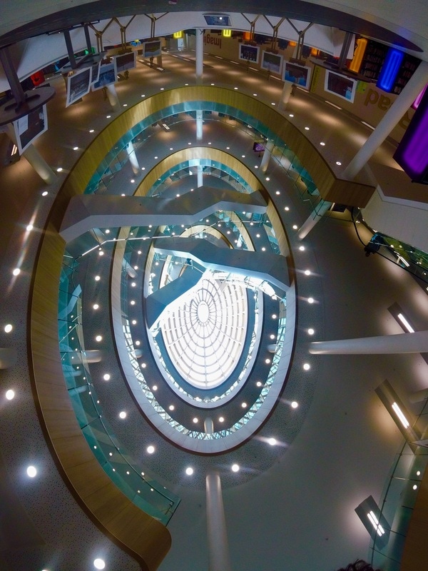 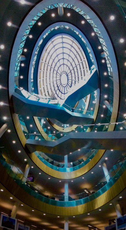
 START OF FMP
0 Comments
|
AuthorWrite something about yourself. No need to be fancy, just an overview. Archives
June 2017
Categories |
 RSS Feed
