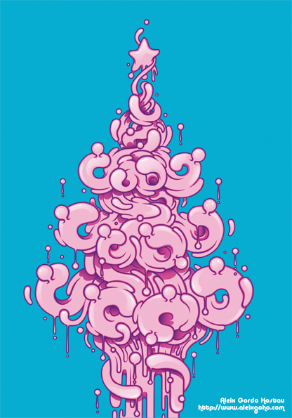
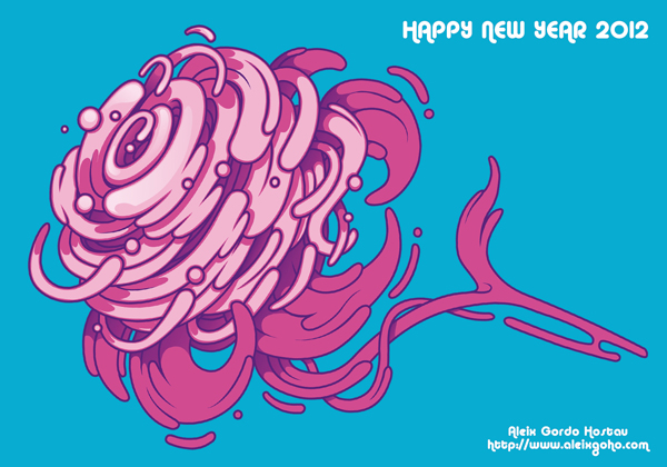
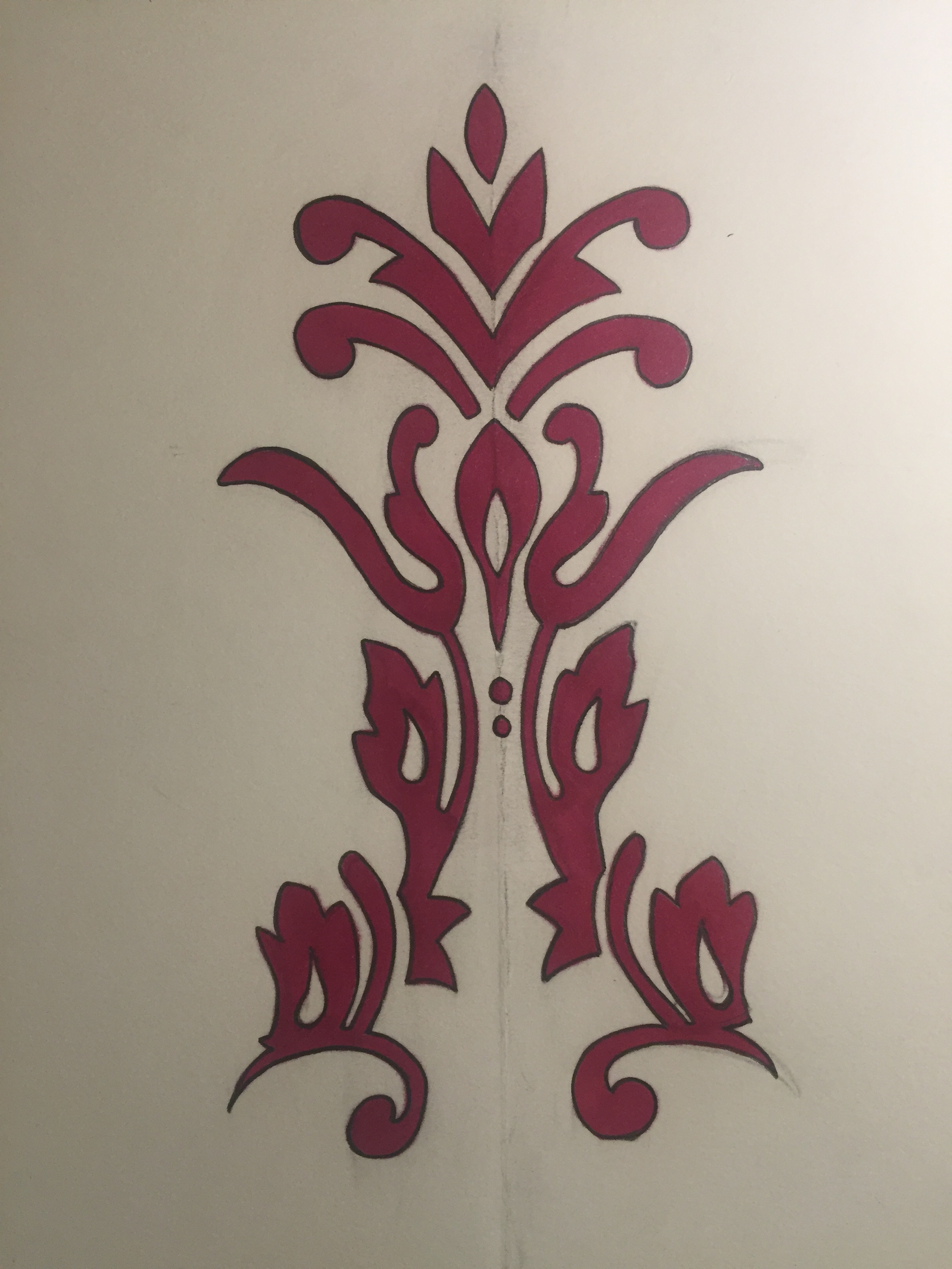
Aleix Gordo HostauFor my christmas card, I´ve used Aleix Gordo as the author to copy. He use to do softy drawings, using sometimes the same pattern for doing water, animals, monsters, wine...He also does often paint things melting. I don´t really like some of them but they are really creative and strange.
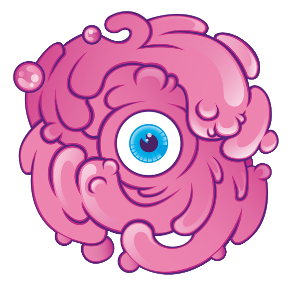
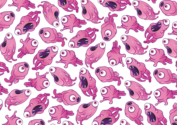
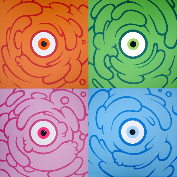
The most characteristic drawings about Aleix Gordo are soft and melty pink masses, which look like monsters. He has done lots of different types, colors, shapes and hights about them and its very curious and interesting.
He has done lots of posters, t shirts, murals, some New year cards and even a Christmas card. Here I´m showing just his cards which I think it´s the most important and what I´m focusing on. I like very much this cards, I like how he has combined colors, the shapes and that fine lines or threads because the complete composition is really nice to see, in my opinion.
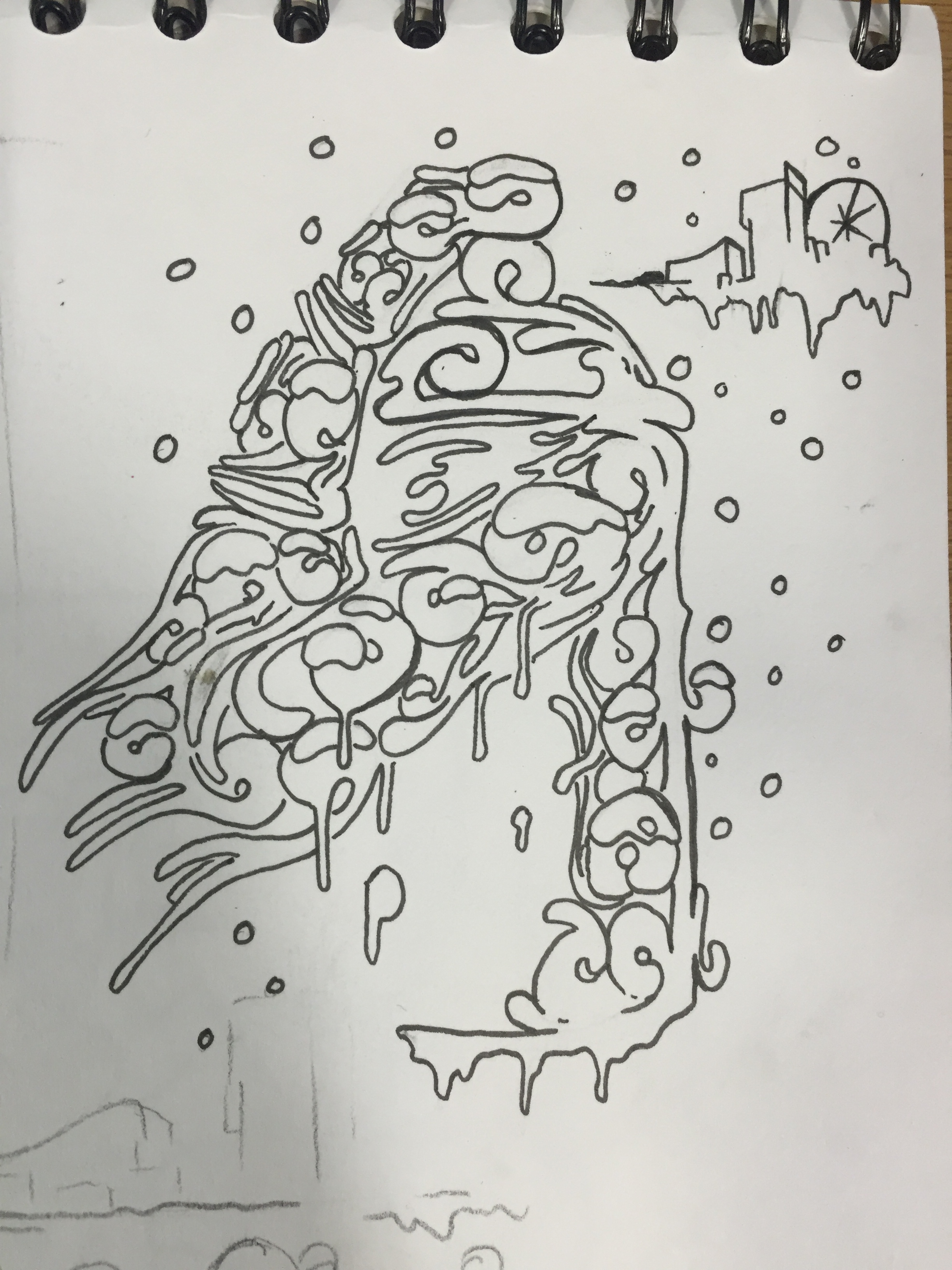
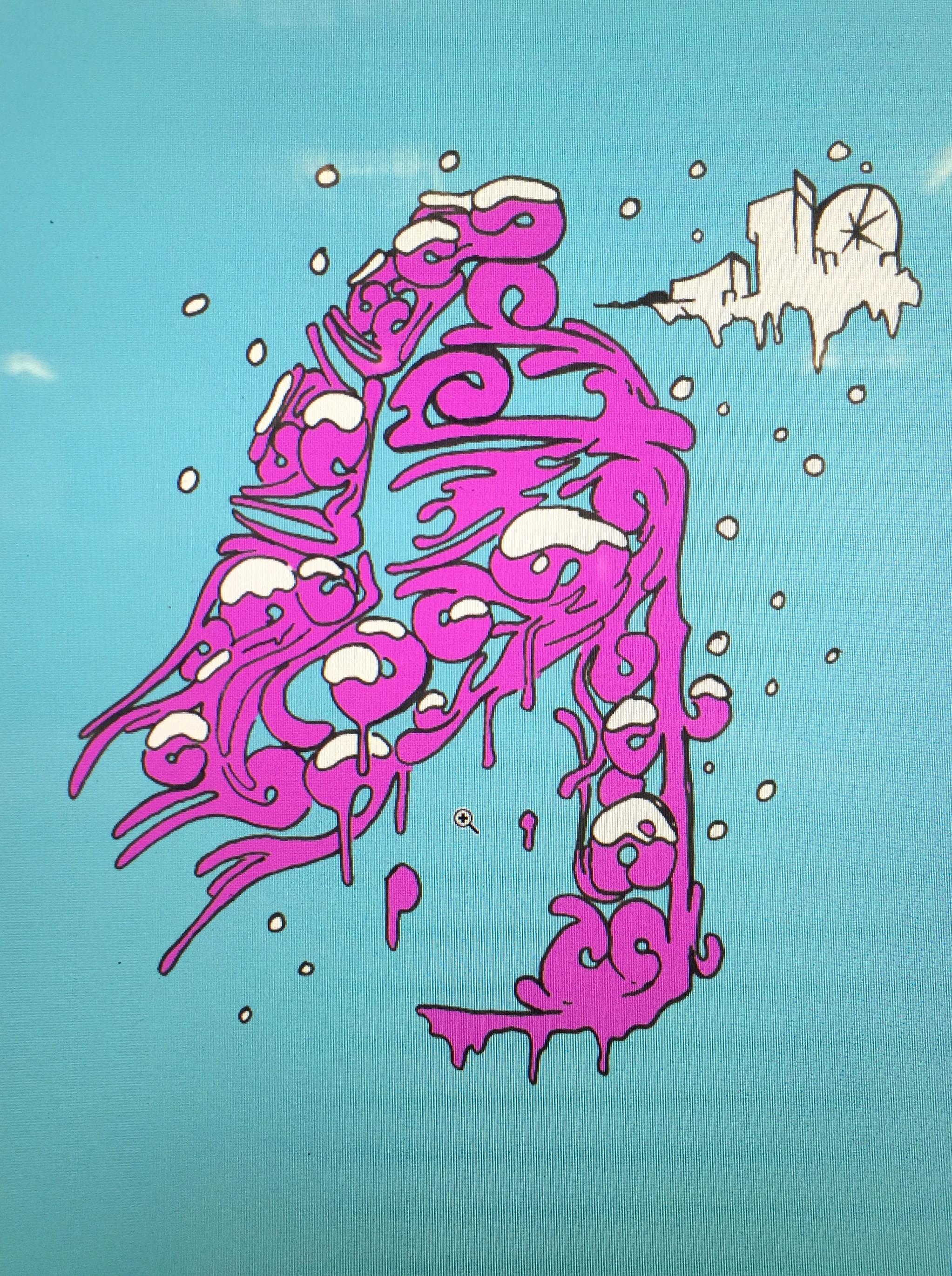
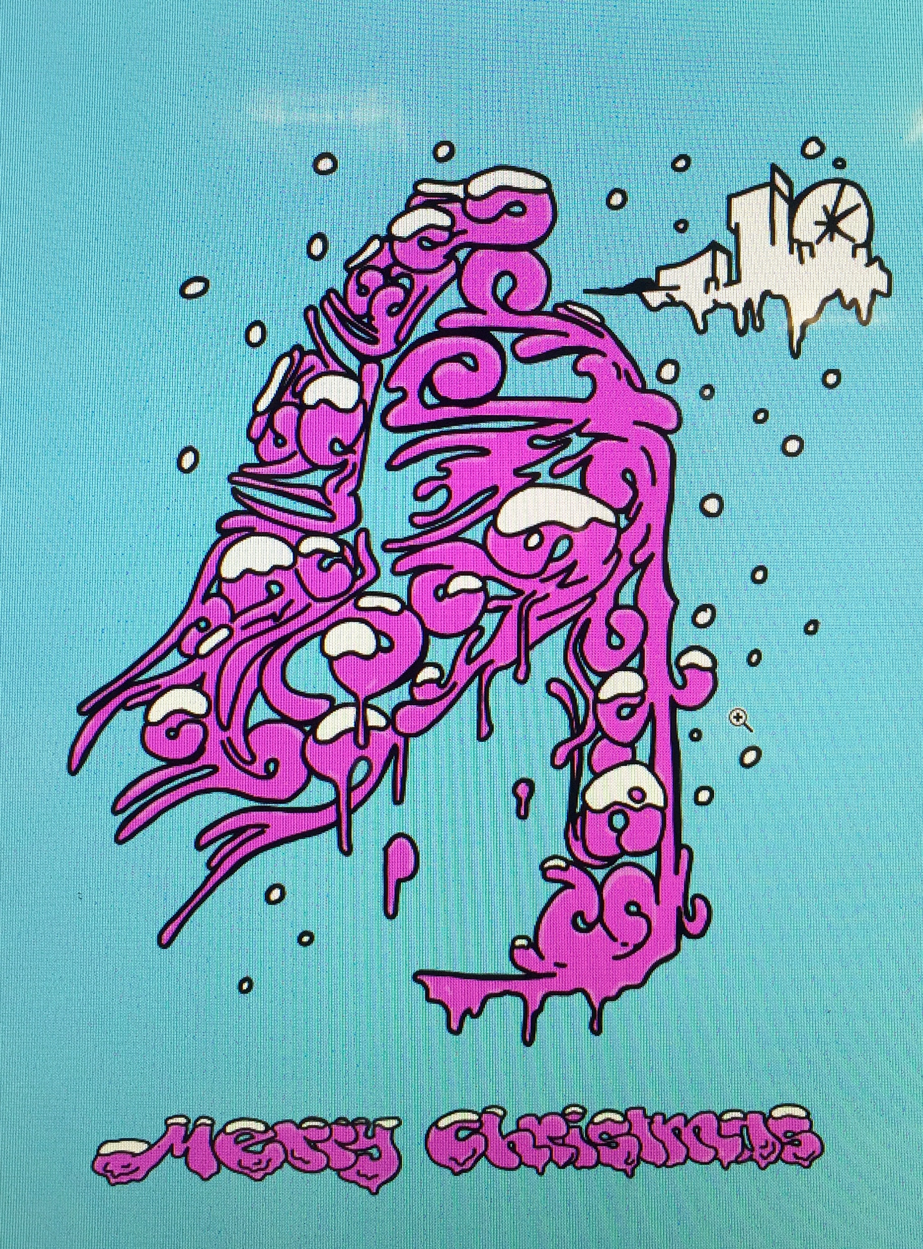
I found he was spanish when I started researching him. He is from barcelona so I decided to chat him and try to ask him if he liked my drawing, and if any improvement could be made to my Christmas to have it perfect, and he answered me telling a bit of light pink to give volume so I did it. I think if the artist which you are copying, corrects you, its the best way to improve because it is just his style and nobody will know better than him. Here is my final Christmas card, with its evolution.
0 Comments
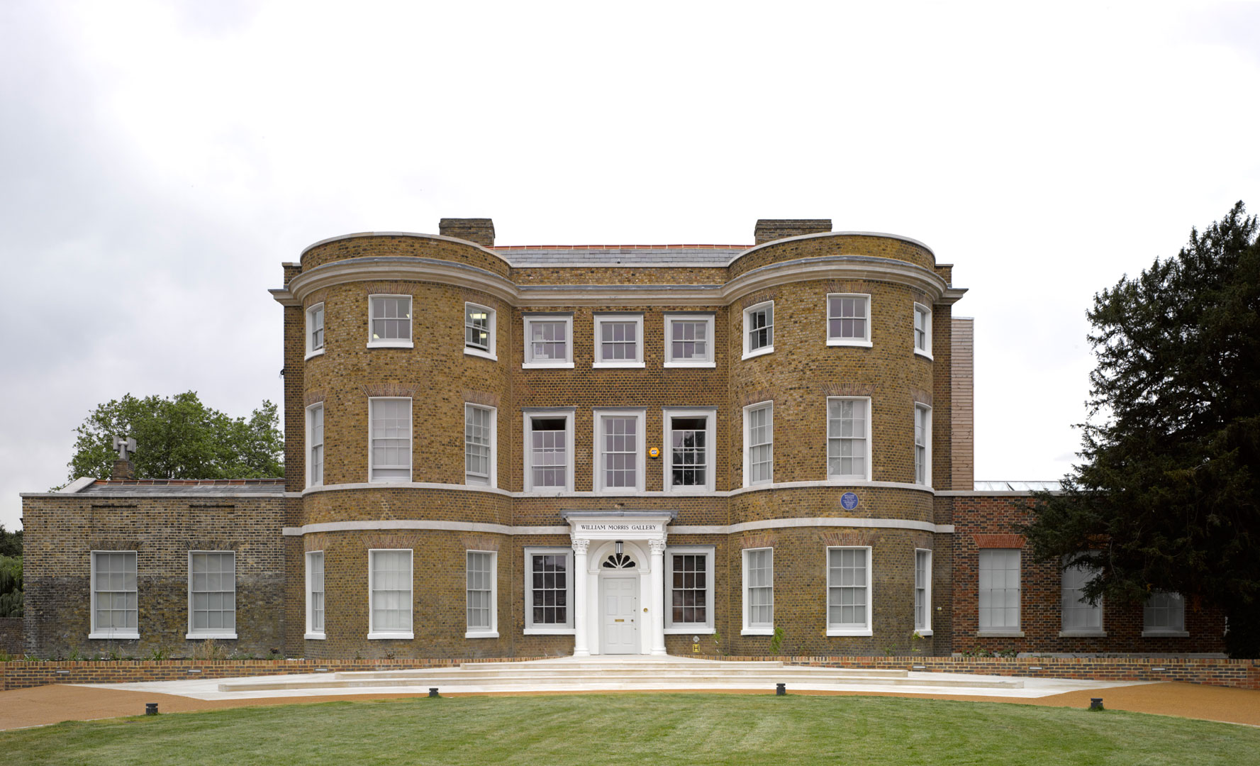
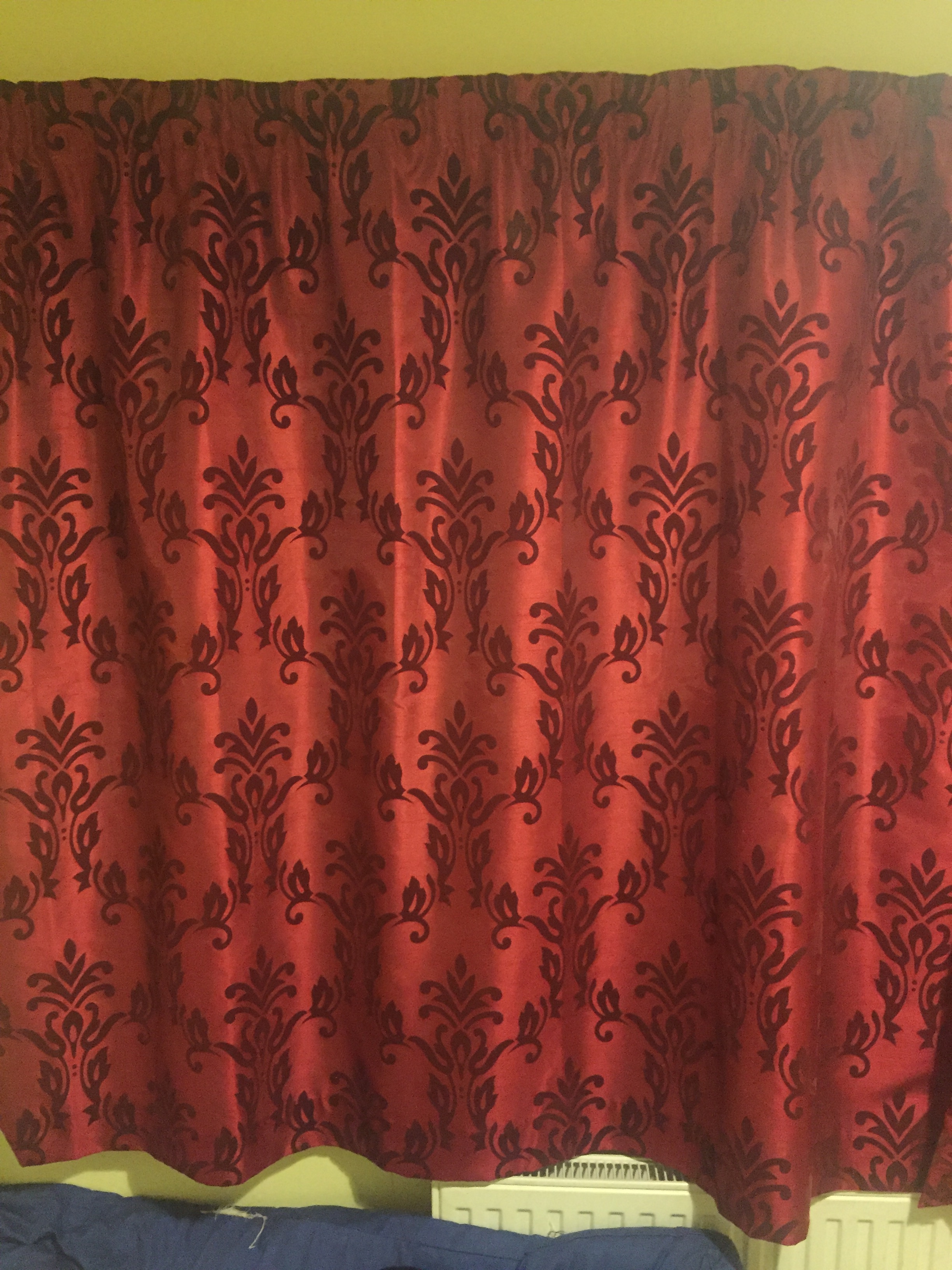
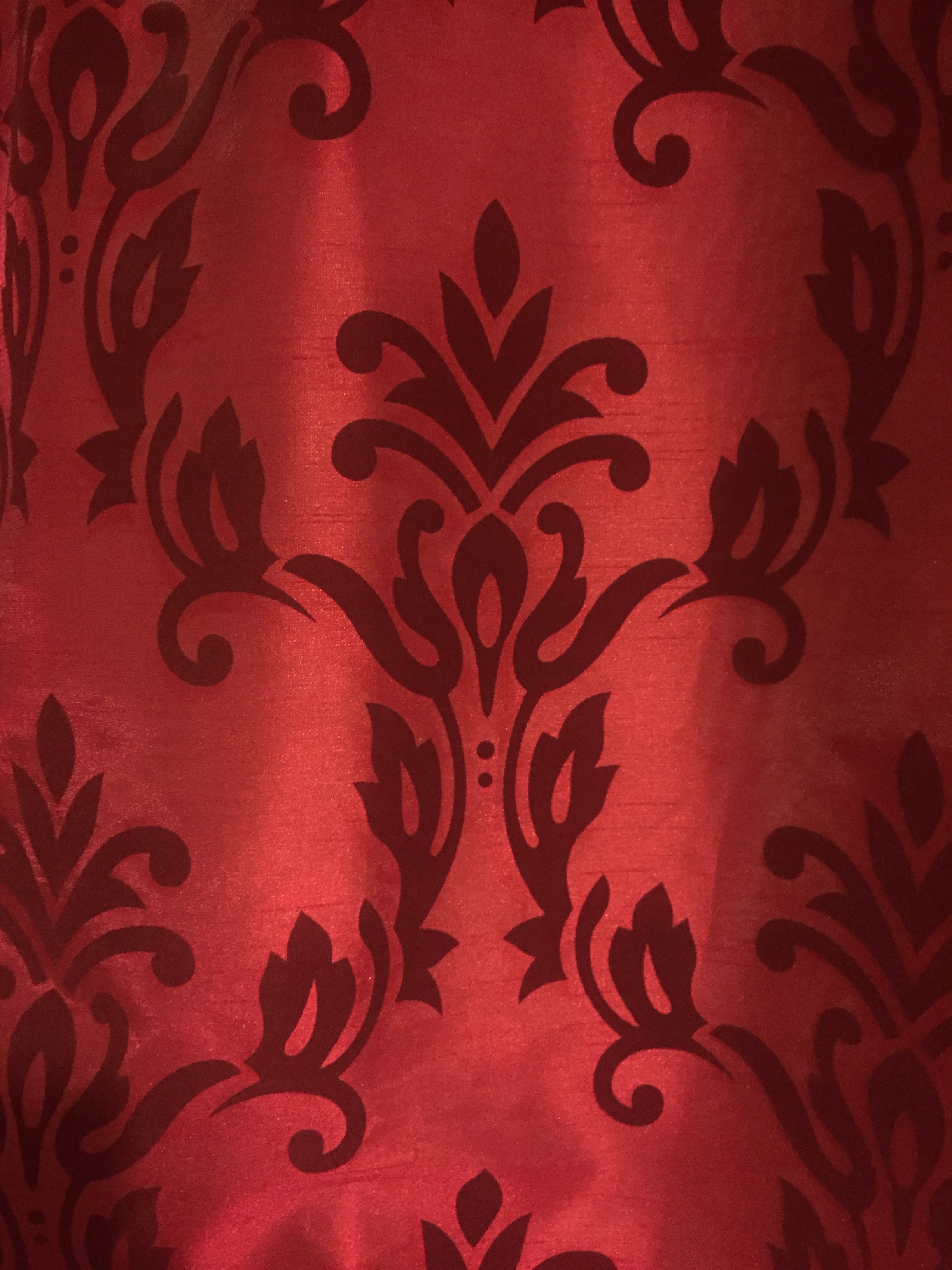
1- The Arts and Crafts is an art movement originated in the end of the nineteenth century. The most characteristic person in that movement was William Morris, a multifaceted person who wanted to get back medieval arts and crafts, denying newer ways of mass production. Arts and Crafts was a movement of huge ambition for the modern architecture which embraces its design and creation, from enamelled houses to churches and from Budapest to California. 2- This movement was important because it is the start of all the modern design, architecture... Improvement in mechanic and sculpture were very important in that period. Arts and Craft´s artists gave a new value to the mechanical and applied arts. 3- WILLIAM MORRIS William Morris was the most representative author of the Arts and Crafts movement.. Morris was born in 1834 on a wealthy family so he went to the Oxford University. He was a multifaceted person but architecture was his principal activity. He was member of the Pre-Raphaelite brotherhood which stayed artisans as artists, like in the medieval times. It rejected any type of industrial production in decorative arts and architecture. Unless he did mainly architecture, he was very well known for his pattern designs, which have been so famous that it's used for lots of curtains, carpets, clothes... that type of pattern is called Liberty. Some of his most famous pieces are: - The Red House, St Martin's Church, Smeaton Manor... as architecture. - Honeysuckle, Trellis, Acanthus, The Saladin...as pattern designs.
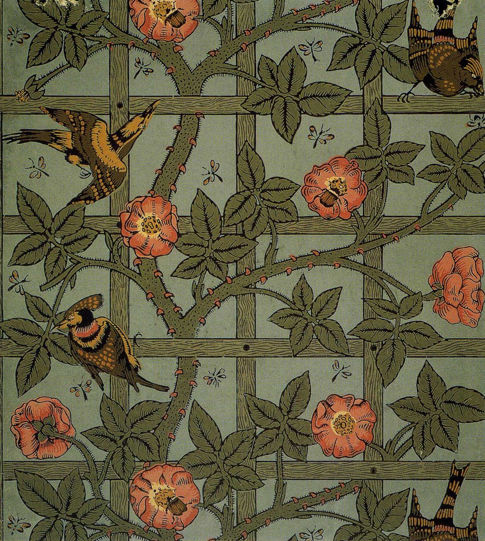
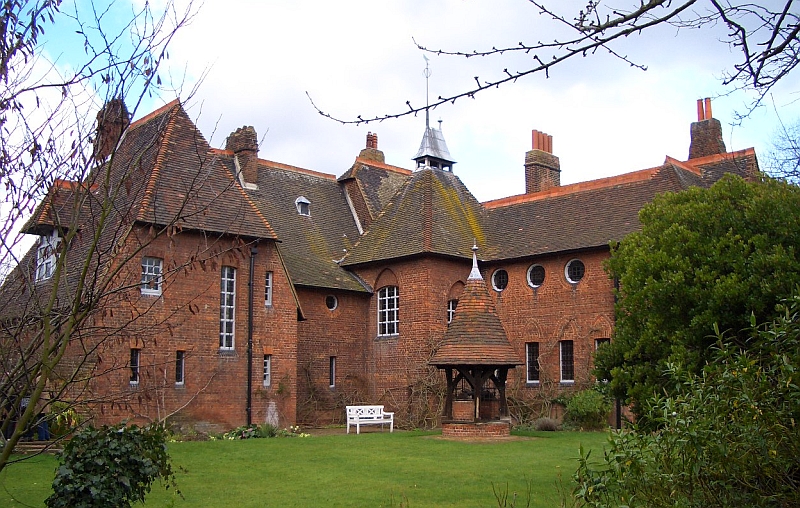
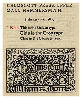
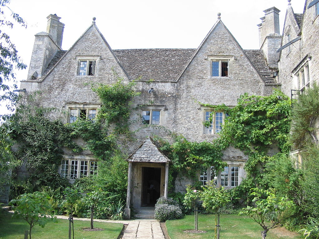
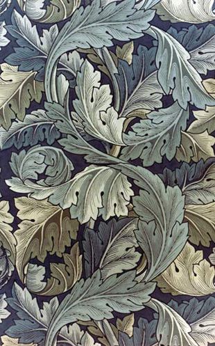
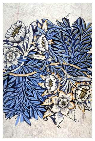
- This is Morris' work and is called Trellis. I like from this picture the continuity of the roses, which can be linked one each other, using just a frame, roses and a few birds, using green, yellow and red. He uses a frame with squares which look like a grid. It looks like if the whole drawing is a part of a pattern, with squares as I said before, lines going uphill curving all around the way and the roses which are like circles. He has used nature because in the Arts and Crafts, which copied medival used nature motifs for the mosaics. I've chosen this image for the book because it's in my opinion one of William Morris's best designs. - This work is called Acanthus and its for sure , one of my favourite designs of Morris. In this image I like every single part of the drawing, even the colours, which are cold, mixing both dark green and blue, or the shape which is a curved line going up like an S, that can be intuited with that branches or leaves, it is also a pattern which can be continued one and another time to make a mosaic. I have chosen this image because its my favourite. It has a lot of movement with that leaves shaking and going round like an ivy. - This work is called Tulip and Willow, and is also one of my Morris's favourite pieces because I like how he has used color, and shape. About colors, he mainly used blue, light and dark and a bit of yellow, which makes big contrast between them due both are primary colors. Here there is also pattern and lines, which are shape, that go round making circles throughthe drawing with branches. Again, he has used natural motifs due to the gothic revival of the medieval arts. I've chosen this picture for my book because its quite interesting, it looks like it hasn't been finished and is the only one which seems it can't be gathered with othes ones. - This one is a design William Morris did for the Kelmscott press when he moved in1891. The title has been made with gothic letters with lots of ornament like branches occupying most of the surface due to the Gothic revival as I explained before. This picture is the first which doesnt have color and form, but it has shape, with a big rectangle in the bottom in which there is also another rectangle a bit smaller where he includes the gothic letters. I like very much Gothic style, its architecture trying to reach the sky, but even more letters, Gothic letters are really difficult to draw but the result if you're good it may be beautiful. - With this picture I start explanining about Arts and Crafts so, first of all I must say I don´t like architecture of this movement. I´ve chosen it because it is the most representative house of Morris. This piece is called the Red House, it was the wedding present for his wife. You can appreciate in some way the similarities with Gothic as in the windows which are very thin and high. As it is architecture trhere is obviously line and shape, for example the round windows. - In this picture, Im going to say very similar things as berore, it is probably the second most famous piece of morris. This house is called the Water House. It does also use line and shape but in a different way, lines are now round and shpes the same, not trying to be high and bearded, includding now simetry and squared windows. CHARLES RENNIE MACKINTOSH Charles Rennie Mackintosh was born in Scotland in 1868. He was an scotish architect, designer and watercolouring, which had many importance and was one of the most representative authors in the Arts and Crafts movement. He became famous in the Vienna Secession in 1900 after exposing his furniture. There, he became part of a group called " The four " of Glasgow. As a designer, he is characterized for using geometric shapes, cubic spaces and groups of straight lines, he liked to use ascendent lines. He did always usedsimetry and asimetry, from his wardrove to the School of Art´s wall. Mackintosh also did important clothing patterns, which were really colourful, that patterns could be the anticipate of the Art Déco movement. Some of his best pieces of art are: - The Hill House, the Mackintosh House, the Queen´s Cross Church, the Glasgow School of Arts...this is just the architecture, but but he made a huge variety of different fields.
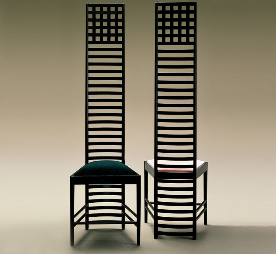
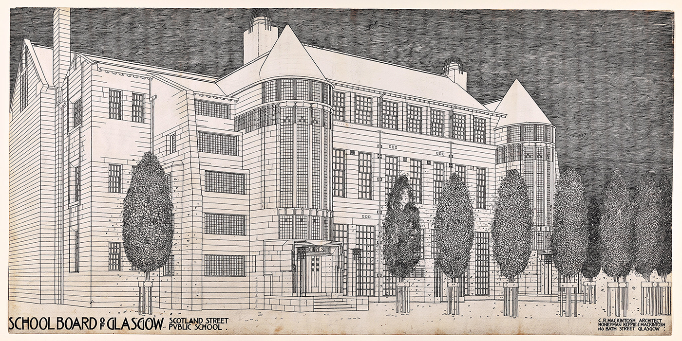
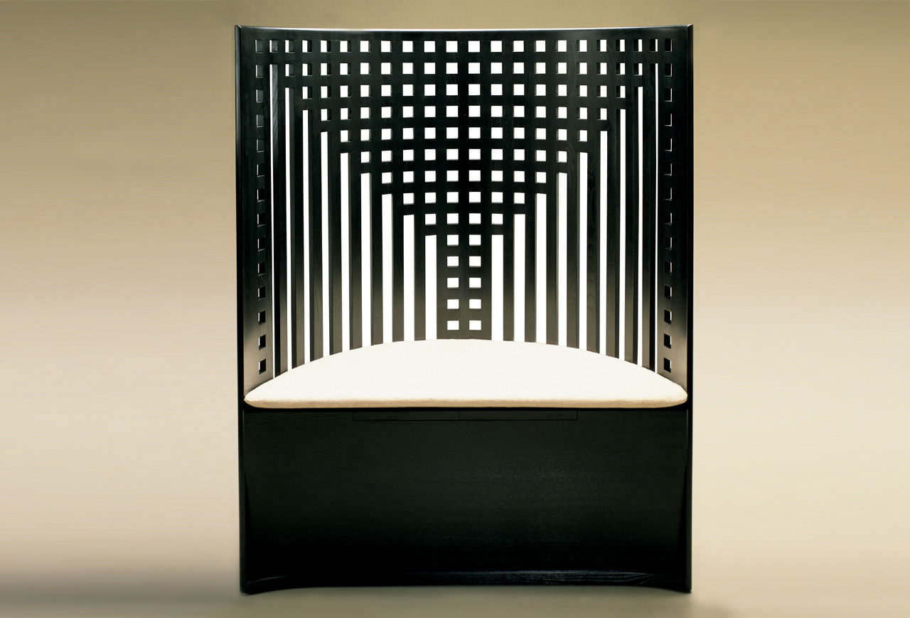
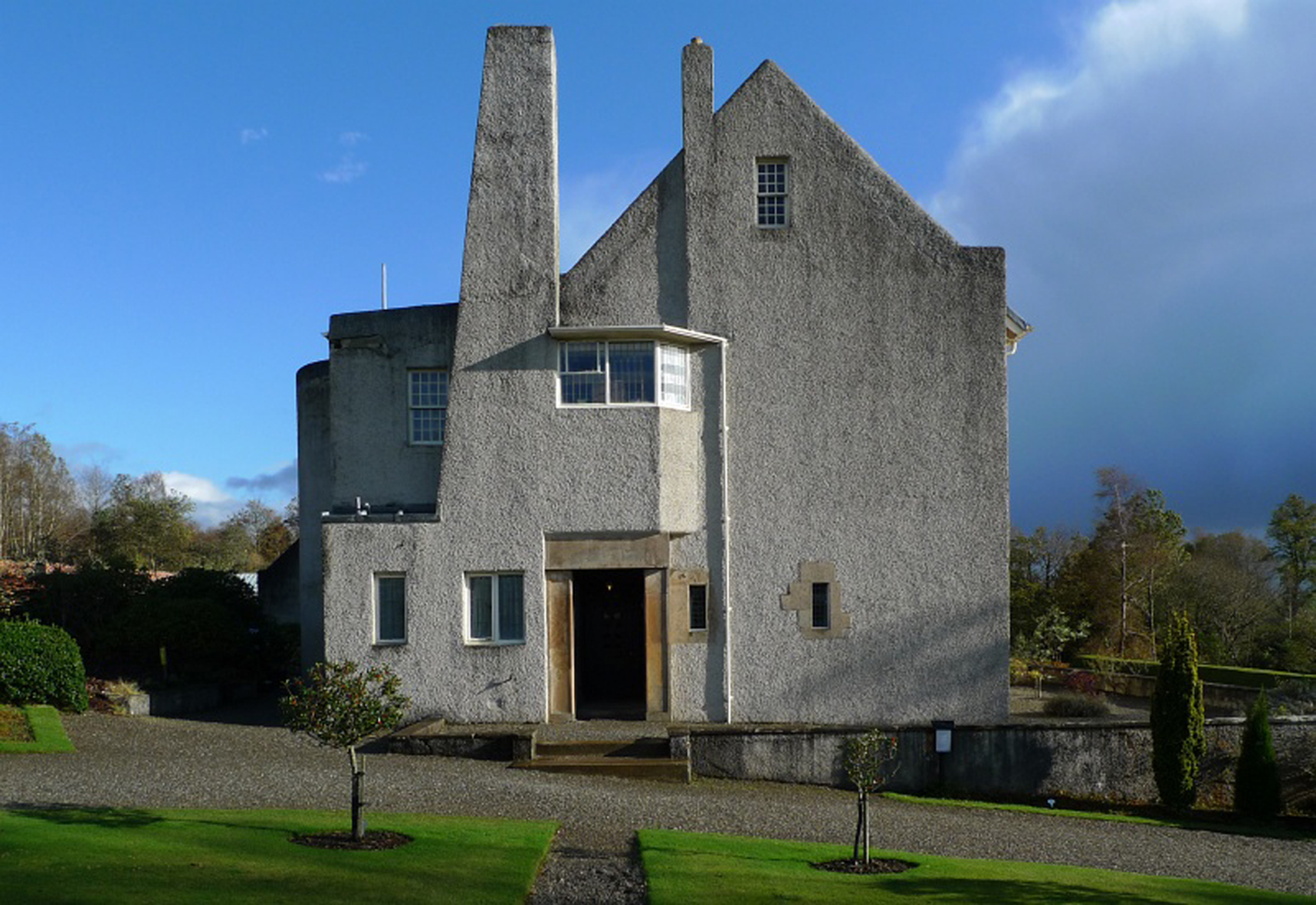
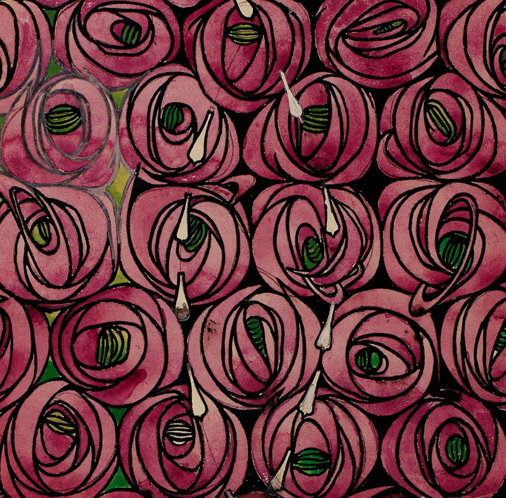
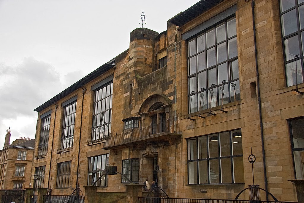
- The first four pictures from this artist are very similar, they are all of them chairs, there are just some few variations between them. The most well known chair is the fourth one. I have chosen this pictures because they are the most characteristic objects of mackintosh, they are very famous all along the wold and have been used for many important places, it was with a chair exposition when he became famous. He uses geometic shapes like squares, rectangles to make beautiful compositions. All the lines are very important and useful, color is also a key fact in his pieces unless there is very few, but very well positioned. I have decided to included in my book because it is my favurite part from him. - The roses design is also one of my favourite designs in all the Arts and Crafts movement, even apparently it seems to be the easier one. When I first saw it I was completely sure it was going to be in the book so I didn´t even have to think about it... Here, in this design, all the visual elements are important: Color is basically the most important because without it, the design would be nothing, the combination between pink, rose and light green makes a big contrast. Shape is aso very important in this composition, that drawing of roses with an apparently continuous line which makes the petals. The last one, pattern, is also very important because it seems to be designed for clothing, or curtains... - This is an architecture piece, the name of this piece is The Hill House, I have chosen it because it is one of the most important Mackintosh´s architechtonical pieces. The most important visual elments in this house are clarely form, shape and line, the entire house, or the principal facade is made with different bodies going out or in, which are all different shapes. There is not color apart from gray and line, and no pattern. - Both architechtonical pictures left are the same building, the School of arts in Glasgow, it was one of his best works in architecture. This building is touching both sides of the art movements, Arts and Crafts and Art Nouveau. That is because of that shapes of the building. So you can imagine shape and form are some of the most important again, and again color is not used. I have chosen this image because its one of the Mackintosh´s most important pieces. CHARLES ROBERT ASHBEECharles Robert Ashbee was born in 1963. He was a designer, entrepreneur, and one of the most characteristic authors from the Arts and Crafts movement. Ashore studied in the Cambridge University between 1883 and 1886. He was student of the famous architect George Frederick Bodley. In 1888 he establishes the Handicrafts guild and school in Whitechapel, London. His specialities were forge, jewellery, enamel and furniture with the will of embracing the entire of the interior design program. Here there are some of its best works.
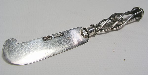
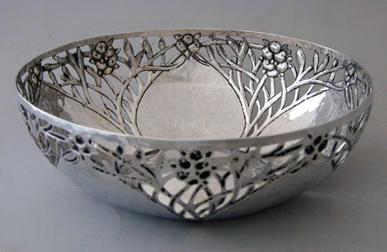
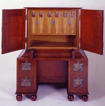
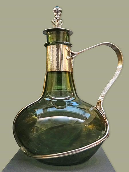
- About this author I have chosen the knife. Charles Robert Ashbee didn´t put names to his pieces so I just name the object. I´ve chosen it because I think it is something beautiful. And I think this is a very hard mind work, because to reach the conclusion of making a knife´s handle with lines going in spiral with a ball in the center. I think this is the type of art that shows really its own creativity, doing pretty pieces in single and absurd objects. I think I could compare in this situation with graffiti, I´ve never painted on a wall but I´m always thinking were to paint, it could be a lighter, old sunglasses, my personal and other peple phone covers, headphones, clothing... - This object I haven´t clearly decide what is it, it could be a hasp, a brooch or just a decorative object. The object is beautiful, how he has made the composition , colors, and the shapes are strange, it is different to all the rest objects. I have chosen it because I really like it, its reflecting the Arts and Crafts movement at its perfection because it is a simple object, transformed into art just with metal and crystal, in my opinion. - This is similar in some way to the first of Ashbee´s pictures, because it is a normal object which everybody uses normally, converted into an incredible piece of art. I have chosen this picture because it reflects very well this movement, showing branches as lines which interlace between them making the bowl. The bottom of the object may be a flower I think because we just see some petals. There is no colour used in this piece, just the silver of the metal. - This picture is my favourite piece about Ashbee, I have taken this image for the book because it reflects cleanliness, simplicity and the care of art. It is a green and round bottle, which is very flat, with a golden string which seems to be a liquid, that goes around the bottle making safety the hang. In this piece the most important visual element is line, as a string and color, mixing the green bottle with the golden hang. At the top of the bottle, the plug , is the most complicated part from the whole piece, looking like the fume of an elixir or something similar. - This is a furnishing, which I don´t like it very much, and even less when I compare it with the other pieces. I personally think it is very heavy or big. If it is going to be a daily life object, useful, for yur bedroom, it should have been more light and occupy less in my opinion. The artist has used natural motifs to decorate the furniture even in the outside and inside. Form and shape are the more important visual elements, color is just dark brown, and light brown, and there are no lines in the piece. AUGUSTUS PUGIN Augustus Pugin was born in 1812, he was son of August Charles Pugin, who trained him to draw Gothic buildings, which he would later use for his books. This was the key for him to later on be the leader of the Neogothic architecture. Pugin had two main rules for designing: - First that there should be no features about a building which are not necessary for convenience, construction or property. - Second, that all ornaments should consist of the essential construction of the building. In 1834, Pugin was payed for restoring the Westminster Palace. Some of his most famous Arts and Crafts pieces were the Windermere train station, the Granville chair, the doors of St Giles...
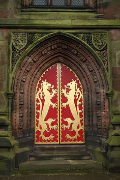
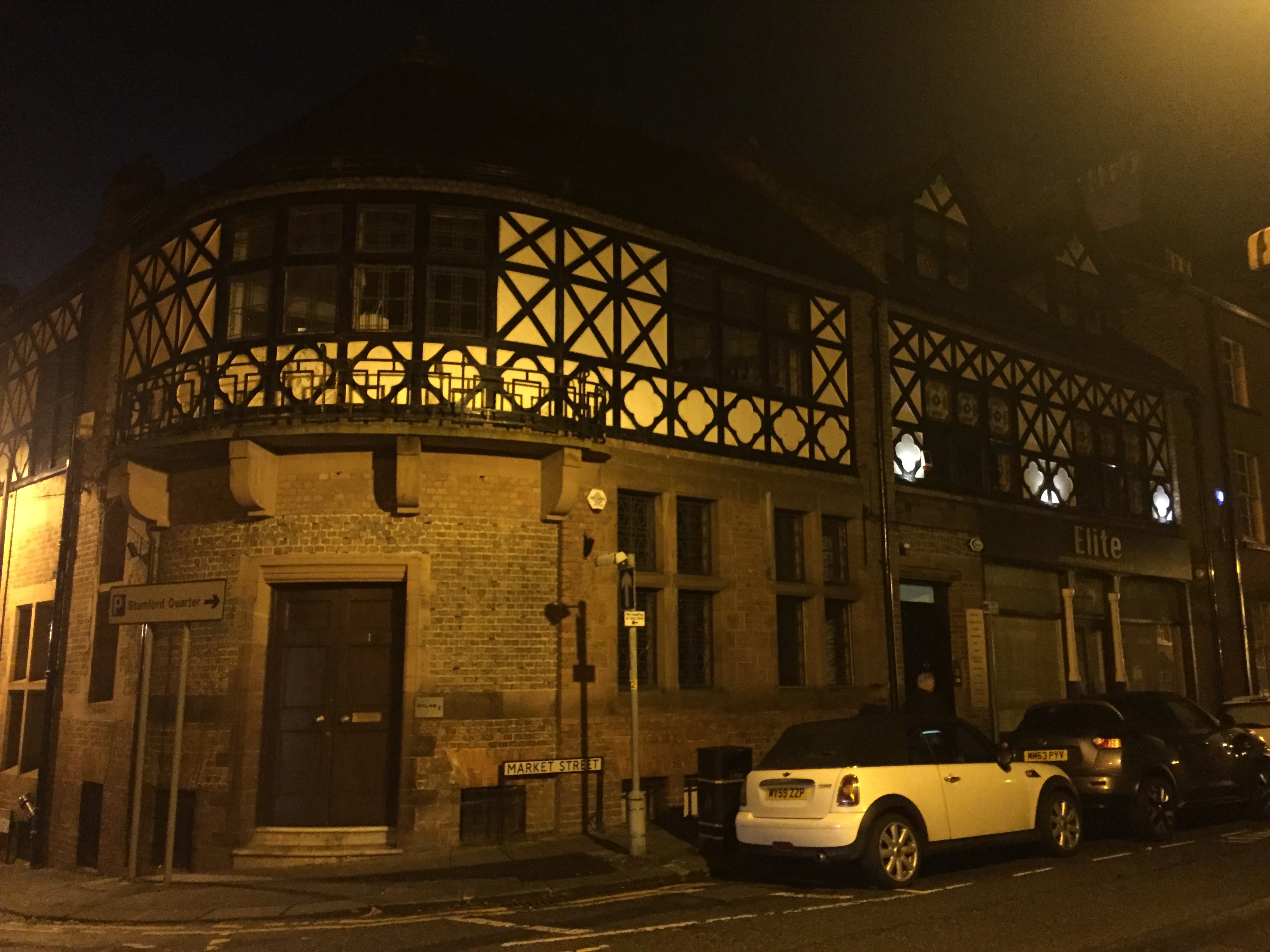
 - I have chosen this picture because it reflects perfectly the return to the medieval, exactly the Gothic, and in this picture you can see all the Gothic characteristics. The door ends in peak, trying to apparent high... The main visual element in this picture is color, it has a very nice red for the backgroud which contrasts a lot with the golden lions. This two colors were also very used in medieval times. Form is also very important in this pic because this two lions are really worked and try to look also as medieval. There is no pattern, and shape in this image. - This picture is a design, it has been made with natural motifs, as flies and flowers, so we can see again where does it come from. I have chosen this image because I like it very much. In this picture shape is very important which are squares formed by the flies wings, form is also important for the flies to have look like flies. Color is also part of this drawing, being all the background of a golden color. And finally, pattern is also a visual element in here, because you can see all the sides end the same, so they can be mixed. I've chosen this image because unless it is another pattern with natural motifs, it's different from the others, for example this just has one layer, the others were different layers overlapped and interlaced between them. This one is another design, this design is very common to see it nowadays, mainly in stained glass windows, but also in cups, mugs, carpets... I like this piece, that's why I've chosen it. Color is in this design the most important visual element, as it uses pink and fuchsia for the roses, green for the leaves, brown for the branches and black for the background. Shape and form are also in this design but not so clearly. Pattern is also here because it has been made for reocurring the image several or infinite times. We come back to furniture, this one looks like a desk, because when you open both doors, a wooden board goes out. I don't like vey much this piece, but Pugin was also known for his furniture so I had to include something. The author has used line and color to decorate the furnishing - This is the last picture, it is again furniture but now the object is a chair, unless it is Arts and Crafts as Mackintosh, is completely different. This one is heavier, bigger and in my opinion it doesn't look as good as Mackintosh's but I like this one. Here Pugin has used form, to give that shapes to the chair, shape and color, with that wooden tone, it looks really ice. I've chosen this picture to compare two types of chairs inside the same art movement. 4- I´ve chosen the Arts and Crafts movement because I really like it. I like the motifs they usually use for doing mosaics or designs, thinking about how to interweave all that leaves or trees or flyes... it could be infinite putting one next to other . How they decorate a wall, a house or a door... I like it very much also because when you see it, you can appreciate the creativity and the work the author should have made to create that piece. Not like for example Dada, which was " no rules " so the solutions of the drawings were not so beautiful. 5- My favourite author from this movement is Charles Rennie Mackintosh because I like so much his chairs, its the best part of Mackintosh in my opinion. I also like very much his drawings and enamels but the chair selection is beautiful.The only part which I don´t really like very much is the architecture, in general in the Arts and Crafts movement the architecture isn´t my favourite, even in Mackintosh. In the rest he has the first place for sure. 6- To take my visual language I´ve gone to Manchester, and I have taken some photographs of Arts and Crafts examples such as this: 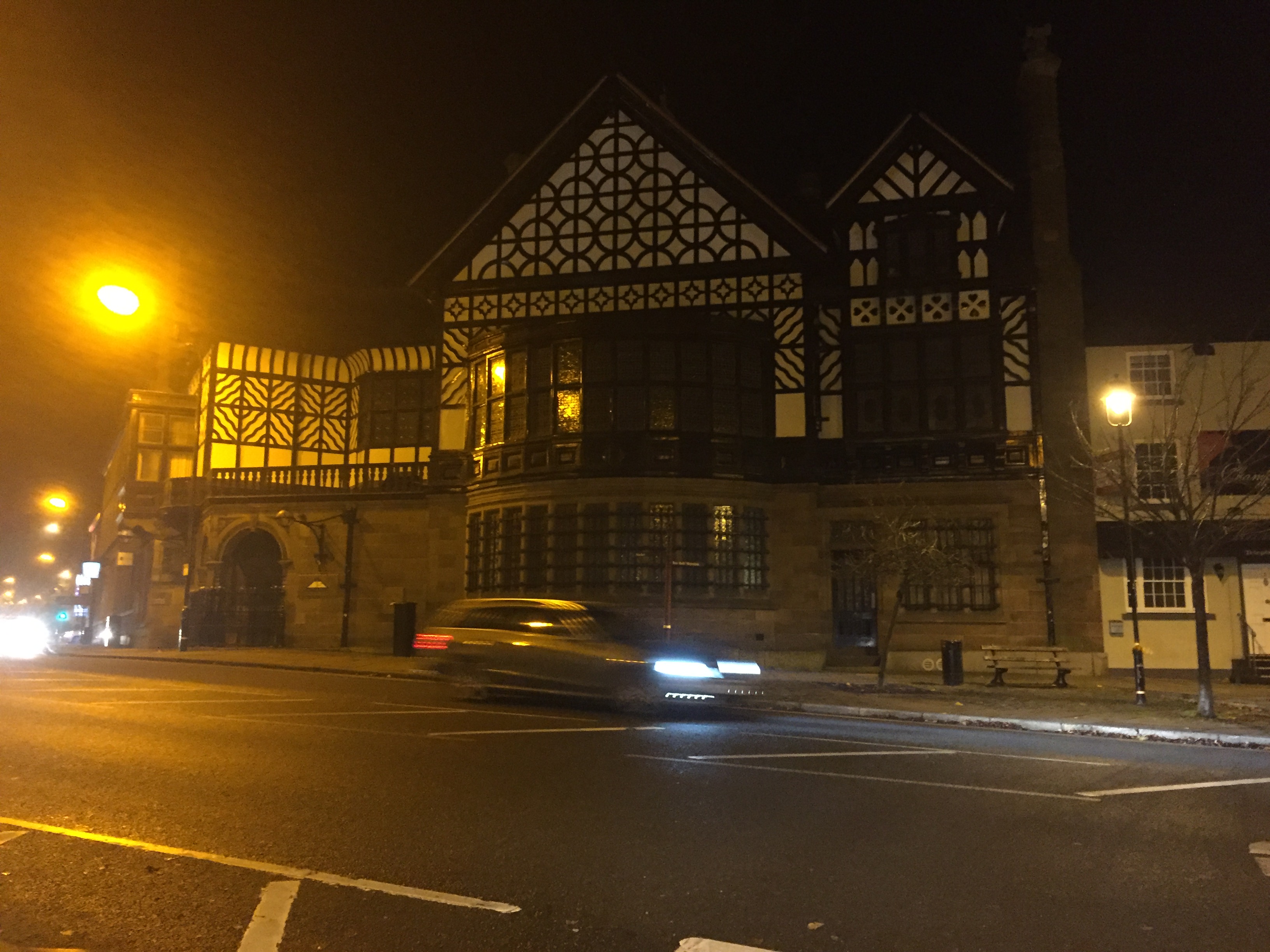
- I have taken that example of Arts and Crafts as the principle because it is the biggest example of the movement I have seen. The whole facade was completely full of Arts and Crafts decorations. Then I have drawn some of them and I have also invented some of them trying to recreate the mosaics and patterns with lots of colors. I 've enjoyed trying to see Arts and Crafts in our daily life because there is much more I thought before, and I think now on I'll see it easier because when I started walking I didn't see anything and when I was finishing I saw lots of things 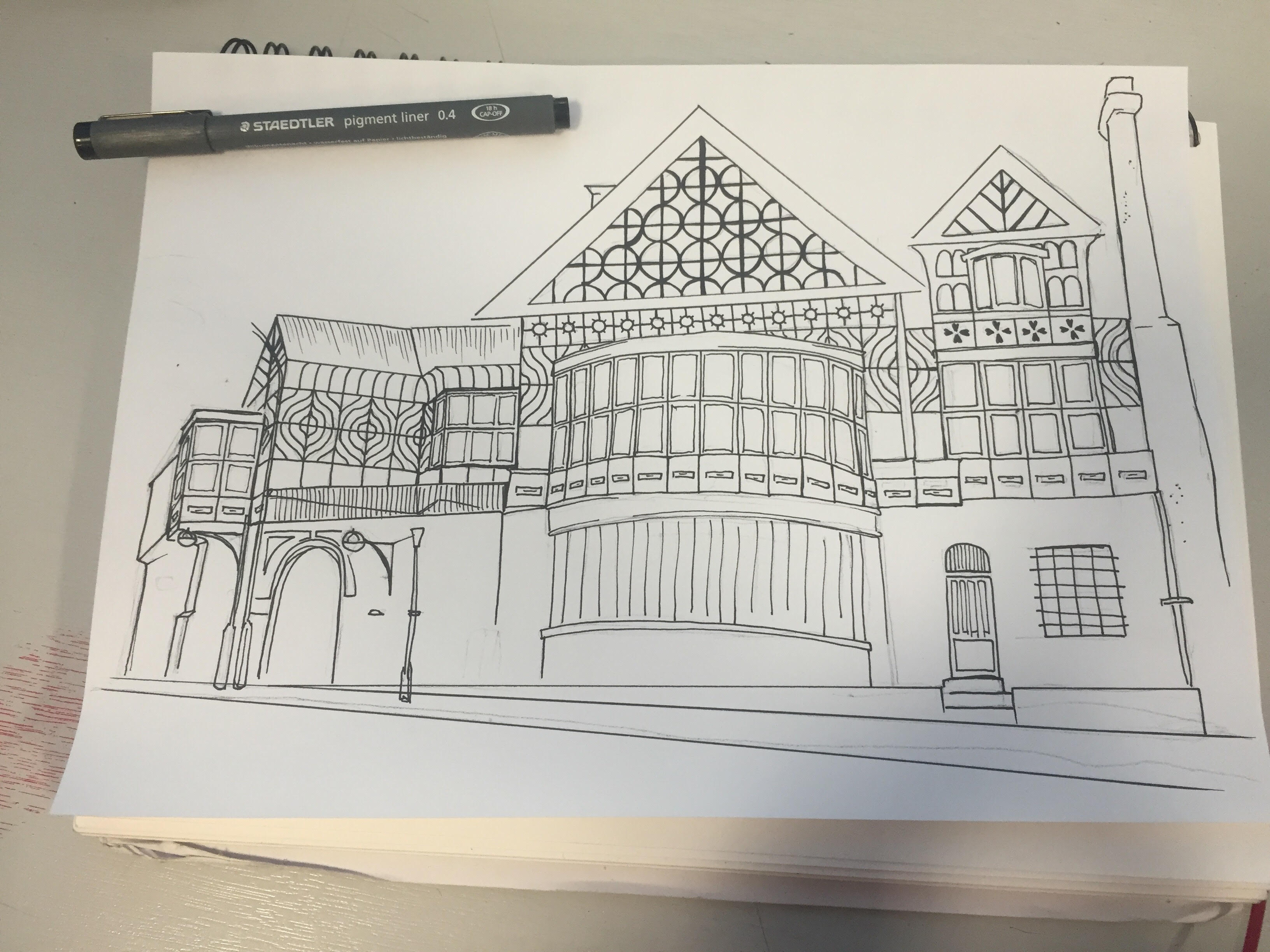
Please evaluate here
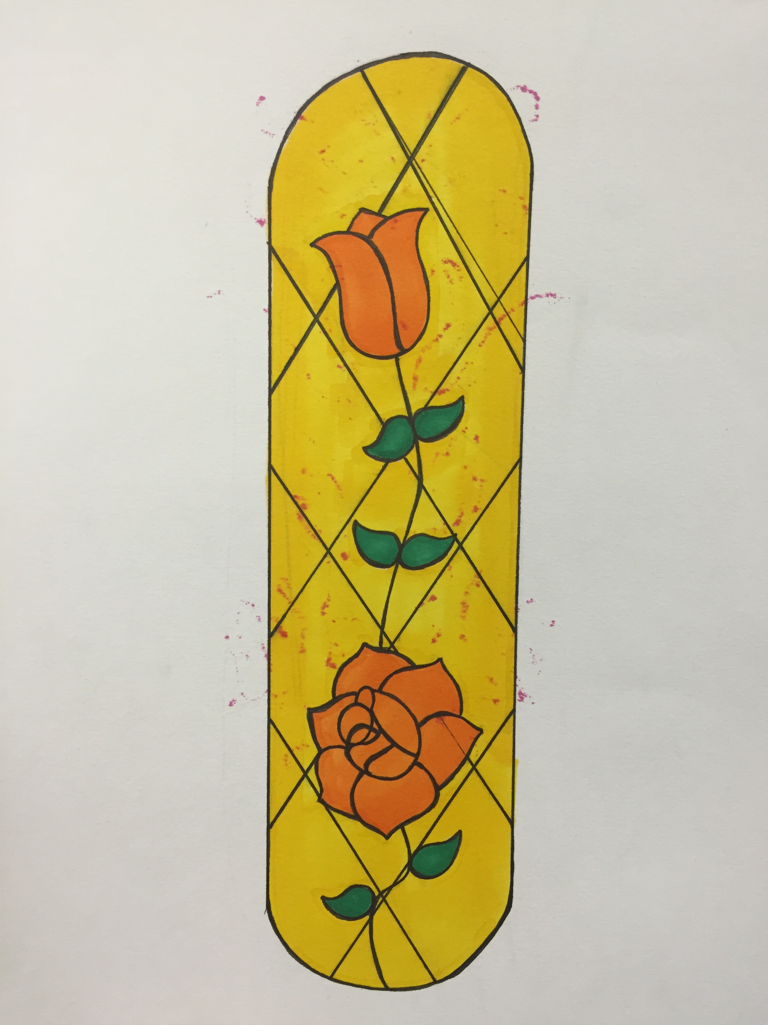
What is it about these images that you like? please talk about the colour shape pattern and form this is your visual elements. What does this research shape tell you Tell me about the book why? 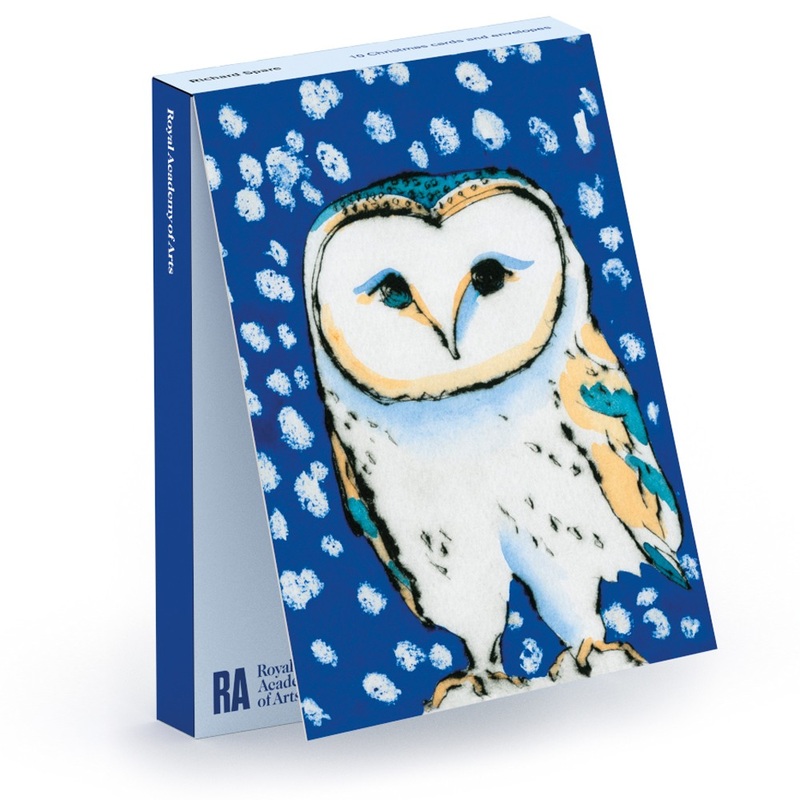 Line- In this Christmas card, there are hard and soft lines, which are used to make the contour of the owl. Form- there is also form, in 2D using tone to give an illusion of perspective. Tone- the tone is mainly appreciated below the ow's head, over the eyes and in the right leg. Pattern- is also used with the snow, making just white round dots. Color- The last element is color, used in mostly every place of the painting, light yellow is used on both wings, eyes, nose and the lower part of the head. Light blue on both wings, an eye and the head and a dark blue for the background.  Line- in this card, line is the main element because most of the card is just a black line going round and round.
Shape- it is also important in this picture,enclosed coloured irregular areas are just the edges of the line. Pattern- i would say pattern in this picture could be the lines, which have a characteristic way all over the image. Color- in this drawing there are lots of colors, primary such as red, blue and yellow, secondary and others. 1- The Christmas card was invented in 1843, by a man called Sir Henry Cole, a civil servant who wanted that every single person could use the post office to communicate by distance, not only the high class. He was one day with an artist friend, and they got the idea of making a Christmas card, copying it and selling it by a very very low price of 5p, selling along 1000 copies. 2- I think Christmas cards are a good idea, they are not a very special thing which you may care, is just funny and nice to send and receive cards from other people you know, congratulating you Merry Christmas. The bad thing is that I think they will disappear with internet, phones, email... There will be very few people sending cards so it will no rent. 3- The fist Christmas card, was realistic, with the typical phrase, ( merry Christmas and a happy new year ), and it tried to represent some values, like generosity in this case. It is also showing a big meal, all the family eating turkey, and with a beautiful frame, while the new Christmas card is much more eased, not so many detail, it defines a turkey outline with a rounded line, feathers are intuited by fine and short lines, and simplifies branches into lines, fact which in the first one takes lot of detail. It is more abstract, but with very vibrant colors. It doesn't include any phrase or comment and it is just a drawing of a turkey and pears, there is no people, no present food... I personally like both cards, but I must admit unless simplifying so much an animal is very difficult, the first picture entails much more work. 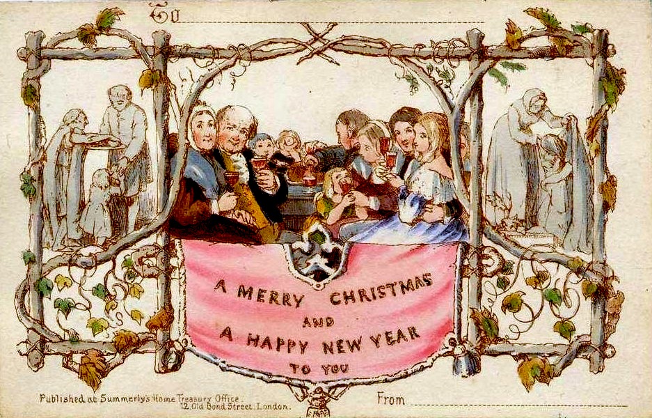 http://www.whychristmas.com/customs/cards.shtml 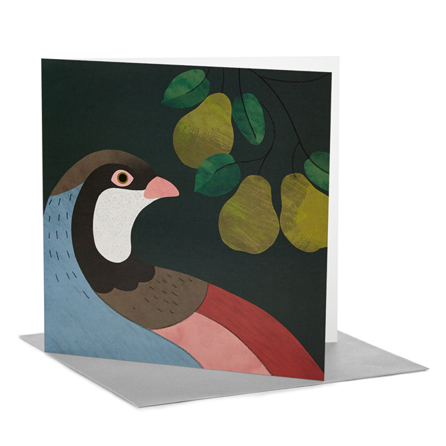 http://shop.tate.org.uk/4-for-3-christmas-cards/tate-rca-christmas-card-rachel-hill-partridge-in-a-pear-tree-pack-of-6/invt/18964&bklist=icat,4,shop,offersale,christmascards
|
AuthorWrite something about yourself. No need to be fancy, just an overview. Archives
June 2017
Categories |


 RSS Feed
